WCAG UI UX design: the share of WCAG 2.2 a designer settles before code
Most accessibility failures on the web are chosen in a design tool long before anyone writes code. Here is which Web Content Accessibility Guidelines (WCAG) 2.2 rules a designer can pass or fail in the file, and how to hand the rest over.
Where does WCAG UI UX design work start and stop?#
A design file settles the WCAG 2.2 criteria that are visual or about flow, contrast, target size, focus styling, reflow, text spacing, colour cues, help placement and re-entry, before any code exists. The WCAG 2.2 Recommendation, in its W3C version of 12 December 2024, holds 31 criteria at Level A, 24 at Level AA and 31 at Level AAA. Since most teams aim at A and AA together, 55 criteria are in play.
Show data table
| Segment | Value | Share |
|---|---|---|
| Level A | 31 | 36% |
| Level AA | 24 | 27.9% |
| Level AAA | 31 | 36% |
Levels A and AA together hold the 55 criteria most teams aim at.
Those 55 fall into three lanes, and the lane depends on who can settle each one. First comes what is measurable in the file. A colour pair either reaches 4.5:1 or it does not. So too a button is either 24 pixels wide or it is not. Second comes behaviour that a picture cannot show, such as focus order or the words in an error message. Here the designer decides, but only a written note carries the decision across. Third comes what lives in code alone: names, roles, keyboard operation and status messages.
So WCAG UI UX design work is not a checklist developers run after the build. Instead, it is the first of three passes, and it is the cheapest one. When a decision is fixed in the palette or the grid, it is fixed once. But found in a built product, it becomes a ticket on every screen that used it.
Why does the design file decide the most common WCAG failure?#
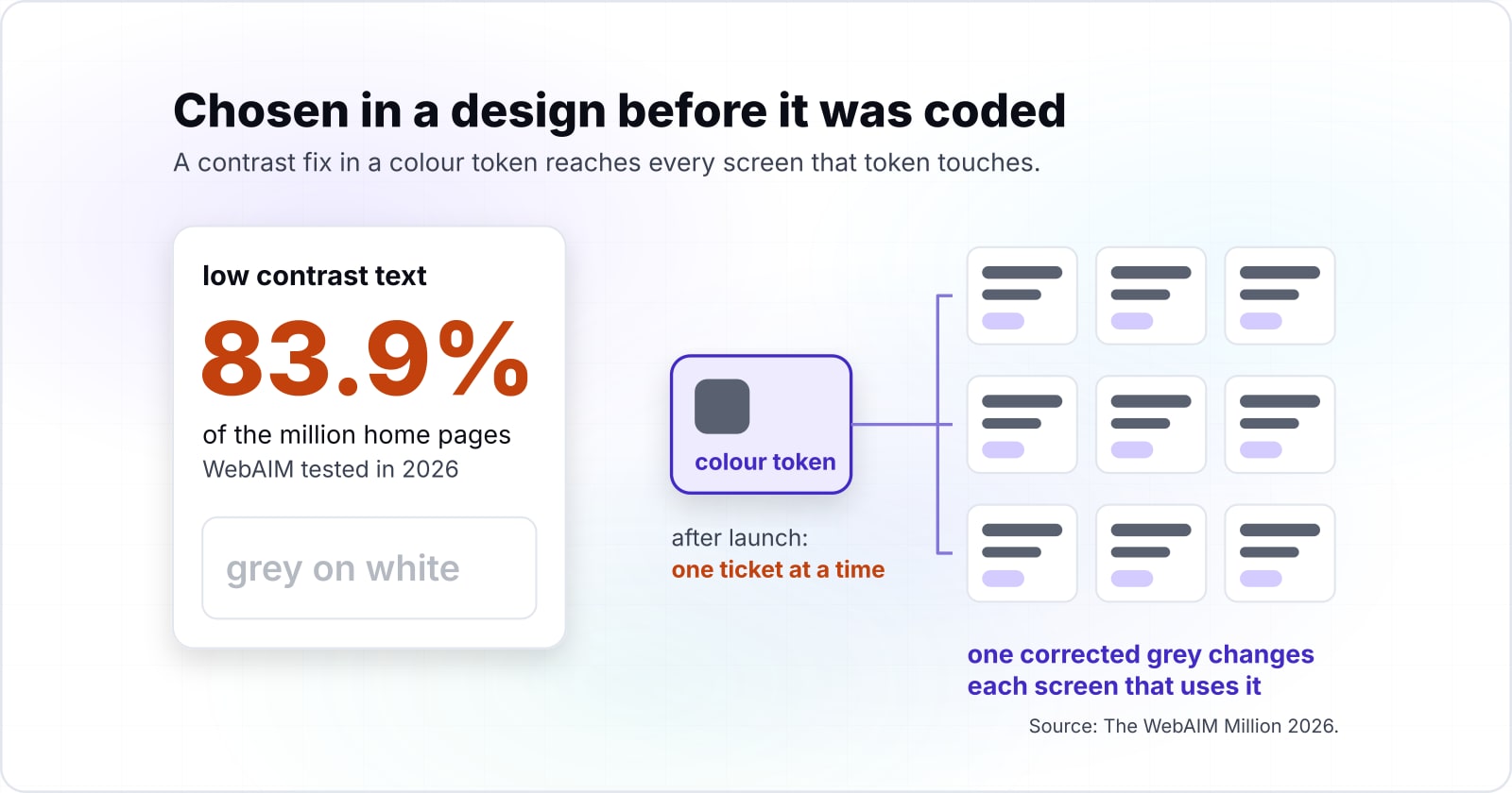
Low contrast text appeared on 83.9% of the million home pages WebAIM tested in 2026, and every one of those colour pairs was chosen in a design before it was coded. That figure comes from The WebAIM Million 2026. It ran the WAVE engine over the rendered home pages of the top million sites. It is the most common failure in the report by a wide margin.
Show data table
| Item | Value |
|---|---|
| Low contrast text | 83.9 |
| Missing alternative text for images | 53.1 |
| Missing form input labels | 51 |
| Empty links | 46.3 |
| Empty buttons | 30.6 |
| Missing document language | 13.5 |
Low contrast text leads the six failure types, and it is chosen in the palette before any code.
WebAIM's 2026 report also notes that "96% of all errors detected fall into these six categories". In other words, a short list covers almost everything an automated scan finds. Yet the top item on that list is not a coding error at all. Instead, it is a grey on white or a white on brand blue. Once picked, it is reused across the product.
That is why the design side matters to anyone who reports on accessibility. When a contrast fix lands in a colour token, it reaches every screen that token touches. After launch, the same fix means finding each use, one ticket at a time. Because tokens feed every component, one corrected grey changes each screen that uses it in the next build. So the design file handed to the build is where the most common failure is cheapest to remove.
Which WCAG 2.2 thresholds can you check inside the design file?#
Five thresholds are measurable in a design file: 4.5:1 text contrast, 3:1 for large text and component edges, a 320 CSS pixel reflow width, four text-spacing multipliers and 24 CSS pixel targets. Each one comes from the normative text of the WCAG 2.2 Recommendation of 12 December 2024. So each one can be passed or failed before handoff.
| Criterion | Level | What to check in the file |
|---|---|---|
| 1.4.3 Contrast (Minimum) | AA | Text at 4.5:1 against its background; large text at 3:1 |
| 1.4.11 Non-text Contrast | AA | Component edges, states and needed graphics at 3:1 |
| 1.4.10 Reflow | AA | The layout still works at 320 CSS pixels wide |
| 1.4.12 Text Spacing | AA | Nothing breaks when spacing grows to the four multipliers |
| 2.5.8 Target Size (Minimum) | AA | Pointer targets at 24 by 24 CSS pixels, or spaced |
Source: W3C, WCAG 2.2 Recommendation, 12 December 2024.
Contrast and non-text contrast#
First, the contrast minimum asks for 4.5:1 on body text, and 3:1 on large text. Then non-text contrast asks for 3:1 on the "visual information required to identify user interface components and states". That covers input borders, toggle states and the focus ring itself. For the ratio arithmetic, the colour contrast guide walks through it step by step.
Reflow and text spacing#
Next, the reflow criterion wants content to scroll in one direction at a width of 320 CSS pixels. The WCAG 2.2 text says that width matches a starting viewport of 1280 CSS pixels at 400% zoom. In practice, a phone frame at that width should hold every screen without sideways scrolling.
Then comes text spacing. The WCAG 2.2 text lists line height at 1.5 times the font size and paragraph spacing at 2 times. Then it adds letter spacing at 0.12 times and word spacing at 0.16 times. A user may set those values, and nothing may be lost when they do. So a fixed-height card with tight text will clip.
What skipping the check costs#
The cost of skipping these checks shows up in WebAIM's data. Its 2026 report puts low contrast text at 79.1% of home pages in 2025, then 83.9% in 2026. Over the same year, the share of pages with any detected WCAG 2 failure rose from 94.8% to 95.9%.
Show data table
| Dimension | WebAIM Million 2025 | WebAIM Million 2026 |
|---|---|---|
| Home pages with low contrast text | 79.1% | 83.9% |
| Home pages with detected WCAG 2 failures | 94.8% | 95.9% |
Both shares rose between 2025 and 2026.
How much gap does an undersized icon need to pass target size?#
Two equal icons smaller than 24 CSS pixels pass target size when their width plus the gap between them reaches 24, so a 20 pixel icon needs 4 pixels of gap. The rule comes from the spacing exception in Understanding 2.5.8 Target Size (Minimum). There, a small target passes "if a 24 CSS pixel diameter circle is centered on the bounding box of each, the circles do not intersect another target or the circle for another undersized target".
A toolbar, worked through#
Take a toolbar of 20 by 20 icon buttons, placed 4 pixels apart. Because 20 plus 4 is 24, the centres of two neighbours sit 24 pixels apart. Each circle has a radius of 12, so the two circles just meet and do not overlap. As a result, the row passes. Now tighten the gap to 2 pixels, and the centres sit 22 pixels apart. Then the circles overlap by 2 pixels. So every icon in the row fails.
Show data table
| Item | Value |
|---|---|
| 16 px icon target | 8 |
| 18 px icon target | 6 |
| 20 px icon target | 4 |
| 22 px icon target | 2 |
The gap needed shrinks as the icon grows: it is always 24 minus the icon width.
The rule for any row#
So the general rule is simple arithmetic. For a row of equal icons, the gap you need is 24 minus the icon width. A 16 pixel icon needs 8 pixels, and an 18 pixel icon needs 6. Once an icon reaches 24 pixels, it passes on its size alone.
Check your own toolbar row
Set the width of your equal icons and the gap between them. The calculator runs the 24 CSS pixel circle test for a row of undersized targets.
Circle overlap in CSS px (0 passes 2.5.8)
0
- Distance between centres in CSS px
- 24
- Gap this icon width needs in CSS px
- 4
An overlap of 0 means the circles do not intersect and the row passes.
Because the test uses the bounding box, a designer can check it in any tool that shows sizes and gaps. In a design tool, measure the button's frame rather than the glyph, since the frame is what gets tapped. However, the circle test is the floor, not the goal. The same Understanding page warns that small targets can still be hard to hit while meeting the rule. For a thumb on a phone, a bigger target is still kinder.
What did WCAG 2.2 add that lands on a designer's desk?#
WCAG 2.2 added nine criteria, six at Level A or AA, and five of those six are decided in layout or flow: focus not obscured, dragging, target size, consistent help and redundant entry. The W3C summary, What's New in WCAG 2.2, lists them with plain examples. It also notes that "4.1.1 Parsing is obsolete and removed from WCAG 2.2".
Each of the five is a design call.
- 2.4.11 Focus Not Obscured (Minimum), AA. When an item gets keyboard focus, it is "not entirely hidden due to author-created content". Sticky headers, sticky footers and cookie banners are the usual cause, and each is drawn in the design first.
- 2.5.7 Dragging Movements, AA. Anything done by dragging also works with a single pointer without dragging. So a sortable list needs a move button, and the button needs a place in the layout.
- 2.5.8 Target Size (Minimum), AA. The 24 pixel rule, worked through for a toolbar earlier.
- 3.2.6 Consistent Help, A. When help repeats across pages, it keeps the same order among the other content.
- 3.3.7 Redundant Entry, A. A process does not ask for the same information twice. For example, a checkout can offer "same as billing address" instead of a second blank form.
The sixth is 3.3.8 Accessible Authentication (Minimum), AA. Under its short rule, a login does not demand a "cognitive function test (such as remembering a password or solving a puzzle)" without an alternative. Since the designer draws the login, paste and password managers need room in it. Still, the team that builds the login owns most of that criterion. For all nine criteria and the version that binds you, read the WCAG 2.0, 2.1 and 2.2 comparison.
What does a design file have to annotate before handoff?#
A screen shows colour and size, but focus order, heading levels, error text, non-colour state cues and where help sits have to be written on the file, or the build guesses them. The Digital.gov guide for visual designers says it plainly: "Plan heading structure early."
The annotations that carry the most weight are these five.
- Focus order. Number the stops a keyboard makes through each screen, including any dialog. Digital.gov's UX design guide asks designers to "intentionally design how focus flows through these interactions".
- Heading levels. Mark which text is a heading and at which level. Size alone does not tell the build that a line is an H2.
- Error text and error states. Write the exact message. Then show how it appears, with "multiple cues like color, icons, bold font weight, heavy border or outline, and helpful text".
- Non-colour cues. Under Use of Color, colour is never the only way to show a state. So note the icon, underline or label that carries it too.
- Help placement. Under Consistent Help, repeated help keeps its order, so mark where the contact link or chat sits in the template.
Without these notes, a developer has to guess each one from a static picture, and two developers guess differently. Also mark the focus ring's colour and offset on the component, and the height of any sticky bar. Those two notes feed straight into the CSS that follows. And for keyboard behaviour inside custom widgets, the keyboard navigation guide covers the build side of it.
Which W3C pages should the handoff be built from?#
Build the handoff from four W3C pages in order: the WCAG 2.2 text for thresholds, then the Understanding pages for target size, focus appearance and focus not obscured. Each page gives the handoff one thing.
- WCAG 2.2 Recommendation: the normative numbers, from 4.5:1 to 24 by 24 CSS pixels. Quote from here when a threshold is disputed.
- Understanding 2.5.8 Target Size (Minimum): the circle test, plus technique C42, "Using min-height and min-width on target container to ensure sufficient target spacing".
- Focus Appearance, Understanding 2.4.13: the 2 pixel outline, and the note that "the outline and outline-offset properties are commonly used" for it.
- Focus Not Obscured (Minimum), Understanding 2.4.11: technique C43, "Using CSS scroll-padding to un-obscure content".
Then pin those four links to the design file itself. As a result, anyone who questions a number can check it at the source in one click.
What do three design decisions look like as CSS?#
Three design decisions become eight lines of CSS: a 2 pixel focus outline with an offset, a 24 pixel minimum target, and scroll padding that keeps focus clear of a sticky header. Each line maps to one technique named on the W3C pages listed before it.
:focus-visible {
  outline: 2px solid currentColor;
  outline-offset: 2px;
}
.icon-button { min-width: 24px; min-height: 24px; }
html {
  scroll-padding-top: 4rem;
}
First, for the focus ring, a solid 2 pixel outline matches the Focus Appearance guidance. Then the offset keeps the ring off the component's own edge. Still, the colour needs 3:1 against what sits next to it, and the designer picks it. Second, for the target floor: with a minimum width and height, every icon reaches 24 pixels and the drawn glyph stays the same. Third, for the sticky header, the 4rem value stands in for the header's height from the design file. With it, the browser scrolls a focused item clear of the header rather than behind it.
Because this ring shows only on keyboard focus, the focus versus focus-visible guide explains when that selector is the right one.
Which WCAG criteria can a design not settle on its own?#
Missing form labels and empty buttons sat on 51% and 30.6% of home pages in 2026, and both are code defects a design can only annotate, never guarantee. Those two figures come from The WebAIM Million 2026, the same scan quoted earlier. So a button with a clear icon still reaches a screen reader with no name if its code is empty.
The criteria in this lane live in the markup and the scripts. In the WCAG 2.2 text, criterion 4.1.2 Name, Role, Value requires that "the name and role can be programmatically determined". Also, criterion 2.1.1 Keyboard requires that all functionality be "operable through a keyboard interface". Status messages, live updates and custom widget behaviour belong here too. Because none of these show up in a static frame, a design review cannot pass or fail them.
Still, a design can help. For example, it can write the accessible name next to every icon button. It can also note the keys each custom widget answers to. However, only the build puts those names in the code, and only testing proves they arrived. The accessibility testing guide covers how that proof is gathered.
When is a design-first WCAG pass the wrong tool?#
On a product that is already live and failing, start with an audit of the built pages, because the defects people meet today are in the code, not in the file. WebAIM found detected WCAG 2 failures on 95.9% of home pages in 2026. If yours is one of them, a better palette next quarter does not fix what visitors hit this week.
There are three cases where the design-first order is the wrong one.
- A live product that already fails. Audit and fix the built pages first, using the accessibility testing guide. Then bring the lessons back into the design file, so new screens stop repeating the old faults and the fixes stay fixed.
- A team with a design system. Do not check contrast and target size screen by screen. Instead, fix the thresholds once in the colour tokens and the base components. The design systems practice describes that route.
- A team treating Level AAA as the bar. Focus Appearance, 2.4.13, is a Level AAA criterion. So at AA it is a target, not a requirement. Meet 2.4.7 Focus Visible and 1.4.11 first, then use the AAA page as guidance.
In each case the thresholds still hold, and only the order changes.
Where do the design decisions go from here?#
The design decides the numbers, the build carries them, and testing proves them, so the next read depends on which of those three is yours. On the design side, start with the colour contrast guide and the keyboard navigation guide. If you are still hiring the designer, how to hire UI/UX product designers shows how to test the work before you commit. On the build side, the accessible forms guide covers labels, errors and redundant entry. Then the WCAG 2.0, 2.1 and 2.2 comparison names the new criteria and which version applies. And when it is time for proof, go to the accessibility testing guide.
Some teams want the design done to WCAG 2.2 AA from the first frame. For them, our UI UX design practice works that way. Others need a live product brought into line, which is the job of our WCAG and ADA compliance work. But neither is needed to use anything above. The W3C pages are free, and they are enough on their own.