Keyboard navigation focus management under WCAG 2.2: six stops, a test and a native fix for each
A modal that leaks focus, a sticky header that hides the focused link and a route change that strands the caret are one problem seen at three moments. Walk the keyboard journey in order and each one has a criterion, a quick test and a fix the browser already ships.
What does keyboard navigation focus management require under WCAG 2.2?#
Keyboard navigation focus management means every control is reachable by keyboard, shows visible focus that is never fully hidden, never traps focus, and lands focus somewhere sensible after every change. The W3C Recommendation for WCAG 2.2, dated 12 December 2024, spreads that promise across seven success criteria.
The root is Success Criterion 2.1.1 Keyboard, at Level A. The W3C Web Accessibility Initiative, in its Understanding document for 2.1.1 under the 2024 Recommendation, quotes the text: "All functionality of the content is operable through a keyboard interface". Next comes 2.1.2 No Keyboard Trap, also Level A. Because a trap strands a person, it requires that "focus can be moved away from that component using only a keyboard interface". Then 2.4.3 Focus Order, at Level A, asks that the sequence preserves meaning and operation.
However, visibility has three levels of strictness. First, 2.4.7 Focus Visible at AA asks for a mode where the focus indicator is visible. Second, 2.4.11 Focus Not Obscured (Minimum) at AA says the focused component is not entirely hidden by author content. Finally, 2.4.12 and 2.4.13 at AAA tighten that to no part hidden and an indicator of a measured size.
In practice, those criteria map onto six stops, walked in order. You reach each control, you see the focus, and you move inside widgets. Then you escape modals, you land after changes, and you test the whole route. The rest of the walk takes them one at a time, starting with a count from the WebAIM Million 2026, the February 2026 analysis of the top home pages.
| Success criterion | Level | Pass condition |
|---|---|---|
| 2.1.1 Keyboard | A | All functionality is operable through a keyboard interface |
| 2.1.2 No Keyboard Trap | A | Focus can be moved away from a component using only a keyboard interface |
| 2.4.3 Focus Order | A | The focus sequence preserves meaning and operation |
| 2.4.7 Focus Visible | AA | A mode of operation where the focus indicator is visible |
| 2.4.11 Focus Not Obscured (Minimum) | AA | The focused component is not entirely hidden by author content |
| 2.4.12 Focus Not Obscured (Enhanced) | AAA | No part of the focused component is hidden |
| 2.4.13 Focus Appearance | AAA | An indicator at least the area of a 2 CSS pixel perimeter, with 3:1 contrast |
Why is keyboard focus getting harder to get right?#
Custom widgets are multiplying faster than their keyboard support: the average top home page carried 30.4 tabindex attributes in 2026, up from 26 a year earlier. Each one is a promise someone wrote by hand.
WebAIM's 2026 Million report tracks three markers of hand-built keyboard behaviour, and all three rose between 2025 and 2026.
Show data table
| Dimension | WebAIM Million 2025 | WebAIM Million 2026 |
|---|---|---|
| tabindex=0 or tabindex=-1 | 26 attributes | 30.4 attributes |
| aria-hidden="true" | 18 attributes | 23.3 attributes |
| role="button" | 3.6 attributes | 4.8 attributes |
All three markers of hand-built keyboard behaviour rose between 2025 and 2026, led by tabindex at 30.4 per home page.
The mechanism is simple. For example, a real button gets focus, Enter and Space from the browser for free. By contrast, a div given role="button" gets none of that until a script adds it. Also, the aria-hidden count matters, because a focusable element inside a hidden subtree is a stop with no name.
However, WebAIM also prints a bound on its own numbers. It says "not all conformance failures can be automatically detected" in the WebAIM Million 2026. As a result, the counts show how much keyboard work pages now carry, not how much of it works. Therefore the cheapest fix is often to need less of it.
How does tab order work, and when should you use tabindex?#
Tab order follows the DOM order of focusable elements, so tabindex 0 adds a custom control, tabindex -1 allows script focus only, and positive values break the order. In particular, the browser builds that order from the source, not from where things sit on screen.
The MDN tabindex reference, updated 17 April 2026, defines all three cases. First, a tabindex of 0 makes an element focusable in sequential navigation, in source order. Second, a negative value means the element is "not reachable via sequential keyboard navigation", yet a script can still focus it. Meanwhile, a positive value jumps the element ahead of every 0 in the order.
MDN's warning is direct: "You are recommended to only use 0 and -1 as tabindex values." The same warning names CSS that reorders flex items as a second way to break the sequence. That is the link to 2.4.3 Focus Order. Therefore a visual order that disagrees with the tab order fails it when the sequence affects meaning.
Native controls need none of this. In fact, MDN lists links with href, button, input, select and textarea as focusable by default. As a result, the first fix for most tab order bugs is to delete a tabindex, not to add one.
Here is the test for this stop. First, press Tab from the address bar and write down each element that takes focus. Then, if the list jumps around the layout, look for positive values or a reordered grid first. Next, the W3C Web Accessibility Initiative's Understanding documents for the 2024 Recommendation turn visible focus into a measured size.
1. flex order
.tod-row { display: flex; }
.tod-item:nth-child(3) { order: -1; }The screen shows C, A, B. The tab sequence stays A, B, C.
2. reversed direction
.tod-row { display: flex; flex-direction: row-reverse; }The screen shows C, B, A. The tab sequence stays A, B, C.
3. explicit grid line placement
.tod-row { display: grid; grid-template-columns: repeat(3, 1fr); }
.tod-item:nth-child(1) { grid-column: 3; }A has moved to the far right. The tab sequence stays A, B, C.
4. absolute positioning
.tod-row { position: relative; }
.tod-item:nth-child(2) { position: absolute; right: 0; }B is taken out of flow and sits at the far right. The tab sequence stays A, B, C.
<div class="row">
  <button id="a">A</button>
  <button id="b">B</button>
  <button id="c">C</button>
</div>| Mechanism | Screen order | Tab sequence | What it shows |
|---|---|---|---|
| 1. flex order | C -> A -> B | A -> B -> C | The screen shows C, A, B. The tab sequence stays A, B, C. |
| 2. reversed direction | C -> B -> A | A -> B -> C | The screen shows C, B, A. The tab sequence stays A, B, C. |
| 3. explicit grid line placement | B -> C -> A | A -> B -> C | A has moved to the far right. The tab sequence stays A, B, C. |
| 4. absolute positioning | A -> C -> B | A -> B -> C | B is taken out of flow and sits at the far right. The tab sequence stays A, B, C. |
Each method's CSS is applied live to three real buttons, so the screen order is what your own browser does with that rule. The tab sequence beside it is derived from the specified ordering rule rather than from a browser run.
These are the sequences the specified ordering yields for this markup. No browser run produced them.
How visible does keyboard focus have to be under WCAG 2.2?#
Focus must be visible (2.4.7) and not entirely hidden by sticky content (2.4.11) at AA, and the AAA indicator for a 90 by 30 button covers 480 square pixels. Those are two separate checks, and passing one does not pass the other.
Success Criterion 2.4.7 asks that "Any keyboard operable user interface has a mode of operation where the keyboard focus indicator is visible", in the W3C Understanding document for 2.4.7. The CSS tool for it is :focus-visible. Meanwhile, the MDN :focus-visible page, updated 10 September 2026, says it applies when the browser decides by heuristics that focus should be evident. In short, keyboard users get the ring and mouse clicks usually do not.
How big is big enough? In practice, WCAG 2.2, the W3C Recommendation dated 12 December 2024, sets a size only at AAA, in 2.4.13 Focus Appearance. The indicator must cover at least the area of a 2 CSS pixel thick perimeter of the control, with 3:1 contrast between focused and unfocused pixels. Also, the W3C Web Accessibility Initiative works one example in its Understanding document for 2.4.13, written for the 2024 Recommendation: a 90 by 30 pixel button needs 480 square pixels. Since that area is (92 × 32) minus (88 × 28), it reduces to 4 times the sum of width and height.
Does your outline meet the 2.4.13 minimum area?
Set your control's size and the outline thickness; it computes the minimum area for SC 2.4.13 and the area a solid outline drawn outside the control covers. The defaults are the W3C example of a 90 by 30 button.
Minimum area for 2.4.13, square CSS px
480
- Area your outline covers, square CSS px
- 496
- Covered as a share of the minimum (100% or more passes the area test)
- 103%
Arithmetic from W3C, Understanding SC 2.4.13 Focus Appearance. Modelled, not measured.
Show data table
| Item | Value |
|---|---|
| 44 by 44 icon button | 352 |
| 90 by 30 button (W3C example) | 480 |
| 120 by 40 button | 640 |
| 200 by 48 text input | 992 |
The minimum grows with the control's perimeter: a 200 by 48 text input needs 992 square pixels, about twice the W3C example.
Then comes the sticky header. Success Criterion 2.4.11 passes when "the component is not entirely hidden due to author-created content", according to the W3C Web Accessibility Initiative's Understanding document for 2.4.11. In particular, that document names sticky headers, sticky footers and cookie banners as the usual cause, and scroll padding as a way to pass. The MDN scroll-padding page, updated 16 September 2026, describes insets that make room for fixed toolbars. Finally, the AAA form, 2.4.12, asks that no part of the component is hidden.
Should a menu or tab list use roving tabindex or aria-activedescendant?#
Use roving tabindex when focus can move between real elements such as tabs or menu items, and aria-activedescendant when focus must stay in a text field, as in a combobox. Both give the widget a single Tab stop.
The WAI-ARIA Authoring Practices Guide on keyboard interfaces describes the roving method in one line. With it, "the element that is to be included in the tab sequence has tabindex="0" and all other focusable elements contained in the composite have tabindex="-1"". Then arrow keys move the 0 to the next item and call focus on it. Meanwhile, Tab leaves the widget entirely.
The APG names one benefit of roving tabindex: the browser scrolls the newly focused element into view. With aria-activedescendant, by contrast, DOM focus stays on the container. Instead, the attribute tells assistive technology which child is active, and assistive technology treats that child as focused.
Therefore the test is one question. Can DOM focus leave the element the person is typing in? If not, as with a combobox input, use aria-activedescendant. Otherwise use roving tabindex, because the scroll behaviour comes for free.
Either way, check this stop by pressing Tab into the widget once. Focus should land on one item, arrows should move it, and the next Tab should leave.
| Question | Roving tabindex | aria-activedescendant |
|---|---|---|
| Where DOM focus sits | On the active item; arrow keys move it | Stays on the container or the text field |
| Tab stops in the widget | One: the item with tabindex="0" | One: the focused container |
| Scrolling the active item into view | The browser does it when focus moves | No DOM focus move, so no free browser scroll |
| Suits | Tabs and menu items | A combobox, where focus must stay in the text field |
How do you keep focus inside a modal dialog without a focus trap script?#
Open a dialog element with showModal(), which makes everything outside it inert, close it with Escape, and send focus back to the control that opened it. The browser now does the containment a focus trap library used to do.
The MDN dialog reference, updated 2 October 2026, states the behaviour plainly. With showModal(), "Everything outside the modal dialog is inert and interactions outside the dialog are blocked." Also, the same page says the Esc key dismisses a modal dialog by default, and that focus goes to the first focusable element inside. However, you can steer that first stop with the autofocus attribute.
Where a dialog element does not fit, the MDN inert reference, updated 17 April 2026, covers the rest. Because inertness covers a whole subtree, an inert element and its descendants are removed from the tab order and the accessibility tree. In particular, the same page notes that a modal opened with showModal() escapes the inertness of its ancestors.
The APG modal dialog pattern adds the closing rule. When a dialog closes, focus returns to the element that invoked it, unless that element no longer exists or the work flow makes another target more logical. So write that return yourself, in one line on the close event.
Does containment break No Keyboard Trap? It does not, because Escape closes a showModal() dialog by default, so focus can leave using only the keyboard. For the role contract behind the dialog element, see the ARIA roles developer guide.
Where should focus go after a route change or a deleted item?#
After a route change, move focus to the new view's main heading, and after a deletion, to the nearest surviving item, so focus never drops back to the page body. Because a script removed the old target, a script has to choose the new one.
A heading is not focusable by default. Therefore give it tabindex="-1" and call focus() on it once the new view renders. MDN's tabindex page describes exactly this use: elements "that should not be navigated to directly using the Tab key, but need to have keyboard focus set to them". Then the heading announces the new view and becomes the starting point for the next Tab.
Deletion follows the same idea. For instance, when a row in a list disappears, focus the next row, or the previous one if it was the last. Finally, fall back to the list heading when the list is empty.
Skip links still earn their place in a single-page app, and their use is growing. WebAIM's Screen Reader User Survey #11, run in July and August 2026, found frequent skip link use rose from 31.2% in 2021 to 37.7% in 2026.
31.2%
2021 survey
37.7%
2026 survey (#11)
Frequent skip link use among screen reader respondents rose between the two surveys.
Show data table
| Option | % of respondents |
|---|---|
| 2021 survey | 31.2% |
| 2026 survey (#11) | 37.7% |
Source: WebAIM, Screen Reader User Survey #11, July to August 2026
Also, WebAIM adds in the survey results that skip links "provide distinct benefits for sighted keyboard users" as well. For router-specific detail, see accessible single-page applications.
Which docs should you build keyboard focus handling from?#
Build from five MDN pages in this order: dialog, inert, tabindex, :focus-visible and scroll-padding, with the WCAG 2.2 Understanding documents as the pass conditions. Each page supplies one piece of the code below.
- dialog element, MDN: showModal(), close() and Escape dismissal.
- inert attribute, MDN: the attribute for overlays that cannot be a dialog element.
- tabindex attribute, MDN: tabindex="-1" for the heading that takes focus after navigation.
- :focus-visible pseudo-class, MDN: the keyboard-only outline.
- scroll-padding property, MDN: clearance under a sticky header.
dialog element, MDN
Step 1 of the code: showModal(), close() and Escape dismissal.
inert attribute, MDN
For overlays that cannot be a dialog element.
tabindex attribute, MDN
Step 4 of the code: tabindex="-1" for the heading that takes focus after navigation.
:focus-visible pseudo-class, MDN
Step 2 of the code: the keyboard-only outline.
scroll-padding property, MDN
Step 3 of the code: clearance under a sticky header.
Then test against the W3C Understanding documents for 2.4.3 Focus Order, 2.4.7, 2.4.11 and 2.1.2 No Keyboard Trap. Also keep the HTML Living Standard section on user interaction open for the focus rules underneath.
What is the minimum code for an accessible modal and route change?#
About twenty lines of HTML, CSS and JavaScript cover a native modal, a visible keyboard outline, sticky header clearance and a focus move after navigation. In short, none of it needs a library.
<!-- Step 1: a native modal dialog and the button that opens it -->
<button id="open-settings" type="button">Settings</button>
<dialog id="settings" aria-labelledby="settings-title">
  <h2 id="settings-title">Settings</h2>
  <button type="button" autofocus id="close-settings">Close</button>
</dialog>

<style>
  /* Step 2: a keyboard-only outline, 2px with an offset */
  :focus-visible { outline: 2px solid currentColor; outline-offset: 2px; }
  /* Step 3: keep focused elements clear of a 64px sticky header */
  html { scroll-padding-top: 64px; }
</style>

<script>
  const dialog = document.getElementById("settings");
  const opener = document.getElementById("open-settings");
  opener.addEventListener("click", () => dialog.showModal());
  document.getElementById("close-settings").addEventListener("click", () => dialog.close());
  // Escape also fires close; either way focus goes back to the opener
  dialog.addEventListener("close", () => opener.focus());

  // Step 4: after a route change, focus the new view's heading
  function onRouteRendered() {
    const heading = document.querySelector("main h1");
    heading.setAttribute("tabindex", "-1");
    heading.focus();
  }
</script>
Each step traces to one documented page. First, step 1 follows MDN dialog, including autofocus on the close button. Second, step 2 follows the MDN :focus-visible example, and step 3 uses scroll-padding-top from MDN scroll-padding. However, set the 64 pixels to your own header height, since that value is only an example. Finally, step 4 is the tabindex -1 use MDN describes.
How do you test keyboard navigation and focus in five minutes?#
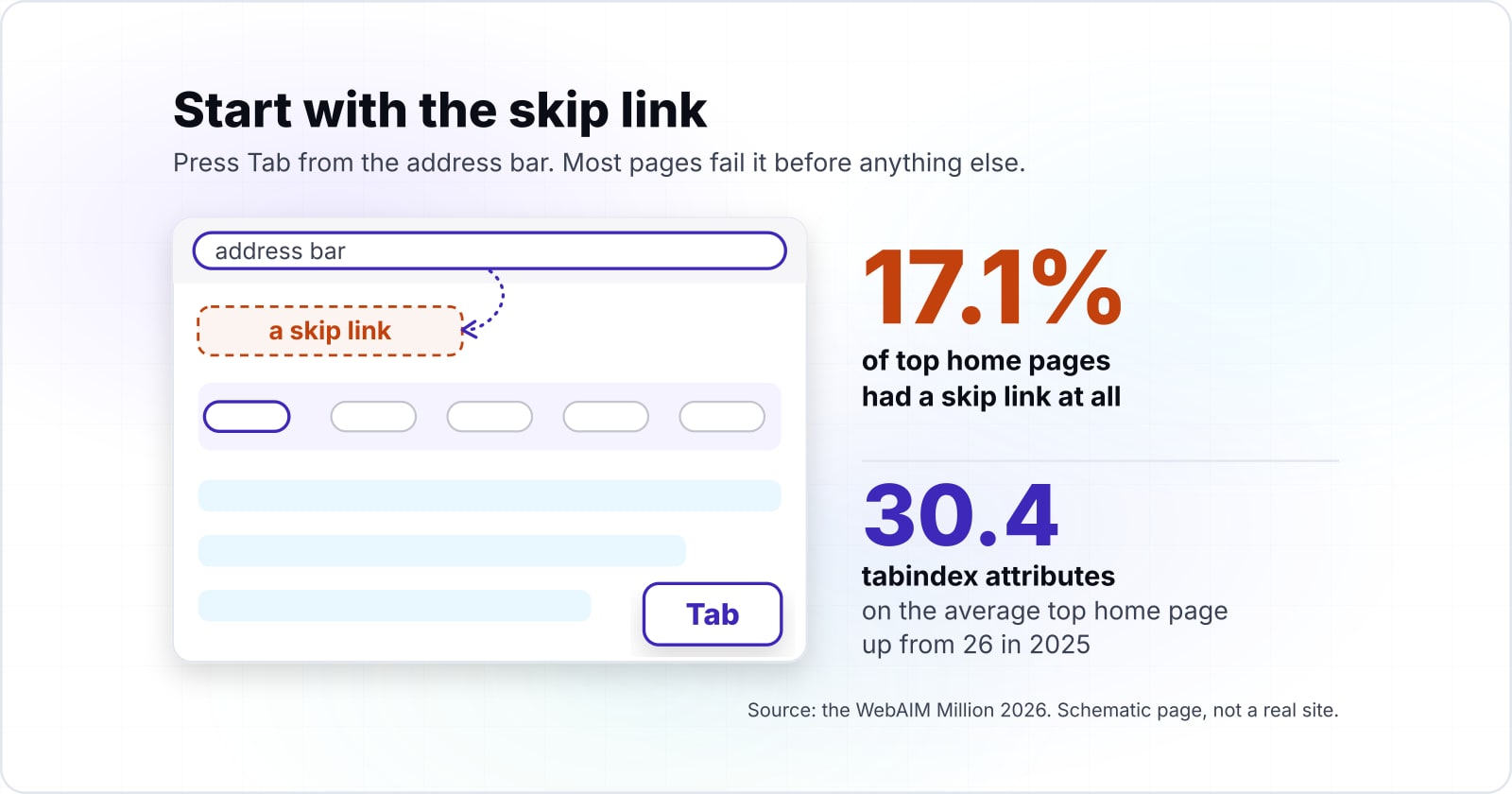
Unplug the mouse, press Tab from the address bar, and check six things in order: a skip link, logical order, visible focus, uncovered focus, Escape from every overlay, and focus after changes. Because each check maps to one criterion, each failure has a name.
First, start with the skip link, because most pages fail it before anything else. The WebAIM Million 2026 found a skip link on 17.1% of top home pages, up from 15.3% in 2025.
Show data table
| Dimension | WebAIM Million 2025 | WebAIM Million 2026 |
|---|---|---|
| Skip link present | 15.3% | 17.1% |
| Main element or main landmark present | 42.6% | 46.1% |
Skip links and main landmarks both rose, and most home pages still lack them.
Then walk the rest. Second, is the Tab order the reading order (2.4.3)? Third, can you see focus on every stop (2.4.7)? Fourth, does any sticky bar cover the focused control (2.4.11)? Fifth, does Escape close every overlay and return focus (2.1.2)? Last, after a route change or deletion, does the next Tab start somewhere sensible?
However, an automated scan cannot run this pass for you. WebAIM states in the 2026 Million that "Absence of detected errors does not indicate that a page is accessible or conformant." For the layers around this pass, see the accessibility testing guide.
When is a custom keyboard model the wrong tool?#
If a native element already does the job, such as a button, a select, a details element or a dialog, a custom keyboard model is the wrong tool and adds risk. In short, custom keyboard navigation focus management is worth writing only for patterns HTML lacks.
For example, take the role="button" count from the WebAIM Million 2026, which rose from 3.6 to 4.8 per home page. Each of those is an element that needs Enter, Space and focus added by script. Instead, a button element gives all three with no code at all.
Also, the same logic applies to menus, disclosures and modals. For instance, a details element already toggles with the keyboard. A select already handles arrow keys. As shown above, a dialog opened with showModal() already contains focus.
Write a custom keyboard model when the APG pattern has no HTML equivalent, such as a tree, a grid or a combobox. Even then, start from the APG keyboard table, not from scratch. Everywhere else, the honest advice is to delete the script and use the element.
| Need | Native element and what it gives | Custom pattern it replaces |
|---|---|---|
| An action control | button: focus, Enter and Space with no code | A div with role="button" plus script |
| A disclosure | details: toggles with the keyboard | A scripted disclosure |
| A choice from a list | select: handles arrow keys | A scripted menu |
| A modal | dialog opened with showModal(): contains focus | A focus trap script |
| A tree, a grid or a combobox | No HTML equivalent | Start from the APG keyboard table |
Where should you go next for each stop?#
Each stop has a deeper guide: single-page app routing, focus-visible styling, ARIA role contracts, WCAG version scope and layered accessibility testing. Pick the one that matches the stop that failed.
For router focus, read accessible single-page applications. Then, for outline styling, see focus vs focus-visible in CSS. Widget roles have their own home: the ARIA roles developer guide covers each contract. If you are unsure which version applies, start with the WCAG guidelines comparison. Finally, layered accessibility testing shows where this keyboard pass fits.
Some teams want the walk run with them across a whole product. For that, there are pages on accessibility testing and WCAG and ADA compliance. Otherwise, the W3C Understanding documents and MDN pages linked above are enough on their own.