ARIA roles for developers: every role is a contract you must keep
Add a role and the screen reader believes you. It cannot check the keys, the states or the children behind the claim, so the work of keeping that promise stays with you.
What are ARIA roles for developers, and what does each one commit you to?#
An ARIA role tells assistive technology what an element is, changes nothing about how it behaves, and leaves you owing every state, child and key that role promises. That is the short answer to "what does aria-role mean", and it is the whole idea behind ARIA roles for developers.
The WAI-ARIA 1.2 Recommendation, published by the W3C on 6 June 2023, defines each role with a table of characteristics. Each table names the states the role needs and the parent it must sit in. It also names the children it must own and where its name comes from. Also, the W3C's APG read-me-first page puts the same idea in five words: "A role is a promise".
So a role definition is less a label than a contract. For example, role="button" on a div promises a screen reader user that Enter and Space will press it. But the browser will not make that true, so your script has to.
What does an unkept role contract cost a page?#
On the February 2026 WebAIM Million crawl, home pages with ARIA averaged 59.1 detected errors against 42 on home pages without it. WebAIM's 2026 report puts the gap at about 17 more potential barriers per home page where ARIA is present.
Show data table
| Item | Value |
|---|---|
| Home pages with ARIA present | 59.1 |
| Home pages without ARIA | 42 |
Home pages with ARIA averaged 59.1 detected errors against 42 on pages without it.
However, WebAIM adds a caveat in the same breath: "This does not necessarily mean that ARIA introduced these errors". Because pages with more ARIA were also more complex, a busy page simply had more places to fail. So the honest reading is narrow. ARIA did not help these pages on average, and a role is not a fix by itself.
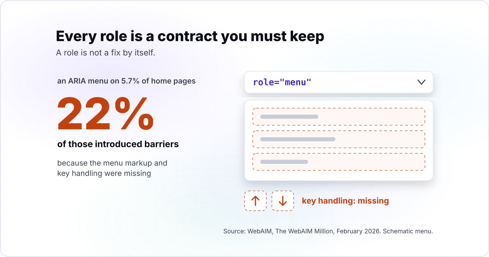
In particular, WebAIM's 2026 report found an ARIA menu (role="menu") on 5.7% of home pages. Yet 22% of those introduced barriers because the menu markup and key handling were missing. In short, that is a role contract left unkept, counted at scale. Therefore the value of keeping each contract is plain to report upward. It means fewer barriers per page, not a promise that ARIA makes a page accessible.
What does the role attribute actually change in the browser?#
The role attribute changes how the browser exposes an element to the accessibility API, and the user agent takes the first token that names a real, non-abstract role. The WAI-ARIA 1.2 text says user agents "MUST use the first token" that matches a non-abstract role. So role="tab button" is read as a tab.
That is all it does. Instead, focus, the tab order, keyboard events and clicks stay exactly as the underlying element defines them. For example, a div with role="checkbox" is still a div. It takes no focus, ignores Space and never flips aria-checked on its own. Because nothing in the browser enforces the role, a mistake stays silent. As a result, the page looks fine with a mouse. It breaks only for someone on a screen reader or a keyboard.
Meanwhile, roles keep spreading. WebAIM's Million reports show the share of home pages using ARIA, landmark roles aside, rising in one year.
79.4%
2025
82.7%
2026
The share of home pages using ARIA, landmark roles aside, rose from 79.4% to 82.7% in one year.
| Option | share of home pages in the WebAIM Million |
|---|---|
| 2025 | 79.4% |
| 2026 | 82.7% |
So most of the ARIA on the web is code someone wrote on purpose. Then each role in it is a claim the browser passes on without checking.
Which ARIA roles exist, and how does WAI-ARIA 1.3 change the list?#
WAI-ARIA 1.2 sorts its roles into six categories, splitting widgets into standalone and composite lists, and the 4 June 2026 Working Draft of 1.3 grows document structure from 38 roles to 42. Any list of ARIA roles for developers starts here, with the accessibility roles a browser knows, counted by category in both versions.
Show data table
| Dimension | WAI-ARIA 1.2 | WAI-ARIA 1.3 Working Draft |
|---|---|---|
| Abstract | 12 roles | 12 roles |
| Widget (standalone) | 20 roles | 20 roles |
| Composite widget | 9 roles | 9 roles |
| Document structure | 38 roles | 42 roles |
| Landmark | 8 roles | 8 roles |
| Live region | 5 roles | 3 roles |
| Window | 2 roles | 2 roles |
Document structure grows from 38 roles to 42 in the 1.3 Working Draft, and live region drops from 5 to 3.
In practice, the categories decide how much a role asks of you. Widget, composite, landmark, live region and window roles carry interaction or navigation duties. Meanwhile, document structure roles mostly describe content, such as heading, list or table. Finally, the twelve abstract roles, such as widget and composite, exist only to build the spec's family tree. The 1.2 text is blunt: "Authors MUST NOT use abstract roles in content."
The WAI-ARIA 1.3 Working Draft adds code, comment, mark and suggestion to document structure. Also, its change list adds the sectionheader and sectionfooter roles. Then its live region heading lists only alert, log and status, where 1.2 also listed marquee and timer. Because a Working Draft can still change, build to 1.2 and treat 1.3 as the direction of travel.
What does a role oblige you to supply?#
Every widget role's definition prints up to five obligations: required states, a required parent, required children, where its name comes from, and whether its children are presentational. Read those five rows and you have the ARIA role definition in practice.
The checkbox owes aria-checked, the tab owes a tablist parent, and the tablist owes tab children. Then the APG pattern for each widget adds the keys the spec leaves to the author. In WAI-ARIA 1.2, each row asks for the following.
First, required states. Section 5.2.2 lists the states a role cannot work without. A checkbox without aria-checked announces as a checkbox with no checked value, which is worse than a plain button.
Second, the required context role. Section 5.2.7 sets the parent a role must live in. The spec says "Authors MUST ensure elements with role tab are contained in, or owned by, an element with the role tablist". As a result, a tab floating outside a tablist has lost the thing that makes it a tab.
Third, required owned elements. Section 5.2.6 sets the children a role must own, such as a list owning a listitem. Ownership counts DOM children and anything linked with aria-owns.
Then there is the name source. Some roles take their name from their content, and others need aria-label or aria-labelledby. A tabpanel, for instance, is marked "name required".
Also, presentational children. Section 5.2.9 says some roles flatten what is inside them. So if you put a link inside a role="button", that link drops out of the tree.
The keyboard is the sixth duty, and the spec does not hold it. Instead, the APG pattern for each widget lists the keys. In short, the contract for any role has two halves: the spec for what it is, the APG for how it behaves.
| Obligation | Where it is defined | Example |
|---|---|---|
| Required states | WAI-ARIA 1.2, section 5.2.2 | A checkbox owes aria-checked |
| Required context role | WAI-ARIA 1.2, section 5.2.7 | A tab sits inside a tablist |
| Required owned elements | WAI-ARIA 1.2, section 5.2.6 | A list owns a listitem |
| Name source | The role definition | A tabpanel is marked name required |
| Presentational children | WAI-ARIA 1.2, section 5.2.9 | A link inside role button drops out of the tree |
| Keyboard keys | The APG pattern for the widget | Arrow keys move between tabs |
When does a native HTML element already carry the role?#
ARIA in HTML, a W3C Recommendation whose current version is dated 11 August 2026, lists the implicit role of every HTML element and marks restating it as not recommended. The ARIA in HTML text has a heading that says it plainly: "Avoid specifying redundant roles".
A native button, input or details element ships its role, name, states and keyboard handling together. So the role attribute belongs only where no element carries the pattern you need. For example, a <button> already is a button, takes focus and answers Enter and Space. Also, an <input type="checkbox"> keeps its own checked state. So writing role="button" on a <button> adds nothing but noise.
Even so, the WebAIM Million counts plenty of roles doing work a native element could do.
Show data table
| Item | Value |
|---|---|
| aria-label, aria-labelledby or aria-describedby | 31.4 |
| aria-hidden="true" | 23.3 |
| role="button" | 4.8 |
An average home page carries 4.8 hand-added button roles, each a contract signed by hand.
Each of the 4.8 buttons per home page in WebAIM's 2026 count is a contract someone chose to sign by hand. In practice, the rule is simple. First look for the HTML element. Then reach for a role only when HTML has no element for the pattern, as with tabs.
What are the HTML5 semantic tags, and which role does each one carry?#
HTML5 tags such as header, nav, main, article, section, aside and footer each map to an implicit ARIA role, and four of them become landmarks only in the right context.
The W3C's HTML5 differences note, dated 9 December 2014, starts its list with one line: "The following elements have been introduced for better structure". Then ARIA in HTML, dated 11 August 2026, gives each element its implicit role. Together they give an HTML5 tags list in which each tag carries a role before you write any attribute.
Which implicit role does each HTML5 tag carry?#
| Tag | What it represents | Implicit ARIA role (ARIA in HTML) | New in HTML5 |
|---|---|---|---|
| header | a group of introductory or navigational aids | banner when not inside article, aside, main, nav or section; otherwise generic | yes |
| nav | a section intended for navigation | navigation | yes |
| main | the main content of the body | main | yes |
| article | an independent piece of content, such as a blog entry | article | yes |
| section | a generic document or application section | region when it has an accessible name; otherwise generic | yes |
| aside | content only slightly related to the content around it | complementary | yes |
| footer | a footer for a section: author, copyright and similar | contentinfo when not inside article, aside, main, nav or section; otherwise generic | yes |
| figure | self-contained content referenced as a unit | figure | yes |
| figcaption | the caption of a figure | no corresponding role | yes |
| mark | text highlighted for reference | no corresponding role | yes |
| time | a date or time | time | yes |
| progress | the completion of a task | progressbar | yes |
| meter | a measurement, such as disk usage | meter | yes |
| output | the result of a calculation | status | yes |
| details | a disclosure widget | group | no, not in the 2014 list |
| search | a search or filtering section | search | no, not in the 2014 list |
Source: W3C, ARIA in HTML (11 August 2026) for the roles, and W3C, HTML5 Differences from HTML4 (9 December 2014) for the last column. Meanings are paraphrased from that note.
When does an HTML5 tag become a landmark?#
The rows that end in "otherwise generic" are where the contract bites. A landmark is a role that marks a region of the page, and the Web Almanac 2025 notes that screen reader users often jump between these regions from a landmark menu. The HTML Accessibility API Mappings draft of 12 October 2026 decides when a tag earns one. For example, an aside inside sectioning content maps to the "complementary role if the aside element has an accessible name". Likewise, ARIA in HTML gives a section "role=region if the section element has an accessible name", so an unnamed section is no landmark at all.
| Tag | Landmark role | Becomes a landmark when |
|---|---|---|
| header | banner | scoped to the body, not inside article, aside, main, nav or section |
| footer | contentinfo | scoped to the body, not inside article, aside, main, nav or section |
| aside | complementary | scoped to the body or main; inside sectioning content only when it has an accessible name |
| section | region | it has an accessible name (aria-label or aria-labelledby) |
| nav | navigation | always |
| main | main | always |
Source: W3C, HTML Accessibility API Mappings 1.0 (12 October 2026) and W3C, ARIA in HTML (11 August 2026).
In practice, a header inside an article is only a group, and the page-level header is the one banner. So writing role="banner" by hand on every header adds landmarks the page never meant to have.
How many pages use the landmark elements?#
In HTTP Archive's Web Almanac 2025, published 15 January 2026, main grew fastest of the four landmark elements, from 35% of desktop pages in 2021 to 47% in 2025.
Show data table
| Dimension | 2021 | 2025 |
|---|---|---|
| nav | 66% | 71% |
| footer | 65% | 68% |
| header | 64% | 67% |
| main | 35% | 47% |
main grew fastest of the four landmark elements, from 35% of desktop pages in 2021 to 47% in 2025.
How do tablist, tab and tabpanel work as one widget, and where did tabs come from?#
A tabs widget is three roles bound by one contract: the tablist owns the tabs, each tab controls one tabpanel, and arrow keys move between tabs. HTML has no tabs element, so every part of this contract is yours to write.
What do the three roles oblige?#
The APG tabs pattern sets out the attributes. First, each tab sits in an element with role="tablist". Second, each tab has aria-controls pointing at its panel, and each panel has aria-labelledby pointing back at its tab. Then the active tab carries aria-selected="true", and every other tab carries false.
Which keys does the tablist owe?#
However, the keys are the part most teams skip. The APG says that "When focus moves into the tab list, places focus on the active tab element." Inside a horizontal list, the arrow keys move between tabs and wrap at the ends. Then pressing Tab again leaves the list and lands on the panel, unless the panel's first content can take focus. Home and End are optional, and so is Delete for closable tabs. With automatic activation, a tab shows its panel as soon as it takes focus. With manual activation, the user presses Space or Enter.
Take four tabs with automatic activation. As a result, the whole tablist costs one tab stop, the active tab. Right Arrow on tab 4 wraps to tab 1, and one press of Tab lands in the panel. But built as four plain buttons, the same strip costs four tab stops. It also tells a screen reader nothing about which one is selected. The APG keyboard interface guide gives the method for the one stop, a roving tabindex. The active tab gets tabindex="0" and the rest get -1.
Focus wraps to tab 1
Panel 1 now shows in place of panel 4.
Tab stops the strip costs: 1 as a tablist, 4 as plain buttons.
Right Arrow moves focus to the next tab and wraps from the last to the first.
The result applies the keyboard rules of the W3C ARIA Authoring Practices Guide tabs pattern (accessed 2 October 2026). It is not a browser measurement.
The strip after the key: > marks focus, tabindex is the roving value each tab carries
- > Tab 1tabindex 0panel shows
- Tab 2tabindex -1
- Tab 3tabindex -1
- Tab 4tabindex -1
| Key pressed | Focus after | Panel |
|---|---|---|
| Left Arrow | Focus moves to tab 3 | Panel 3 now shows in place of panel 4. |
| > Right Arrow | Focus wraps to tab 1 | Panel 1 now shows in place of panel 4. |
| Home | Focus moves to tab 1 | Panel 1 now shows in place of panel 4. |
| End | Focus stays on tab 4 | Panel 4 keeps showing. |
| Tab | Focus leaves the list for panel 4 | One press of Tab leaves the tablist; panel 4 keeps showing. |
| Enter or Space | Focus stays on tab 4 | Panel 4 keeps showing. |
When are tabs the wrong UI?#
Tabs fail when people need to compare what sits in two panels. Nielsen Norman Group's Tabs, Used Right, last reviewed 2 September 2026, gives the rule. Use tabs only when people do not need to see two tabs at once. It also says that "Accordions are particularly useful on mobile devices, where they work better than tabs due to the limited screen space." For mobile tabs UI design, then, an accordion is often the better pattern. Finally, keep tabs that switch pages apart from tabs that switch panels. NN/g warns that mixing navigation tabs and in-page tabs in one control disorients people. Navigation tabs are links, not role="tab".
Where did the tab metaphor come from?#
The tab metaphor is older than the web, and NN/g traces it to the file folder that first inspired it. On the desktop, Microsoft's Windows 95 Reviewer's Guide, from 1995, calls property sheets "a pervasive feature in Windows 95". The same 1995 guide shows the Display property sheet with four tabs. The Computer History Museum's 1995 timeline dates the Windows 95 launch to 24 August 1995.
Browsers came to tabs later. BuzzFeed News reported on 9 May 2014 that Adam Stiles published SimulBrowse on 4 January 1998. That browser, later renamed NetCaptor, had tabs along the bottom of the window. BuzzFeed called it the first tabbed web browser "in the contemporary sense". However, Wikipedia's Tab (interface) article lists tabbed windows in BookLink's InternetWorks in 1994, marked "citation needed". So the word "first" depends on whom you ask.
Then the big browsers followed. Mozilla's 0.9.5 release notes list a "Tabbed Browsing feature. Press Ctrl+T to open a new tab." Wikipedia dates that release to October 2001. Finally, BetaNews reported on 18 October 2006 that Internet Explorer 7 shipped, saying "IE7 has joined the 21st century with tabbed browsing". As a result, by Wikipedia's account, every major browser had tabs from that release on.
- 1995
Windows 95 property sheets
Microsoft's Windows 95 Reviewer's Guide calls property sheets "a pervasive feature in Windows 95" and shows the Display property sheet with four tabs.
- 24 August 1995
Windows 95 launches
The Computer History Museum's 1995 timeline dates the Windows 95 launch.
- 4 January 1998
SimulBrowse, later NetCaptor
BuzzFeed News reported on 9 May 2014 that Adam Stiles published SimulBrowse, with tabs along the bottom of the window.
- October 2001
Mozilla 0.9.5
The release notes list a "Tabbed Browsing feature. Press Ctrl+T to open a new tab." Wikipedia dates the release.
- 18 October 2006
Internet Explorer 7
BetaNews reported that IE7 shipped, saying "IE7 has joined the 21st century with tabbed browsing".
When is adding a role the wrong tool, and what should you use instead?#
A role is the wrong tool when a native element exists, when you cannot ship the keyboard behaviour it promises, or when the role is abstract. The APG puts its first rule in one line: "No ARIA is better than Bad ARIA".
No ARIA is better than bad ARIA. So the better tool is the native element, a plain link for navigation, or an accordion where content must stay comparable, never a role whose keys you will not write. So here are the three cases, and what to use in each.
First, a native element exists. Use <button>, <a href>, <input>, <select> or <details>. ARIA in HTML marks a redundant role as not recommended. So skip the role, because the native element brings its keys for free.
Second, you will not write the keys. Leave the role off. For instance, a menu is the classic trap. WebAIM's February 2026 data found that 22% of the ARIA menus it met introduced barriers. Instead, a list of links in a <nav> element gives site navigation that works with no script at all. After all, most site menus are navigation, not the app menus role="menu" was made for.
Third, the content needs comparing. Then tabs hide what people need to see side by side. In that case an accordion, a table or a plain long page often serves better, as NN/g notes for mobile screens. For tabs that change the URL, use links styled as tabs and mark the current one with aria-current="page".
| Case | Use instead |
|---|---|
| A native element exists | button, a href, input, select or details |
| You will not write the keys | No role; a list of links in a nav element for site navigation |
| The content needs comparing | An accordion, a table or a plain long page |
| Tabs that change the URL | Links styled as tabs, the current one marked with aria-current set to page |
Which pages should you build a widget role from?#
Build a widget role from three W3C pages in order: the APG read-me-first principles, the APG pattern for your widget, and the APG keyboard interface guide. Because each answers a different question, use them while you build.
The APG pattern gives the keys and attributes, and the keyboard interface guide gives roving tabindex or aria-activedescendant. Then the WAI-ARIA 1.2 definition settles any required state the pattern leaves implicit. Work through them in this order:
- Read me first, in the APG: the principle that a role is a promise, and that no ARIA beats bad ARIA.
- The tabs pattern, in the APG: the keys and attributes for this widget, and the same layout for every other pattern.
- A tabs example with automatic activation: a working reference to test your build against.
- The keyboard interface guide, in the APG: roving tabindex and
aria-activedescendant, the two ways to keep a composite widget at one tab stop. - WAI-ARIA 1.2: the required states, context role and owned elements for the role you chose.
What is the smallest script that checks your own roles?#
A twenty-line browser console script can check three contracts on any page: checkboxes carry aria-checked, tabs sit inside a tablist, and every tablist owns a tab. Because each test maps to one row of the WAI-ARIA 1.2 role tables, a failure points at the duty you missed.
In practice the steps are short. First, select every element with a role attribute and read its first token, as the spec tells browsers to. Then test checkbox for its required state, tab for its required context and tablist for its required owned element. Finally, print each failure with the element, so you can click straight to it.
// Paste into the browser console. Lists three broken role contracts.
const fails = [];
const ownedBy = (el, role) =>
  el.parentElement?.closest(`[role~="${role}"]`) ||
  (el.id && document.querySelector(`[role~="${role}"][aria-owns~="${el.id}"]`));
for (const el of document.querySelectorAll('[role]')) {
  const role = el.getAttribute('role').trim().split(/\s+/)[0];
  if (role === 'checkbox' && !el.hasAttribute('aria-checked'))
    fails.push({ problem: 'checkbox without aria-checked', el });
  if (role === 'tab' && !ownedBy(el, 'tablist'))
    fails.push({ problem: 'tab outside a tablist', el });
  if (role === 'tablist' && !el.querySelector('[role~="tab"]') && !el.hasAttribute('aria-owns'))
    fails.push({ problem: 'tablist that owns no tab', el });
}
console.table(fails.map(({ problem, el }) => ({ problem, html: el.outerHTML.slice(0, 80) })));
fails.forEach(({ el }) => console.log(el));
So an empty table means these three contracts hold on the page as rendered now. But it says nothing about the keys, so press Tab and the arrow keys yourself after it runs clean.
Where should you go after the role contracts?#
Role contracts connect to three neighbours: focus order for the keyboard half, live regions for the announcement half, and testing tools for catching a broken contract. The next step depends on which half of a contract is failing: focus and keys, announcements, or detection.
When the keys are the problem, keyboard navigation and focus management walks the focus path every widget role plugs into. Also, if a status message never speaks, aria-live regions covers the status, alert and log roles in depth. Finally, to find broken roles across a whole site, web accessibility testing tools shows what each tool reports. And for form controls that already carry their roles, read accessible forms.
Some teams also want a second pair of eyes. Atyantik runs accessibility testing against the spec and the APG keyboard contracts, and builds widgets once in a design system. Still, the W3C pages above are enough on their own to build every role in this guide correctly.