Accessible forms in HTML and ARIA: the four things every field must expose for WCAG 2.2
A screen reader can only say what your code tells it. So here is each piece of HyperText Markup Language (HTML) and Accessible Rich Internet Applications (ARIA) markup a field needs, what it exposes, and the Web Content Accessibility Guidelines (WCAG) 2.2 rule it meets.
What makes accessible forms work for everyone?#
An accessible form gives every field four things a screen reader can announce: a name, a description, its state, and an error message tied to it in text. Its name says what the field is, and its description adds the hint or the format. Then the state says whether it is required or invalid. Finally, the error relationship ties a message to the field that caused it.
The base rule fits in one line of WCAG 2.2, which the W3C updated on 12 December 2024. It reads "Labels or instructions are provided when content requires user input". Criterion 4.1.2 Name, Role, Value goes further. It asks that the name and role of every form element "can be programmatically determined". In plain words, the code has to say it, and the screen alone is not enough.
So this guide works field by field. The W3C forms tutorial covers labels, groups, instructions, validation and notifications. Each of those creates one of the four parts. When a field fails an audit, you can ask which of the four is missing and fix that one part.
| Markup | Part it exposes | WCAG 2.2 criterion |
|---|---|---|
| <label for> | name | 1.3.1, 3.3.2, 4.1.2 |
| <fieldset> and <legend> | group name | 1.3.1 |
| aria-describedby on a hint | description | 1.3.1, 3.3.2 |
| required | state | 3.3.2 |
| aria-invalid="true" | state | 3.3.1, 4.1.2 |
| error text linked by aria-describedby | error relationship | 3.3.1, 3.3.3 |
| autocomplete token | input purpose | 1.3.5 |
Source: criterion numbers from W3C, WCAG 2.2, 12 December 2024, and the W3C WAI forms tutorial.
How common are broken form labels on real sites?#
Missing form input labels appeared on 51% of the top one million home pages in February 2026, up from 48.2% a year earlier. That figure comes from WebAIM's Million report, an automated scan run in February 2026. Since 2019, the rate has stayed near half in every year.
Show data table
| Stage | Value |
|---|---|
| 2019 | 52.8 |
| 2020 | 53.8 |
| 2021 | 54.4 |
| 2022 | 46.1 |
| 2023 | 45.9 |
| 2024 | 48.6 |
| 2025 | 48.2 |
| 2026 | 51 |
Missing form input labels have stayed near half of all home pages in every year since 2019.
For a team, that means a missing label is the normal case and not the edge case. Each field without a name is one that some people cannot fill in. When a screen reader reaches it, the user may hear only the field type, such as "edit text", and has to guess. Also, a voice control user has no name to say out loud. As a result, the form loses people at the exact point where they wanted to act.
Yet the fix is the cheapest one in this guide, since a label is one element and one attribute. In short, the label is the first thing to check on every form you own.
How do you give every field a name a screen reader can announce?#
Pair each input with a visible label element whose for attribute matches the input id, so the label text becomes the field's accessible name. The W3C labels tutorial puts it plainly. It says "The for attribute of the label must exactly match the id of the form control." A linked label also gives a bigger click target, because clicking the text moves focus to the field.
WebAIM's February 2026 report shows how often this goes wrong. Home pages had 6.9 form inputs on average, and 33.1% of them were not properly labeled. So that works out to about 2.3 unlabeled inputs on a typical home page.
6.9
Form inputs per home page
2.3
Inputs not properly labeled per home page
About 2.3 of the 6.9 inputs on an average home page have no proper label; 2.3 is 6.9 times 33.1%, rounded.
| Option | inputs per home page |
|---|---|
| Form inputs per home page | 6.9 |
| Inputs not properly labeled per home page | 2.3 |
Source: WebAIM, The WebAIM Million, 2026
But placeholder text does not fill the gap. The W3C instructions tutorial says "placeholder text is not a replacement for labels". And it adds that screen readers do not treat it as a label. Also, the text fades out once someone starts typing, so a person cannot check what the field asked for.
There are two fallbacks. If the purpose is clear from the content around the field, such as a search button, the tutorial allows aria-label or aria-labelledby. Otherwise, a label can be hidden visually but kept in the code. Still, a visible label helps everyone, so treat the fallbacks as the exception in accessible forms.
When do a fieldset and legend help, and when are they noise?#
Wrap radio buttons and related checkboxes in a fieldset with a legend, because the legend names the question that each option answers. A radio labeled "Yes" means nothing alone, so the legend supplies the question, such as "Do you want a paper invoice?"
The W3C grouping tutorial is direct: "Radio button groups should always be grouped using" a fieldset. It also uses a fieldset for two sets of fields with the same labels. For example, a shipping address and a billing address both have "Street" and "City". So the legend tells the two apart. In this way, criterion 1.3.1 Info and Relationships is met, because the group shown on screen is also present in the code.
However, a fieldset is not free. The W3C grouping tutorial notes a catch here. Some screen readers read the legend with every field, some read it once, and some rarely read it at all. So keep a legend short, and make each label clear on its own in case the legend is never heard.
That gives a simple test for each set of controls. If a set answers one shared question, group it. But if a control makes sense alone, like a single "Remember me" checkbox, leave it out of a fieldset.
Where should hints and format instructions go?#
Put a format hint in its own element next to the field and point to it with aria-describedby, so a screen reader reads it after the name. The W3C instructions tutorial explains that text referenced this way "is made available to the users after the label" is announced. That is the field's description, the second of the four parts.
Also, hints fail in two common ways. First, a hint lives in the placeholder and vanishes on the first key press. Second, a hint sits in a tooltip that a keyboard user cannot open. In both cases, the hint exists on screen but not in the code.
Yet instructions for the whole form go somewhere else. The tutorial says to put them "before the <form> element". That way, a screen reader reads them before it switches into forms mode. For instance, say which fields are optional and whether there is a time limit.
Criterion 3.3.2 Labels or Instructions covers both levels. The label names the field, and the instruction says what a valid answer looks like. So keep the hint short and concrete, like "For example, name@example.com". When a hint runs long, it is read in full on every visit to the field.
How should a form show, describe and announce an error?#
When a field fails validation, set aria-invalid to true, show the error as text beside it, and reference that text from the field. Criterion 3.3.1 Error Identification asks that "the item that is in error is identified and the error is described to the user in text". A red border alone does neither, because color is not text.
MDN's aria-invalid page, updated 2 June 2025, adds a timing rule. It says not to set aria-invalid on an empty required field "until after the user attempts to submit the form". After all, the person may still be filling it in. Then criterion 3.3.3 Error Suggestion asks for a fix when one is known. So write "Enter a date as DD/MM/YYYY" and not "Invalid input".
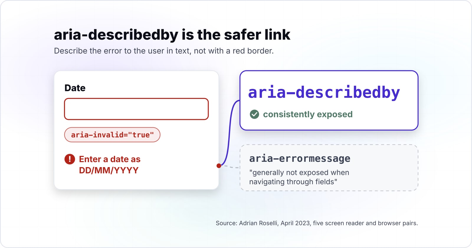
Next comes the link from field to message, and WAI-ARIA 1.2 has two options for it: aria-describedby and aria-errormessage. MDN's aria-errormessage page, updated 12 May 2025, says that attribute only counts once aria-invalid is true. Adrian Roselli tested both in April 2023 across five screen reader and browser pairs. And he found the aria-errormessage text was "generally not exposed when navigating through fields". By contrast, aria-describedby was consistently exposed. So today, aria-describedby is the safer link.
For a long form, also list the errors at the top. The W3C notifications tutorial says each item should name the field, say how to fix it and link to it. It also suggests moving focus to the first field with an error. Finally, a success message that appears without moving focus needs a role, as 4.1.3 Status Messages asks. Then a screen reader can announce it. The ARIA live regions guide covers how.
How do you mark required fields and set autocomplete?#
Use the required attribute and say required in the label text, then add an autocomplete token such as email or postal-code to every personal-data field. The W3C validation tutorial says the required attribute shows "programmatically" that a field is required. It also puts "(required)" in the label text for people who do not use assistive technology.
An asterisk alone is weak, because it is a symbol with no text of its own. Worse, a screen reader may read it as "star". So keep the word in the label, or explain the asterisk once in the form's opening instructions.
Then autocomplete solves a different problem. Criterion 1.3.5 Identify Input Purpose is at Level AA. It asks that the purpose of each field collecting data about the user "can be programmatically determined". For the values, the MDN autocomplete page, updated 27 August 2026, lists each token, such as given-name, email, tel and postal-code.
| Field | autocomplete token |
|---|---|
| First name | given-name |
| Email address | |
| Phone number | tel |
| Postal or ZIP code | postal-code |
And the benefit is wider than compliance. With a token in place, the browser can fill the field from saved data. And that helps anyone with a motor or memory disability. In practice, it also cuts typing for everyone on a phone.
What did WCAG 2.2 add for forms?#
WCAG 2.2 added 3.3.7 Redundant Entry at Level A and 3.3.8 Accessible Authentication (Minimum) at Level AA, and both target multi-step forms and logins. The W3C overview of what is new counts 9 new criteria since WCAG 2.1. Of those, these two touch accessible forms most directly.
First, Redundant Entry covers a process with more than one step. It asks that "Information previously entered by or provided to the user" is filled in again or offered for selection. On the Understanding page, the W3C gives a familiar fix, a checkbox for "my billing address is the same as my shipping address". It also notes that browser autofill does not count, because the site itself has to supply the stored answer.
Then Accessible Authentication says a login step cannot require a "cognitive function test", such as remembering a password, unless that step offers an alternative or a mechanism to help. Also, the criterion names two such mechanisms: support for password managers, and copy and paste. So never block paste on a password or code field.
One older rule matters here too. Criterion 3.3.4 Error Prevention covers forms with legal or financial effect. So those forms must be reversible, checked, or confirmed before the final submit.
Which specifications should a form be built from?#
Build from four references in order: the WAI forms tutorial, the HTML autofill and validation rules, WAI-ARIA 1.2 for states, and WCAG 2.2 to check. Since each one answers a different question, reading them in order turns each design choice into a lookup.
W3C WAI forms tutorial
The structure, from labels and groups to instructions and notifications.
WHATWG HTML form controls
The autofill tokens, the required attribute and constraint validation with checkValidity.
MDN autocomplete reference
The exact token for each kind of personal data.
WAI-ARIA 1.2, W3C, 6 June 2023
What aria-describedby, aria-invalid and aria-errormessage mean.
WCAG 2.2
The criteria to check the finished form against.
The five references, in order: W3C WAI forms tutorial, WHATWG HTML form controls, MDN autocomplete reference, WAI-ARIA 1.2, W3C, 6 June 2023, WCAG 2.2.
In practice, the HTML and MDN pages are one step, since MDN lists the values the HTML standard defines. Together, they cover every choice the field below makes.
What does one complete accessible field look like in code?#
The smallest complete pattern is an email field with a label, a hint, the required attribute, an autocomplete token, and a script that links an error on submit. It takes five steps, and each one adds one of the four parts.
- Link a label to the input with for and id, and give the input
type="email",requiredandautocomplete="email". - Put the hint in its own element and reference it with aria-describedby.
- Add novalidate to the form and check the field with checkValidity on submit.
- On failure, set aria-invalid to true and add the error's id to aria-describedby.
- Move focus to the field, so the name, hint and error are read together.
<form id="signup" novalidate>
  <label for="email">Email address (required)</label>
  <p id="email-hint">For example, name@example.com</p>
  <input id="email" name="email" type="email" required
         autocomplete="email" aria-describedby="email-hint">
  <p id="email-error" hidden></p>
  <button type="submit">Send receipt</button>
</form>

<script>
  const form = document.getElementById("signup");
  const field = document.getElementById("email");
  const error = document.getElementById("email-error");

  form.addEventListener("submit", (event) => {
    if (field.checkValidity()) {
      field.removeAttribute("aria-invalid");
      field.setAttribute("aria-describedby", "email-hint");
      error.hidden = true;
      return;
    }
    event.preventDefault();
    error.textContent = field.validity.valueMissing
      ? "Enter your email address."
      : "Enter an email address like name@example.com.";
    error.hidden = false;
    field.setAttribute("aria-invalid", "true");
    field.setAttribute("aria-describedby", "email-hint email-error");
    field.focus();
  });
</script>
The same pattern scales to every field in accessible forms of any size. For example, say a twelve-field checkout form had WebAIM's 2026 rate of 33.1% unlabeled inputs. That is about four fields with no name at all. Because each field gets the same four parts, the fix is the same edit repeated.
Every part a screen reader needs is exposed
A screen reader announces:
Email address (required), edit text, required, For example, name@example.com
| Part | Status | Exposed to a screen reader |
|---|---|---|
| Name | Exposed | Email address (required) |
| Description | Exposed | For example, name@example.com |
| State | Exposed | required |
| Error relationship | Not needed yet | Nothing |
How do you test a form before it ships?#
Run an automated rule set such as axe-core first, then complete the form with only a keyboard, then listen to every field with a screen reader. Each check proves something the one before it cannot, so run all three in that order.
First, automated rules find the missing parts. The axe-core rule list from Deque includes label, which ensures "every form element has a label", and autocomplete-valid, which maps to 1.3.5. And it also has form-field-multiple-labels for a field with two label elements. Yet WebAIM's February 2026 report warns that "not all conformance failures can be automatically detected".
Show data table
| Item | Value |
|---|---|
| Low contrast text | 83.9 |
| Missing alternative text for images | 53.1 |
| Missing form input labels | 51 |
| Empty links | 46.3 |
| Empty buttons | 30.6 |
| Missing document language | 13.5 |
Missing form input labels were the third most common failure WebAIM detected on home pages in February 2026.
Next comes the keyboard, so tab through every field, submit with errors, and check that focus lands on the first invalid field. Then fix each error and submit again without touching a mouse.
Finally, use a screen reader. WebAIM ran its screen reader survey from December 2023 to January 2024. JAWS was the primary desktop screen reader for 40.5% of respondents, and NVDA for 37.7%. So test with at least one of them, and with VoiceOver on a phone. While you listen, check for the name, the hint, the state and the error on each field. The accessibility testing guide shows where this pass fits in a full audit.
When is ARIA the wrong tool for a form?#
ARIA is the wrong tool when a native element already does the job, because a div with a role still needs keyboard handling, focus and state that input gives free. A note under 4.1.2 in WCAG 2.2 makes the point, since it says "standard HTML controls already meet this success criterion" when they are used as the HTML standard intends. In other words, a real input already passes that rule.
The data points the same way. In fact, WebAIM's February 2026 report found that ARIA labels and descriptions rose 28% in one year. Home pages that used ARIA averaged 59.1 detected errors, against 42 on pages without it. But WebAIM adds that this "does not necessarily mean that ARIA introduced these errors". Even so, more ARIA did not bring fewer barriers.
So here are three cases where a different tool is better:
| Case | Use instead |
|---|---|
| A custom dropdown | A native select. It brings keyboard use, focus and state for free. |
| A label written only in aria-label | A visible label element, so sighted and voice users see the same name. |
| A required star built with ARIA | The required attribute and the word "required". |
In short, reach for ARIA only to describe a link or a state that HTML cannot express. The error link in the code above is that case.
Where to go next for ARIA, live regions and testing#
For custom controls read the ARIA roles guide, for announcements read the live regions post, and for the full audit method read the accessibility testing guide. The ARIA roles developer's guide covers the roles and states a custom control must expose under 4.1.2. Then the live regions post explains how status messages get announced without moving focus. Meanwhile, the testing tools roundup compares the scanners that run the automated form rules.
If a team wants help, two pages describe it. The WCAG and ADA compliance work covers bringing forms and sites to WCAG 2.2 AA. Then the accessibility testing service covers audits with assistive technology before release.
But neither is needed to build accessible forms. The W3C tutorial and the field above are enough on their own.