focus vs focus-visible in CSS: the rules, the ring, and :focus-within
The ring that flashes on every click and the ring that vanishes for keyboard users have one cause. The browser already decides when focus should show, and the right selector lets you follow that choice.
Focus vs focus-visible in CSS: what is the actual difference?#
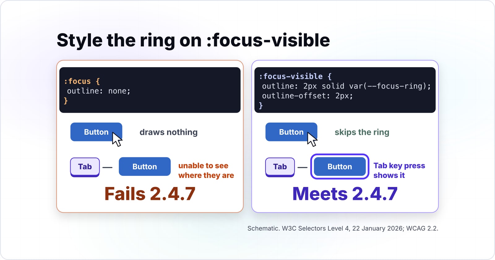
:focus matches every focused element, while :focus-visible matches only when the browser decides a focus indicator would help, so a mouse click on a button skips the ring.
The W3C Selectors Level 4 draft of 22 January 2026 says it plainly. While :focus always matches, "UAs only sometimes visibly indicate focus" and use heuristics to show it when it helps. In CSS focus vs focus-visible terms, the second matches the same element in those moments only. As a result, you change how the ring looks without changing when it appears. That is the whole difference between focus and focus-visible.
| Pseudo-class | When it matches | A mouse click on a button |
|---|---|---|
| :focus | Every focused element | Matches |
| :focus-visible | Only when the browser decides a focus indicator would help | Skips the ring |
What does getting the focus ring wrong cost a product?#
A ring styled on :focus flashes after every mouse click, and removing it to stop the flash leaves keyboard users unable to see where they are.
The second outcome is the expensive one. WCAG 2.2 success criterion 2.4.7, Focus Visible, is Level AA. The rule is one line on W3C's Understanding page. "Any keyboard operable user interface has a mode of operation where the keyboard focus indicator is visible." So a stylesheet that removes the outline on :focus fails a criterion that audits test.
In practice, the fix for a cosmetic complaint blocks people who move by keyboard. So the selector decides whether they can finish a task at all.
When does a browser decide focus should be visible?#
Browsers show focus for keyboard navigation, for any control that takes typed text, and for script focus that follows a visible focus, and they hide it after a pointer click.
The rules come from the non-normative list in W3C's Selectors Level 4 draft of 22 January 2026. First, a user preference to always see focus wins over everything. Second, an element that takes keyboard input, such as a text field, shows focus even after a click. Then a pointer click on a button does not show it. If focus showed and a script moves it, the draft says to "indicate focus on the newly focused element".
| Event | :focus | :focus-visible | :focus-within on the parent | :active |
|---|---|---|---|---|
| Tab key | Matches | Matches | Matches | No |
| Mouse click on a button | Matches | No | Matches | During the press |
| Mouse click into a text input | Matches | Matches | Matches | During the press |
| Script focus after a visible focus | Matches | Matches | Matches | No |
| Script focus after a hidden focus | Matches | No | Matches | No |
| A dialog button that gains focus on open | Matches | Matches | Matches | No |
The MDN :focus-visible page, updated 10 September 2026, shows the split in a demo. Click a button styled on :focus and the ring appears, but the same click on :focus-visible draws nothing. Also, the draft asks browsers to "use :focus-visible to specify the default focus style". So you need not disable a default :focus ring.
What does :focus-within match, and how is it different from :focus?#
:focus-within matches an element when it or any descendant has focus, so a form group or a menu can restyle itself while focus sits on a child control.
It exists because of one rule in Selectors Level 4: "the :focus pseudo-class must not automatically propagate to the parent element". So a fieldset never matches :focus when its input does. That is the whole answer to CSS focus vs focus-within. In short, :focus sits on the focused element, and :focus-within sits on it and on every ancestor.
For example, the MDN :focus-within page, updated 10 September 2026, colours a whole form when its input takes focus. The same pattern lights up a card or a dropdown menu while you move through its items. However, :focus-within ignores how focus arrived. A mouse click into a field lights the group just as a Tab key does.
Show data table
| Item | Value |
|---|---|
| Chrome | 60 |
| Edge | 79 |
| Firefox | 52 |
| Safari | 10.1 |
:focus-within shipped in Chrome 60, Edge 79, Firefox 52 and Safari 10.1.
Should a form group use :focus-within or :has(:focus-visible)?#
:focus-within reacts to any focus inside the group, mouse clicks included, while :has(:focus-visible) reacts only when the focused child shows a ring.
No :focus-visible-within selector exists. A CSS Working Group issue, number 3080, asks "Do we need :focus-visible-within" and is still open. Meanwhile, :has(:focus-visible) does the job today. It matches the group only when a child matches :focus-visible, so a click on a button leaves the group plain.
That choice has a cost. The MDN :has() page, updated 11 August 2026, warns that browsers "must re-evaluate :has() selectors when the DOM changes". So anchor it to a small container class, never to body or :root. Use :focus-within when any focus should light the group, and :has(:focus-visible) when only keyboard focus should.
Show data table
| Item | Value |
|---|---|
| Chrome | 105 |
| Edge | 105 |
| Firefox | 121 |
| Safari | 15.4 |
:has() shipped in Chrome 105, Edge 105, Firefox 121 and Safari 15.4.
How is :focus different from :active in CSS?#
:active applies only while a pointer is held down or a link is being triggered, while :focus stays on the element after release until focus moves elsewhere.
W3C's Selectors Level 4 times :active "between the time the user presses the primary mouse button and releases it". By contrast, :focus applies while the element "accepts keyboard or other forms of input". So in the focus vs active CSS question, a clicked button matches both during the press, and then only :focus.
Because a style on :active vanishes on release, it cannot mark a selected item. So use :active for a pressed look, and :focus-visible for a ring.
Press the primary mouse button on a button.
:active matches between the time the user presses the primary mouse button and releases it, and :focus matches too.
Release it.
:active stops matching, and :focus stays on the button.
Click elsewhere.
Focus moves to another element, so :focus leaves the button as well.
Which references should the focus styles be built from?#
Build from MDN's :focus-visible page first, then its :focus-within page, then its :has() page for the keyboard-only group variant.
- :focus-visible on MDN: the global ring rule and the outline-offset example.
- :focus-within on MDN: the container rule for a form group.
- :has() on MDN: the keyboard-only group variant and its performance notes.
Then keep the Selectors Level 4 draft open, since it defines every rule the three pages use.
What is the smallest focus ring CSS that works in every engine?#
Style :focus-visible with a solid outline and an offset, never remove the outline on :focus, and add a :focus-within rule for groups that should light up.
/* Step 1 and 2: one ring colour, one ring rule for every control */
:root {
  --focus-ring: #1d4ed8;
}

:focus-visible {
  outline: 2px solid var(--focus-ring);
  outline-offset: 2px;
}

/* Step 3: a form group that lights up while any field inside has focus */
.field-group:focus-within {
  background-color: #eef2ff;
}

/* Step 4: a menu that lights up only when its focused item shows a ring */
.menu:has(:focus-visible) {
  outline: 2px solid var(--focus-ring);
}
This focus-visible CSS runs as written, with no build step. Note what it leaves out: no :focus rule and no outline set to none. Since the browser already draws its default ring with :focus-visible, a rule on :focus only brings the click flash back.
How large does a focus ring have to be under WCAG 2.2?#
W3C's WCAG 2.2 Focus Appearance guidance, accessed October 2026, sets a minimum area of a 2 CSS pixel perimeter, which is 480 square pixels on a 90 by 30 button.
That criterion, 2.4.13, is Level AAA, so it is a target rather than an audit floor. The Understanding page gives the area for a rectangle as 4h + 4w. It also asks for a 3:1 contrast change in those pixels. So the ring grows with the control, and a thin line can fail on a wide input.
Show data table
| Item | Value |
|---|---|
| 90 by 30 button (W3C example) | 480 |
| 120 by 40 button | 640 |
| 200 by 48 button | 992 |
| 320 by 48 text input | 1,472 |
The minimum area grows with the control, so a wide input needs more ring than a small button.
Here is a worked example on that button. A 2px outline drawn flush outside it covers 94 by 34 minus 90 by 30. That illustrative total is 496 square pixels, so it passes. But a 1px outline covers 92 by 32 minus 90 by 30. That illustrative total is 244 square pixels, so it fails.
Does your outline cover the WCAG 2.2 minimum area?
Enter a control's width and height and the outline width to compare the area a solid outline covers with the 4h + 4w minimum.
Outline area minus the minimum (zero or more passes)
16
- W3C minimum area, 4h + 4w (square CSS px)
- 480
- Area the outline covers (square CSS px)
- 496
Defaults: W3C's 90 by 30 button with a 2px outline, from Understanding SC 2.4.13, WCAG 2.2. Modelled, not measured.
Also check criterion 2.4.11, which is Level AA. The Focus Not Obscured page requires that the focused component "is not entirely hidden due to author-created content". A sticky header is the usual culprit.
Is :focus-visible safe to use without a fallback?#
Can I use, accessed October 2026, lists :focus-visible support from Chrome 86, Firefox 85 and Safari 15.4, so the selector needs no fallback today.
The release notes agree. Chrome 86 shipped it in October 2020, then Firefox 85 in January 2021 and Safari 15.4 in March 2022. So :focus-visible is now a native feature in every engine, not a polyfill.
Show data table
| Item | Value |
|---|---|
| Chrome | 86 |
| Edge | 86 |
| Firefox | 85 |
| Safari | 15.4 |
:focus-visible shipped in Chrome 86, Edge 86, Firefox 85 and Safari 15.4.
That retires an old pattern, since the Chrome 86 notes paired a :focus rule with :focus:not(:focus-visible) to undo the ring. Today that pair adds selectors and no benefit, so delete it.
When is :focus-visible the wrong tool?#
:focus-visible is the wrong tool for a container, for a state that must persist after a click, and for styling that must follow every focus, where :focus-within, a class or :focus fits.
First, a container never matches :focus-visible itself, so a form group needs :focus-within or :has(:focus-visible). Second, a selected tab must stay marked after the click. Only a class or an ARIA state such as aria-selected does that. Finally, some styling should follow every focus, such as hint text in a search field. Use :focus there, since a hint that hides on click fails the person who clicked. But keep the ring itself on :focus-visible.
| Case | Why :focus-visible misses | What fits instead |
|---|---|---|
| A container such as a form group | A container never matches :focus-visible itself | :focus-within or :has(:focus-visible) |
| A selected tab | It must stay marked after the click | A class or an ARIA state such as aria-selected |
| Hint text in a search field | It should follow every focus, a click included | :focus |
Where does focus work go after the ring is right?#
A correct ring is one half of keyboard access, and the other half is where focus moves, which the keyboard navigation guide covers next.
The keyboard navigation and focus management guide covers tab order, focus traps and focus after a route change. Then the colour contrast guide explains the 3:1 contrast a ring needs. And the accessible forms guide builds the fields a focus group wraps. For a full audit, see WCAG and ADA compliance work. For focus tokens shared across a product, see design systems. Still, the spec and the three MDN pages are enough on their own.