Color contrast accessibility under WCAG 2.2 and the ADA: ratios, checks and dark mode
A color never passes or fails on its own. The same gray can read clearly on white and drop below the line on a dark screen, so the thing you test is always the pair and the surface it sits on.
What does color contrast accessibility require under WCAG 2.2?#
Color contrast accessibility means every text and interface color pair meets a WCAG ratio: 4.5:1 for body text, 3:1 for large text and 3:1 for controls. The WCAG 2.2 Recommendation, published by the W3C on 12 December 2024, sets those Level AA lines and a stricter 7:1 for body text at Level AAA.
Show data table
| Item | Value |
|---|---|
| 1.4.3 body text (AA) | 4.5 |
| 1.4.3 large-scale text (AA) | 3 |
| 1.4.11 UI components and graphics (AA) | 3 |
| 1.4.6 body text (AAA) | 7 |
| 1.4.6 large-scale text (AAA) | 4.5 |
Body text needs 4.5:1 at Level AA and 7:1 at Level AAA, while large text and interface parts need 3:1 at AA.
The word that matters is pair. Because a ratio compares a foreground with the background behind it, no single brand color can be called accessible. For example, a gray can pass on white and fail on a tinted card in the same layout. Therefore, the useful unit of work is the list of real pairs your interface draws.
Why does low contrast text still fail most websites?#
Low contrast text appeared on 83.9% of the top million home pages in 2026, the most common failure the WebAIM Million detected, up from 79.1% in 2025. WebAIM's 2026 report also counted 34 distinct low contrast instances per home page on average, up 15% from 2025.
Show data table
| Stage | Value |
|---|---|
| 2019 | 85.3 |
| 2020 | 86.3 |
| 2021 | 86.4 |
| 2022 | 83.9 |
| 2023 | 83.6 |
| 2024 | 81 |
| 2025 | 79.1 |
| 2026 | 83.9 |
Low contrast text fell from 86.4% of home pages in 2021 to 79.1% in 2025, then rose again to 83.9% in 2026.
But those 34 instances rarely mean 34 separate choices. In practice, they trace back to a handful of color tokens bound in the design file, such as a muted text gray or a placeholder color, reused across every page. As a result, fixing the token clears the failure everywhere at once. So contrast is the cheapest large win in an accessibility backlog. One change in the design system, and every scan and audit reports less.
How is a contrast ratio calculated from two colors?#
A contrast ratio divides the lighter color's relative luminance plus 0.05 by the darker color's plus 0.05, so #767676 on white passes at 4.54:1. The WCAG 2.2 definition writes it as (L1 + 0.05) / (L2 + 0.05), where L1 belongs to the lighter color.
- L1
- is the relative luminance of the lighter color.
- L2
- is the relative luminance of the darker color.
Show data table
| Item | Value |
|---|---|
| Gray 595959 | 7 |
| Gray 767676 | 4.54 |
| Gray 777777 | 4.47 |
| Gray 949494 | 3.03 |
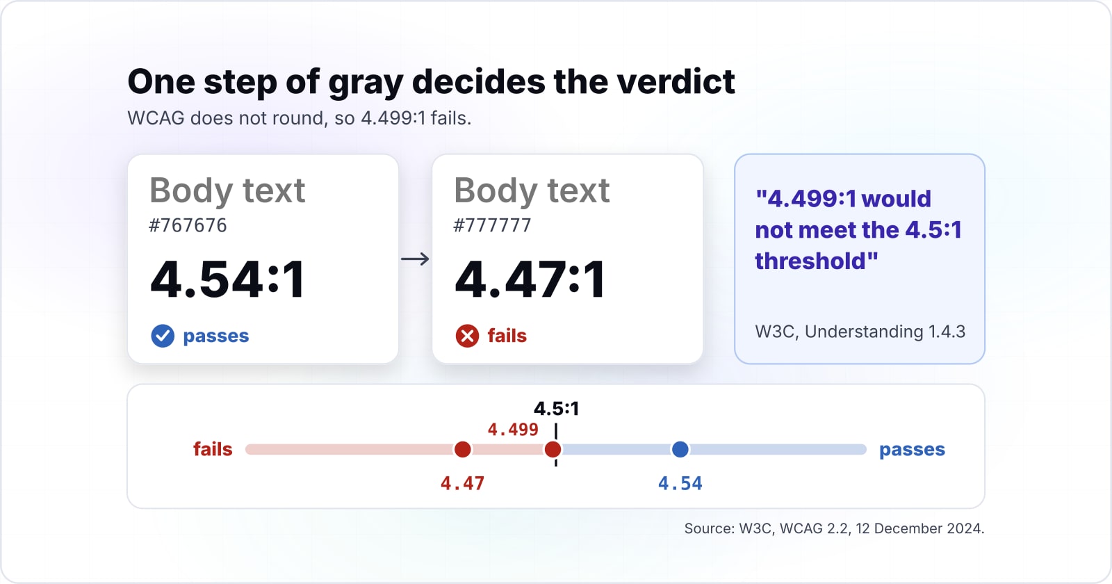
#767676 passes 4.5:1 on white at 4.54:1, and one step lighter, #777777 fails at 4.47:1.
Relative luminance comes first. In the WCAG 2.2 definition, each sRGB channel is divided by 12.92 when it is at or below 0.04045, and otherwise raised to the power 2.4. Then red, green and blue are weighted by 0.2126, 0.7152 and 0.0722, so green counts for most of the result.
One step of gray then decides the verdict. For example, #767676 measures 4.54:1 on white and passes, while #777777 measures 4.47:1 and fails. Also, the W3C's Understanding 1.4.3 page is blunt that "4.499:1 would not meet the 4.5:1 threshold". So a checker that rounds to one decimal can show 4.5 for a pair that fails.
Which WCAG success criteria cover color: 1.4.3, 1.4.6, 1.4.11 and 1.4.1?#
Four WCAG 2.2 success criteria govern color: 1.4.3 and 1.4.11 at Level AA, 1.4.6 at Level AAA, and 1.4.1 Use of Color at Level A. Since each one binds a different kind of element, the first job is sorting your screen into them.
- 1.4.3 Contrast (Minimum), AA. Text needs 4.5:1, and large text needs 3:1. The WCAG 2.2 text defines large as at least 18 point, or 14 point bold. Deque's axe rule page translates that to 24 CSS pixels, or 19 CSS pixels bold.
- 1.4.6 Contrast (Enhanced), AAA. Text needs 7:1, and large text 4.5:1. The W3C's Understanding 1.4.6 explains that 7:1 is the contrast a person with about 20/80 vision would need.
- 1.4.11 Non-text Contrast, AA. Input borders, focus rings, icons and chart marks that carry meaning "must have a minimum 3:1 contrast ratio with the adjacent colors", in the words of the W3C's Understanding 1.4.11 page.
- 1.4.1 Use of Color, A. Color can never be the only way information is shown. But this one is not a ratio at all.
Two kinds of text are exempt. WCAG 2.2 exempts logotypes, meaning text that is part of a logo or brand name. It also exempts incidental text, such as the label of an inactive control, pure decoration or text inside a busy photo. However, an active control's label is never incidental, so it always needs its ratio.
| Success criterion | Level | What it covers | Minimum |
|---|---|---|---|
| 1.4.3 Contrast (Minimum) | AA | Text | 4.5:1, large text 3:1 |
| 1.4.6 Contrast (Enhanced) | AAA | Text | 7:1, large text 4.5:1 |
| 1.4.11 Non-text Contrast | AA | Input borders, focus rings, icons and chart marks | 3:1 with the adjacent colors |
| 1.4.1 Use of Color | A | Any information shown by color | No ratio: color is never the only cue |
What does ADA color contrast compliance require?#
The ADA prints no contrast ratio of its own; its Title II web rule adopts WCAG 2.1 Level AA, which carries the same 4.5:1 and 3:1 thresholds as WCAG 2.2. This section restates the Department of Justice's published pages and is not legal advice.
For state and local governments, the Department of Justice's web rule page says their "web content usually needs to meet WCAG 2.1, Level AA". The Department's interim final rule of April 20, 2026 set April 26, 2027 for entities with a total population of 50,000 or more. Meanwhile, that same April 2026 rule set April 26, 2028 for smaller entities and special district governments.
Businesses open to the public fall under Title III. However, Title III has no technical standard in regulation. Even so, the Department's web guidance, dated 18 March 2022, lists poor color contrast as a barrier. It says "People with limited vision or color blindness cannot read text if there is not enough contrast". In practice, the same guidance points businesses to existing technical standards and names WCAG first. So to check whether colors are ADA compliant, check them against WCAG AA. For which WCAG version applies to you, see the WCAG guidelines comparison. For what a failing site can lead to, see the consequences of an inaccessible website.
- 18 March 2022
Title III web guidance names poor color contrast
The Department of Justice lists poor color contrast as a barrier and points businesses to existing technical standards, naming WCAG first.
- April 20, 2026
Interim final rule sets the Title II dates
State and local government web content usually needs to meet WCAG 2.1, Level AA, by a date that depends on size.
- April 26, 2027
Entities of 50,000 or more comply
State and local governments with a total population of 50,000 or more.
- April 26, 2028
Smaller entities and special districts comply
Smaller entities and special district governments, under that same April 2026 rule.
Does a passing contrast ratio make a site work for color blind users?#
No; WCAG 1.4.1 requires a second cue besides color, such as text, an icon or an underline, because a contrast ratio cannot tell red from green. The W3C's Understanding 1.4.1 states the rule plainly: "Color is not used as the only visual means of conveying information".
Here is the trap. Say a red error border and a green success border can each pass 3:1 against white. Yet to someone with a red and green deficiency, the two can still look the same. According to Section508.gov's guide to color usage, about 1 in 12 men and 1 in 200 women experience color blindness.
So ADA compliance for color blind users rests on two rules, not one. First, the pair must pass its ratio. Second, every state, link and chart series needs a cue that survives without color. For example, add an icon and the word "Error" to the red border. Also keep underlines on links inside body text, and give each chart line a label or a marker shape.
1 in 12
Men
1 in 200
Women
A color pair that passes its ratio can still carry no meaning for about 1 in 12 men, so every colored state needs a second cue.
| Option | share of people who experience color blindness |
|---|---|
| Men | 1 in 12 |
| Women | 1 in 200 |
Source: Section508.gov, guide to making color usage accessible
How does WCAG apply to dark mode?#
WCAG has no separate dark mode rule, so every pair is measured again on the dark surface: #6B7280 passes on white at 4.83:1 and fails on #121212 at 3.87:1. Instead, the same 4.5:1 and 3:1 lines apply to whatever surface the text sits on in normal use.
| Text color | Ratio on white #FFFFFF | Ratio on dark #121212 |
|---|---|---|
| gray #6B7280 | 4.83 | 3.87 |
| blue #2563EB | 5.16 | 3.62 |
| light gray #9CA3AF | 2.53 | 7.37 |
| white #FFFFFF text | 1.0 | 18.73 |
A theme switch changes every pair, so a token set is checked once per theme. For instance, a link blue like #2563EB drops from 5.16:1 on white to 3.62:1 on a dark surface. Meanwhile, a light gray like #9CA3AF rises from 2.53:1 to 7.37:1. In short, the token that fails in one theme is often the right one for the other.
4.83:1 on light #FFFFFF
PassBody text needs 4.5:1
- Body text at 4.5:1Pass
- Large text at 3:1Pass
#6B7280 passes body text here but fails on dark #121212 at 3.87:1, so this token flips between themes.
Computed from the WCAG 2.2 relative luminance and contrast ratio definitions. The ratio is cut to two decimals, never rounded up.
Browsers tell your CSS which theme someone asked for. The MDN page for prefers-color-scheme says the feature detects "if a user has requested light or dark color themes". Its sibling, prefers-contrast, lets you serve a stronger palette when more contrast is requested. So each palette you ship is one more set of pairs to measure.
How do you check color contrast for accessibility?#
Check single pairs in the WebAIM Contrast Checker, inspect rendered text in Chrome DevTools, then scan whole pages with axe-core and review what it marks incomplete. Because each tool measures a different population, use them in this order:
- WebAIM's contrast guide and checker. Take the AA and AAA verdicts for normal text, large text and graphics. The WebAIM Contrast Checker also offers a Lightness slider, which makes it the right tool for testing a token pair before it ships.
- Chrome DevTools contrast tools. Take the contrast ratio of one rendered element. Google's guide shows the Color Picker's Contrast ratio section, where a Use suggested color button applies a text color that passes.
- The axe-core color-contrast rule. Take a scan of every text node on a page against 4.5:1 and 3:1. Then read the incomplete results by eye.
- MDN prefers-color-scheme. Take the dark theme, forced on, and run steps 2 and 3 again.
Any accessibility checker for colour works the same way underneath, since each one applies the WCAG formula. What differs is the population. First, the WebAIM checker sees two colors you type in. Then DevTools sees one element as rendered. Finally, axe-core sees the whole page but cannot judge every background. For the wider set of tools, see the guide to web accessibility testing tools.
What is the smallest code that checks a contrast ratio?#
A short JavaScript function reproduces the WCAG formula exactly, so a test can fail whenever a token pair drops below 4.5:1 in either theme. Also, each constant below comes from the relative luminance definition in WCAG 2.2.
// Step 1: turn one hex channel into a linear sRGB value
const channel = (v) => {
  const c = v / 255;
  return c <= 0.04045 ? c / 12.92 : ((c + 0.055) / 1.055) ** 2.4;
};

// Step 2: weight red, green and blue into relative luminance
const luminance = (hex) => {
  const [r, g, b] = [1, 3, 5].map((i) => channel(parseInt(hex.slice(i, i + 2), 16)));
  return 0.2126 * r + 0.7152 * g + 0.0722 * b;
};

// Step 3: the contrast ratio, lighter color over darker color
const contrast = (a, b) => {
  const [hi, lo] = [luminance(a), luminance(b)].sort((x, y) => y - x);
  return (hi + 0.05) / (lo + 0.05);
};

// Step 4: compare the unrounded ratio with 4.5 on every theme surface
const surfaces = { light: "#FFFFFF", dark: "#121212" };
for (const [theme, surface] of Object.entries(surfaces)) {
  const ratio = contrast("#6B7280", surface);
  console.log(theme, Math.floor(ratio * 100) / 100, ratio >= 4.5 ? "pass" : "fail");
}
Run it with Node and it prints "light 4.83 pass" and "dark 3.87 fail", the same pair as the dark mode table. Step 4 compares the raw ratio, never a rounded one, because WCAG counts 4.499:1 as a fail. Then swap the single color for your full token list and throw on any fail, so the build stops before a weak pair reaches production.
How do you fix a failing color pair without losing the brand color?#
Keep the hue and move the lightness: darken the text or lighten the surface until the pair clears its threshold, and keep the brand color for large text and fills. WebAIM's contrast guide notes that changing a color's lightness changes its contrast ratio with another color.
4.47:1
#777777 on white, fails
4.54:1
#767676 on white, passes
#777777 fails body text at 4.47:1 and #767676 passes at 4.54:1, so the fix is often one step of lightness.
| Option | contrast ratio against white |
|---|---|
| #777777 on white, fails | 4.47:1 |
| #767676 on white, passes | 4.54:1 |
Source: computed from the W3C WCAG 2.2 contrast ratio definition, 12 December 2024
The shift needed is often small. As the gray chart shows, one step from #777777 to #767676 moves a pair from a fail to a pass on white. So start with the smallest change in lightness, and keep the hue and saturation where the brand set them.
Then use the brand color where the rules allow it. Large text needs only 3:1 under WCAG 2.2, so a brand blue that fails as body text can often work as a heading. Also, logotypes are exempt, so the logo keeps its exact color. When you are stuck on one element, Chrome DevTools offers a suggested color that passes. For the design-stage side of these choices, see WCAG for UI and UX design.
When is a contrast checker the wrong tool?#
A ratio checker is the wrong tool for text over photos, gradients and pseudo-element backgrounds, which axe-core marks incomplete and a person must judge by eye. Deque's rule page lists CSS background gradients, pseudo-element backgrounds and overlapping elements among the cases it cannot settle. Then it adds that "Elements found to have a 1:1 ratio are considered" incomplete and need a manual review.
So a clean scan over a hero image is not a pass; it is silence. Here is what settles each case instead:
- Text over a photo. Sample the worst region with the DevTools eyedropper, or add a solid scrim and measure against that.
- Text over a gradient. Measure the pair at the lightest and the darkest point the text crosses.
- Focus rings and states. Read them as 1.4.11 pairs against their neighbours. The post on focus versus focus-visible in CSS covers styling them.
| Case | What settles it |
|---|---|
| Text over a photo | Sample the worst region with the DevTools eyedropper, or add a solid scrim and measure against that |
| Text over a gradient | Measure the pair at the lightest and the darkest point the text crosses |
| Pseudo-element backgrounds and overlapping elements | axe-core marks them incomplete; a person must judge by eye |
| Focus rings and states | Read them as 1.4.11 pairs against their neighbours |
Where should a contrast fix start?#
For the version question, read the WCAG guidelines comparison. For the tools around a contrast check, read the testing tools guide. If a team wants its pages audited against WCAG 2.2 AA, that is the work of accessibility testing. If it wants contrast-safe tokens for both themes built in, that sits with design systems. Still, the W3C pages linked above are enough to do all of it yourself.