Component-Driven Development: Storybook with Vite and Pico CSS
A component that looks fine on its page can still break in the empty, loading and error states nobody opens. A workshop that renders each state on its own, and tests it on every change, is how a team stops shipping those bugs.
What is Storybook, and how does it work with Vite?#
Storybook is a frontend workshop for building UI components in isolation, and Vite is the builder it runs on, so the two are layers of one setup rather than rivals. Storybook's own docs say it plainly: "Storybook is a frontend workshop for building UI components and pages in isolation." Each story is one state of one component, rendered with no app around it.
Then something has to compile those stories, and that job belongs to a builder. The Storybook Vite builder page says of Vite: "It is the default builder for Storybook and is recommended in most cases." In short, Storybook decides what to show, and Vite turns your source into code a browser can run. So what is Storybook in React? It is the same workshop, wired to React through the @storybook/react-vite framework.
Is it Storybook vs Vite, or Storybook on Vite?#
Comparing Storybook with Vite compares a workshop with a bundler: Vite serves and builds code, while Storybook decides what to render and lets you inspect each state. The Vite guide describes two parts: a dev server with fast Hot Module Replacement (HMR), and a build command for production. Therefore Storybook sits on top of both, and a search for Vite vs Storybook has no winner, because one runs on the other.
Because the builder is Vite, your project's own config keeps working. The Storybook Vite builder docs say its defaults "are merged alongside your existing configuration file". They recommend putting settings in vite.config.ts. However, a change only Storybook needs goes in viteFinal, a function in .storybook/main.ts. It takes the default config and returns the updated one. As a result, aliases and plugins live in one place.
| Storybook | Vite | |
|---|---|---|
| Job | Decides what to render and lets you inspect each state | Serves and builds code |
| Parts | Stories, one state of one component each | A dev server with fast HMR, and a build command for production |
| Config | .storybook/main.ts, with viteFinal for a change only Storybook needs | vite.config.ts, merged into Storybook's defaults |
Why build components in isolation at all?#
In a worked example, a component with five view states and three variants hides most of its states on any one page, and a story per state makes each one visible. For example, say a notifications panel has three variants, five view states and a disabled flag. The states are default, empty, loading, error and overflow. That is 3 x 5 x 2, or 30 combinations of args, in this illustrative case.
A real page shows one of them at a time, usually the default. The empty state appears only for a new account. Meanwhile, the error state appears only when an API fails, so it is rarely seen before a customer sees it. Instead, one story per view state gives five stories, and each one runs as a check on every change.
The overflow state is where bugs hide. In this illustrative case, with 12 sample rows, a panel built to show 6 renders 6 and clips 6. A story makes that clip visible, and a test can count the rows. In practice, that is the outcome a team lead reports upward. Fewer state bugs reach code review, because each state has a story.
Notifications
6 unread- Build finished on the main branch
- A reviewer approved your pull request
- Storybook build passed on the Vite builder
- Pico CSS loaded once in preview.ts
- A story was added to Button
- Preview deploy is live
- … and 6 more the panel has to clip
More rows than the panel was built to show. This is where bugs hide.
Button.stories.ts
export const Overflow: Story = {
  args: {
    variant: 'primary',
    disabled: false,
    label: 'Mark all read',
    view: 'overflow',
  },
};- Arg combinations
- 30
- Stories, one per view state
- 5
- Rows shown and clipped
- 6 shown, 6 clipped
Preview showing the overflow state with a primary button labelled Mark all read.
How do you set up Storybook with Vite and Pico CSS?#
Storybook's install docs, read 8 October 2026, list Node.js 20, npm 10, Vite 5 and Vitest 3 as minimum versions before the installer sets up the Vite builder. First, run npm create storybook@latest in the root of a Vite project. The installer detects React and Vite, then adds the @storybook/react-vite framework. Storybook's React and Vite framework page, read 8 October 2026, asks for React 16.8 and Vite 5 or newer.
| Item | minimum supported major version |
|---|---|
| Node.js | 20 |
| npm | 10 |
| Vite | 5 |
| Vitest | 3 |
| TypeScript | 4.9 |
| Webpack | 5 |
Second, add the stylesheet with npm install @picocss/pico, as the Pico CSS docs show. Then import the classless build once in .storybook/preview.ts. A classless stylesheet styles plain HTML elements such as button, input and table, so a component needs no extra class names. Finally, run npm run storybook, and every story renders with Pico CSS.
What does the smallest working story look like?#
A Component Story Format file needs only a default export naming the component and one named export per state, with args carrying the props. The CSF reference says a story file "consists of a required default export and one or more named exports." Args are the props a story passes in. Three files make a working setup:
// Step 1: .storybook/main.ts names the Vite framework
import type { StorybookConfig } from '@storybook/react-vite';

const config: StorybookConfig = {
  stories: ['../src/**/*.stories.@(js|jsx|mjs|ts|tsx)'],
  framework: '@storybook/react-vite',
};
export default config;

// Step 2: .storybook/preview.ts loads Pico CSS once for every story
import '@picocss/pico/css/pico.classless.min.css';

// Step 3: src/Button.stories.ts, one named export per state
import type { Meta, StoryObj } from '@storybook/react-vite';
import { fn, expect } from 'storybook/test';
import { Button } from './Button';

const meta = {
  component: Button,
  args: { label: 'Save', onClick: fn() },
} satisfies Meta<typeof Button>;
export default meta;
type Story = StoryObj<typeof meta>;

export const Default: Story = {};
export const Disabled: Story = { args: { disabled: true } };
export const Clicked: Story = {
  play: async ({ args, canvas, userEvent }) => {
    await userEvent.click(canvas.getByRole('button', { name: 'Save' }));
    await expect(args.onClick).toHaveBeenCalled();
  },
};
Each named export becomes one entry in the Storybook sidebar. Also, the last story already carries a test, which the next section explains.
How do you test components in Storybook?#
Storybook's Vitest addon docs, read 8 October 2026, list Vitest 3.0 as the minimum version for an addon that turns every story into a component test in a real browser. The addon docs say "it transforms your stories into component tests". Add it with npx storybook add @storybook/addon-vitest, and it sets up browser mode with Playwright's Chromium browser.
| Item | minimum supported version |
|---|---|
| Vitest | 3.0 |
| MSW (optional) | 2.0 |
| Next.js | 14.1 |
There are two layers. First, every story is a render test: if a state throws, the test fails. Second, a play function drives the story the way a person would. The interaction testing docs use canvas to find elements and userEvent to click and type. Then expect from storybook/test asserts. For example, the Clicked story clicks the button and checks the spy was called.
Since a story is also the test, the five panel states become five tests for free. Also, the visual testing docs cover snapshots of how each story looks.
What does the Pico CSS archive mean for a project using it?#
Pico CSS's owner archived its repositories on 4 October 2026, so v2.1.1 is the final release and the stylesheet keeps working but gets no fixes. The Pico CSS README on GitHub says "The repositories are archived. No new issues, PRs or releases." It also says npm, the jsDelivr CDN and picocss.com stay online, and the code stays MIT licensed.
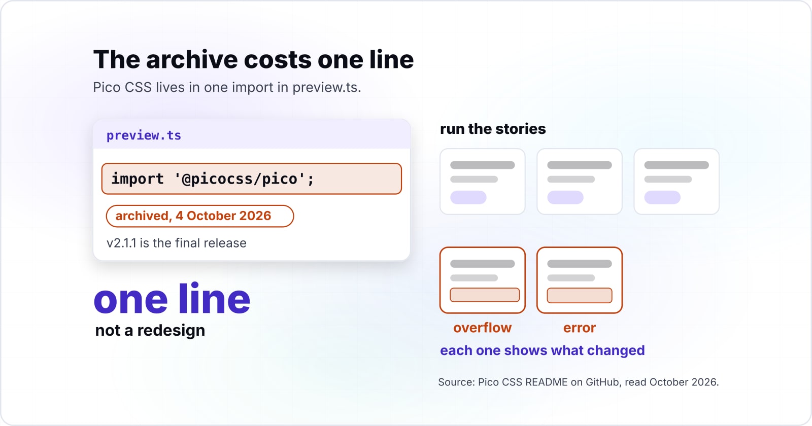
Because Pico CSS lives in one import in preview.ts, the archive costs one line, not a redesign. There are two sound choices. First, keep it as a frozen dependency and pin @picocss/pico at 2.1.1, the final release before the October 2026 archive, since nothing breaks. Second, swap that import for another stylesheet or a fork, and weigh two common replacements with the same page built in Tailwind CSS and Bootstrap. Then run the stories, and each one shows what changed. In particular, watch the overflow and error states. A page rarely shows them, and a stylesheet swap tends to break them.
What is the latest stable Storybook version in October 2026?#
Storybook's GitHub releases page lists v10.6.1, released 29 September 2026, as the latest stable version, following v10.6.0 on 2 September 2026. Therefore pin that version, and run npx storybook@latest upgrade when the next one ships. In October 2026, Storybook's releases page also lists v11.0.0 alpha builds, which are previews and not for production.
- 2 September 2026
v10.6.0
The stable release before the current one.
- 29 September 2026
v10.6.1
The latest stable version on Storybook's GitHub releases page.
- October 2026
v11.0.0 alpha builds
Previews, and not for production.
Also, the Storybook app needs a recent browser. Storybook's install docs, read 8 October 2026, set a browser floor for the app. That matters when someone opens a published React Storybook on an older laptop.
Show data table
| Item | Value |
|---|---|
| Chrome | 131 |
| Edge | 134 |
| Firefox | 136 |
| Safari | 18.3 |
| Opera | 117 |
Each browser vendor numbers its versions on its own scale, so read Safari 18.3 against its label, not its bar length.
Which Storybook, Vite and Pico CSS docs should you build from?#
Build from the official pages in this order: the Storybook install guide, the react-vite framework page, the Vite builder page, the CSF reference and the Vitest addon guide.
- Install Storybook: the create command and the minimum versions.
- Storybook for React with Vite: the
@storybook/react-viteframework package. - Vite builder: how config is merged, and viteFinal.
- Component Story Format: the default export and named stories.
- Vitest addon: stories as component tests.
- Pico CSS classless: the stylesheet, with the archive note in its GitHub README.
Install Storybook
the create command and the minimum versions.
Storybook for React with Vite
the @storybook/react-vite framework package.
Vite builder
how config is merged, and viteFinal.
Component Story Format
the default export and named stories.
Vitest addon
stories as component tests.
Pico CSS classless
the stylesheet, with the archive note in its GitHub README.
When is Storybook the wrong tool?#
Storybook is the wrong tool for a page with a handful of one-off components, where a route in the app itself shows every state at lower cost in setup time. In that case, a few plain Vitest component tests cover the states, because Vitest runs fine without Storybook.
Second, a team with no time to keep stories current should wait. A stale story shows a state the component no longer has. Instead, start with tests for the components that break most often.
Third, check the trade-off on a Webpack app. The Storybook Vite builder docs say Vite starts faster there. However, they add "the disadvantage that your component's execution environment differs from your application." So if a bug only appears in your Webpack build, keep the Webpack builder until the app moves to Vite.
| Case | Use instead |
|---|---|
| A page with a handful of one-off components | A route in the app that shows every state, plus a few plain Vitest component tests |
| A team with no time to keep stories current | Tests for the components that break most often |
| A bug that only appears in your Webpack build | Keep the Webpack builder until the app moves to Vite |
Where to go next#
The next step is the component design itself: how to split a UI into pieces that each deserve a story, and how layout holds at every width. First, read building scalable UI components on cutting a UI into reusable parts. For layout, read CSS Grid and Flexbox together and CSS Grid for complex responsive layouts. Then test each width as a story.
Also, a classless stylesheet rewards the clean markup that building an SEO-friendly frontend needs. Streaming UI states deserve their own stories too, as reactive AI interfaces with Svelte shows. If you want to give back, contributing to open source frontend projects is a good next read.
For a team that wants to hire Storybook developers, the frontend developers and React developers pages describe how we work. However, the official docs above are enough to build all of this yourself.