Scalable UI components: count the API contract, then use enums and slots
Six true or false flags on one Button look harmless. Count what they allow, though, and most of the results are buttons no designer ever drew, which someone still has to test and support.
What makes scalable UI components scalable?#
Scalable UI components keep a small API contract, enums for choices and slots for content, so a new variant adds one value instead of doubling the states. Android publishes Jetpack Compose component API guidelines, read on 9 October 2026. They name the goal: "Scalable long term: the author is able to evolve the API to cause the least amount of friction to users."
Folders, tokens and reuse matter. However, they do not stop a prop list from accepting states no designer drew. Because the contract is the part every caller touches, it is the part that has to grow slowly. Therefore the test for scalable components is a count. How many prop combinations does the component accept, and how many of them mean something?
- n
- the number of boolean flags, or the values one enum holds besides its default
What does a boolean-heavy component cost a growing design system?#
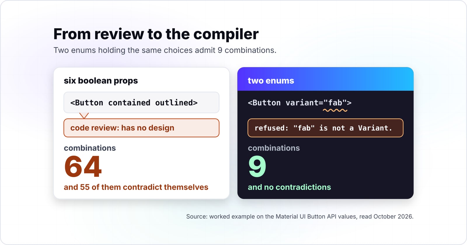
In this worked example, a Button with three variants and three sizes written as six boolean props admits 64 combinations, and 55 of them contradict themselves. The values come from the Material UI Button API, read on 9 October 2026. It lists contained, outlined and text, then small, medium and large. By contrast, two enums holding the same choices admit 9 combinations and no contradictions.
64 combinations
Six boolean props
9 combinations
Two enums
Six boolean props admit 64 combinations and 55 contradict themselves; two enums admit the 9 that mean something.
| Option | prop combinations; 55 of the 64 boolean ones contradict themselves |
|---|---|
| Six boolean props | 64 combinations |
| Two enums | 9 combinations |
Source: arithmetic on the Material UI Button API values, 2026. Modelled, not measured
Every contradictory combination is a state someone must test, document, guard at runtime or field as a bug, so the count is the cost. For example, contained and outlined both set to true has no design. Still, someone has to decide what it renders. In practice that decision lands in a code review, a runtime warning or a support ticket. As a result, those 55 states show up as test cases, docs pages and bug reports, never as features.
Why do boolean props stop scaling as the design system grows?#
Every boolean prop doubles the combinations a component admits, so 8 boolean props admit 256 while one enum holding the same choices admits 9. Material UI's API design guide, read on 9 October 2026, grants that an enum is less flexible. "However, it prevents an invalid combination from being used," the guide says.
So booleans multiply by two per prop while an enum adds one per value, and the gap between them widens with every design decision.
Show data table
| Dimension | boolean props | one enum |
|---|---|---|
| 1 prop | 2 | 2 |
| 2 props | 4 | 3 |
| 3 props | 8 | 4 |
| 4 props | 16 | 5 |
| 5 props | 32 | 6 |
| 6 props | 64 | 7 |
| 7 props | 128 | 8 |
| 8 props | 256 | 9 |
Booleans double with every prop while one enum adds one value, so at eight props the gap is 256 against 9.
The formula is short. With n boolean flags, a component accepts 2 to the power n combinations. Instead, one enum with a value per flag plus a default accepts n plus 1. At three flags the gap is 8 against 4, and it goes unseen. But in the Material UI arithmetic, eight flags give 256 against 9, and every reviewer sees it.
55 of 64 boolean combinations contradict themselves
6 boolean props admit 64 combinations, and only 9 set exactly one variant and one size. Two enums admit those 9 and nothing else. One more variant adds 3 enum combinations and 64 boolean ones.
| Contract | Combinations | Mean something | Contradict |
|---|---|---|---|
| 6 boolean props | 64 | 9 | 55 |
| Two enums | 9 | 9 | 0 |
When is a boolean prop still the right choice?#
Use a boolean when a prop has exactly two values that can never grow, and an enum the moment it has three or might gain a third. Material UI's API design guide, read in October 2026, puts the rule in one line: "A boolean is used when 2 possible values are required." That page sets it beside an example is a Button with contained and fab booleans against one variant enum of three values.
In that guide, read in October 2026, two booleans admit 4 combinations for a prop that needs only 3 values. So one of the four is a contradiction from day one.
Show data table
| Item | Value |
|---|---|
| combinations of the contained and fab booleans | 4 |
| values of the variant enum | 3 |
Two booleans admit four combinations for a prop that needs three values, so one is a contradiction from day one.
The guide also prefers an enum if "additional possible values may be required in the future" for that prop. So the test for a boolean is whether its two values are the whole future of the prop. Therefore disabled stays a boolean, because a control is either disabled or not. Also, loading stays one too. Meanwhile contained fails the test, since a button style is one choice among several.
How does a slot replace a pile of content props?#
A slot hands a region of the component to the caller, so the component keeps its structure while icons, headers and footers stop being props. Content props grow the same way flags do. Once a showIcon flag exists, it soon needs an iconName string, then an icon position, then an icon size.
Instead, the Material UI Button takes startIcon and endIcon as nodes, so the caller passes the icon itself. Vue's slots guide, read in October 2026, adds fallback content. When the caller passes nothing, the component renders a default, such as the text "Submit".
Content belongs to the caller and structure belongs to the component, and a slot is the line between them. As a result, the component owns padding, focus and layout. And the caller owns what sits inside.
How do React, Vue, Svelte and Web Components spell a slot?#
The same contract has four spellings: children and element props in React, named slots in Vue, snippets in Svelte, and the slot element in Web Components.
- React. Content nested inside a JSX tag arrives "in a prop called children," says React's props page. A second region is another prop that takes an element, like
startIcon. - Vue. Several regions become named slots, each filled through a
<template v-slot:header>element in the Vue slots guide. - Svelte. Content inside the component tags "implicitly becomes part of the children snippet," per the Svelte snippet docs.
- Web Components. MDN describes the slot element as "a placeholder inside a Web Component that you can fill with your own markup."
| Framework | How the slot is spelled |
|---|---|
| React | children, plus a prop that takes an element, like startIcon |
| Vue | named slots, each filled through a template v-slot:header element |
| Svelte | the children snippet |
| Web Components | the slot element |
Because every major component model ships a slot, the contract travels across frameworks even when the syntax does not.
How does asChild let a component lend its behaviour to your element?#
Radix Primitives' asChild prop tells a part to skip its own element and merge its props and behaviour onto the child you pass instead. Its docs say every primitive part that renders a DOM element accepts an asChild prop. When asChild is set, its composition guide says "Radix will not render a default DOM element" and clones the child instead.
The Slot utility behind it "Merges its props onto its immediate child." So asChild turns the rendered element into a slot. As a result, a Button can become a link without a polymorphic as prop or a second component. Event handlers merge too, with the child handler taking precedence, per the Slot page.
Which documentation pages do you build the contract from?#
Build the contract in this order: the TypeScript handbook for the unions, React's props page for children, then the Radix Slot utility for asChild.
- 1
TypeScript narrowing handbook
string literal unions for variant and size, and the discriminated union for an icon-only Button.
- 2
React, passing props to a component
children as the content slot.
- 3
Radix Slot utility
Slot.Root behind an asChild prop, imported from the radix-ui package.
- 4
Material UI API design guide
the rule for when a boolean is still right.
The pages: TypeScript narrowing handbook, React, passing props to a component, Radix Slot utility and Material UI API design guide.
So three official pages hold every call the contract needs, and Material UI's guide holds the rule behind it.
What is the smallest Button contract that refuses contradictions?#
Two string unions, a children slot and an asChild flag give a Button whose types accept only the 9 combinations the design system means. The file below assumes a React project with TypeScript and the radix-ui package installed. Your usual bundler compiles it.
import * as React from "react";
import { Slot } from "radix-ui";

// Step 1: one string union per design axis.
type Variant = "contained" | "outlined" | "text";
type Size = "small" | "medium" | "large";

type Base = Omit<React.ComponentProps<"button">, "aria-label"> & {
  variant?: Variant;
  size?: Size;
  asChild?: boolean; // Step 3: render the caller's element instead.
  children: React.ReactNode; // Step 2: content is a slot.
};

// Step 4: an icon-only Button must carry a label, or it does not compile.
type ButtonProps =
  | (Base & { iconOnly?: false; "aria-label"?: string })
  | (Base & { iconOnly: true; "aria-label": string });

export function Button({ variant = "text", size = "medium", asChild, iconOnly, ...props }: ButtonProps) {
  const Comp = asChild ? Slot.Root : "button";
  return <Comp data-variant={variant} data-size={size} data-icon-only={iconOnly || undefined} {...props} />;
}

// <Button variant="outlined" size="small">Save</Button>
// <Button asChild><a href="/docs">Read the docs</a></Button>
// <Button iconOnly>x</Button>          refused: aria-label is missing.
// <Button variant="fab">Add</Button>   refused: "fab" is not a Variant.
A discriminated union moves the contradiction check from review to the compiler. Here the iconOnly field is the shared literal the TypeScript handbook describes. When every member carries one, TypeScript "considers that to be a discriminated union" and narrows on it.
How do you move an existing component off boolean props without breaking callers?#
Add the enum beside the old booleans, map each boolean to an enum value, warn when the old prop is used, then remove it in the next major version. In short, a recomposition is a deprecation, not a rewrite: both contracts live side by side for one release.
Add the enums
Add variant and size beside the old flags, with defaults that keep today's look.
Map the flags
Map each flag to an enum value inside the component, so outlined becomes variant="outlined".
Settle the contradictions
Settle the contradictions once. In the worked Button there are 55, so pick an order of precedence and log a development warning when two flags are set.
Warn, then delete
Warn on every old prop for a release, then delete the flags in the next major version.
For a target shape, the Material UI Button API table already types variant and size as unions of string values.
Where should a new design system start, and when is this the wrong tool?#
Start from the axes the design system will grow along, because a fourth variant costs an enum one value but costs a boolean API 128 combinations. So what is the best practice for how a developer should start building a page with components? Begin with the shared Button, Input and Card, since they gather callers fastest. Then give each its enums and slots.
In the same Material UI arithmetic, read in October 2026, a fourth variant takes the boolean contradictions from 55 to 116. Meanwhile the two enums grow from 9 to 12.
Show data table
| Dimension | boolean props: combinations | boolean props: contradictions | two enums: combinations |
|---|---|---|---|
| three variants | 64 | 55 | 9 |
| four variants | 128 | 116 | 12 |
A fourth variant doubles the boolean combinations while the two enums grow by one row of sizes.
The contract pays off on shared components that grow, and a one-off component or a fixed two-state toggle is the wrong place to spend it. Three cases call for something else:
In short, a scalable UI architecture is mostly these decisions, made early on the few scalable UI components everyone calls.
Where do you go from here?#
Count the combinations your most-used component admits today, then read on for documenting, styling and sharing that contract across teams.
To document the contract, a Storybook setup with Vite gives every enum value and slot its own story. Under the variant enum, Tailwind against Bootstrap weighs the two common styling layers. When several teams share one library, micro-frontends and team governance covers who owns which component. For the behaviour a primitive owns, see accessible website examples.
If the work is a whole library of scalable UI components, our design systems practice and frontend software engineers are routes too. Still, the documentation linked above is enough on its own to build the contract.