CSS Grid and Flexbox together: one test to pick each, and how to nest them
Picking a layout module by how big the component is leaves you fighting fixed widths later. One question about alignment settles it, and the two modules then stack cleanly inside each other.
What is the difference between CSS Grid and Flexbox?#
CSS Grid lays items out in rows and columns at the same time, while Flexbox lays them out along one line, so most layouts use Grid for the frame and Flexbox inside it. The MDN guide to flexbox and other layout methods was updated on 3 August 2026. It says: "Flexbox is a one-dimensional layout method whereas grid layout is a two-dimensional layout method". That split comes from the W3C Flexbox specification and the W3C Grid specification themselves.
In practice, one axis means Flexbox works from the content out. So each item takes the space its content asks for. Then the line shares out what is left along the main axis, and align-items places items on the cross axis. Two axes means Grid sizes its tracks first and then drops items into the cells. So the question is never which module is better. Instead, it is which kind of control a given box needs.
- Flexbox: one lineEach item takes the space its content asks for, then the line shares out what is left along the main axis.
- CSS Grid: two axesGrid sizes its tracks first and then drops items into the cells.
Why does picking the wrong layout module cost time later?#
A layout module chosen by component size instead of by alignment leaves fixed widths, extra wrappers and media queries that every later change has to work around. MDN's demo of this, updated 7 April 2026, gives five boxes flex: 1 1 150px and turns on wrapping. Two boxes drop onto a second line and stretch to share it, so they no longer sit under the boxes above. In the same way, what people call a CSS flex grid, a card list built with wrapping Flexbox, needs a fixed flex-basis on each card to keep the columns straight. Then it needs a breakpoint for each screen size where that width stops fitting. And each breakpoint is one more place to edit.
One auto-fit rule replaces that stack. The web.dev Learn CSS module on grids was updated on 11 June 2025. It calls the result "a two-dimensional responsive layout with no need for any media queries". As a result, a redesign that changes the card size touches one value instead of four breakpoints.
The reverse mistake costs time too. If a row of buttons is built on fixed tracks, a fourth button means editing the track list. But Flexbox would have simply made room, because each button sizes itself from its label.
How do you decide between Grid and Flexbox for a new layout?#
Ask one question first: must items line up with items in other rows or columns? If they must, use Grid; if they only flow along one line, use Flexbox. The MDN flexbox guide, updated 3 August 2026, explains why. Once flex items wrap, "flexbox does not look at the placement of items in other rows" when it shares out space.
Because of that, the old rule of Flexbox for small parts and Grid for big ones does not hold. The same MDN guide says "A tiny component can be two dimensional," and a full page can be a single line of content. Also, MDN gives a plain warning sign. If you set widths on flex items to make them line up with the row above, you wanted Grid.
Side by side, grid layout vs flex layout comes down to five questions.
| Question | CSS Grid | Flexbox |
|---|---|---|
| How many axes does it control? | Rows and columns together | One line, a row or a column |
| Where does sizing start? | The tracks set on the container | The content of each item |
| Do wrapped items line up as columns? | Yes, every row shares the same tracks | No, each line shares out its own space |
| Best fit | Page frames, card lists, forms with labels in a column | Nav bars, button rows, tag lists, centring one box |
| Spacing and alignment | gap, justify-items, align-items | gap, justify-content, align-items, align-self |
Source: MDN, Relationship of grid layout with other layout methods, updated 7 April 2026, and the MDN flexbox guide, updated 3 August 2026.
How do CSS Grid and Flexbox together build one layout?#
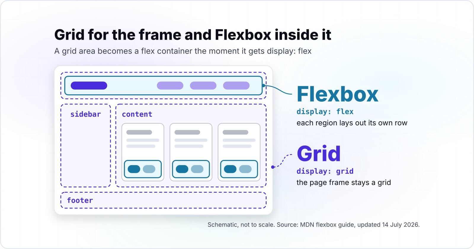
A grid area becomes a flex container the moment it gets display: flex, so the page frame stays a grid and each region lays out its own row with Flexbox. Nesting works because an element can be a grid item to its parent and a flex container to its children at once. The parent places the box, and the box decides how its own children flow.
For example, take a page with a header, a sidebar, a main area and a footer. First, the page itself gets named areas. Then the header is a flex row that pushes the logo left and the links right, with justify-content: space-between. Meanwhile, the main area holds a card list, and each card ends in a flex row of buttons. MDN's flexbox guide was updated on 14 July 2026. It adds that it is "perfectly OK to set a flex item to also be a flex container". So the nesting can go as deep as the design needs, and a grid with Flexbox in each region is the normal case, not a workaround.
Both modules also share their alignment and spacing tools. The MDN guide to grid and other layout methods was updated on 7 April 2026. It notes that the two specs "both use CSS box alignment features". So gap, align-items and justify-content mean the same thing at every level. That is why CSS Grid and Flexbox together work as one system rather than two.
Grid frames the page. Flex flows the contents. At 1024px the grid frame holds 2 macro columns (a 320px sidebar plus a flexible main). Grid frames the page. Inside main the card wall reflows to 4 cards per row, and inside each card a flex media object keeps the avatar at a fixed size while the text sizes to what is left. Flex flows the contents.
| Region | Tool | Why that tool |
|---|---|---|
| Page skeleton | CSS Grid | Two axes, named areas, tracks declared up front. |
| Card wall in main | CSS Grid | A two-axis wall that reflows with repeat(auto-fill, minmax()). |
| Navbar in header | Flexbox | One axis, items sized to content, one push to the right. |
| Media object in each card | Flexbox | Fixed avatar, text flexes to fill the remaining main-axis space. |
| Footer meta row | Flexbox | One axis, content-sized items with a spacer between. |
Can you put a grid inside a flex item?#
Yes, any flex item can be a grid container, and CSS Subgrid goes further by letting a nested grid reuse its parent's tracks so card parts line up. Setting display: grid on a flex item starts a fresh set of tracks inside it. That works well for a small block, such as a form row inside a flex toolbar. And the flex row around it still sizes that block like any other item.
However, a fresh nested layout cannot see its neighbours. For example, three cards side by side each size their own rows. So a long title in one card pushes its button lower than the others. MDN's Subgrid guide was updated on 7 November 2025. It says that "the nested grid uses the tracks defined on the parent". In short, each card borrows the rows of the list, and titles, text and buttons line up across all cards.
Can I use, read in October 2026, shows it shipping in every major engine, with Firefox first at version 71 and Chrome at version 117.
Show data table
| Item | Value |
|---|---|
| Chrome | 117 |
| Edge | 117 |
| Firefox | 71 |
| Safari | 16 |
| Opera | 103 |
Firefox shipped Subgrid first at version 71, and Chrome followed at version 117.
What is a flexible grid, and how many columns does auto-fit make?#
A flexible grid lets the browser fit as many columns as the width allows; the MDN grid guide, updated July 2026, uses minmax(230px, 1fr) with a 20px gap. In that example, the browser fits whole columns of at least 230px, with 20px between them, and then stretches them to fill the row. So a CSS flexible grid needs no breakpoints, and its column count follows one sum.
Each column needs its minimum plus one gap, and the last column needs no gap after it. Therefore, take the container width plus one gap, divide by the minimum plus one gap, and round down. Say the container is 1024px wide, so 1,044 divided by 250 is 4.18 and the rule makes 4 columns. At a 768px width, for example, it makes 3, and on a 320px phone it makes 1.
Columns an auto-fit grid makes
Set the container width, the minimum column width and the gap; it counts the whole columns that fit and the width each one stretches to.
Columns
4
- Width each column stretches to (px)
- 241
Arithmetic from MDN's Grids guide, 20 July 2026. Modelled, not measured.
Then the difference between auto-fit and auto-fill only shows when there are fewer items than columns. With auto-fit, the empty tracks collapse and the items stretch. With auto-fill, the empty tracks stay, so the items keep their width.
Which documentation should you build from?#
Build from the MDN grid guide first, then the web.dev Flexbox module, then the MDN subgrid guide, and settle edge cases in the W3C specifications. The order follows the layers: the frame, then the rows inside it, then the alignment across cards.
- MDN, Grids, updated 20 July 2026: named areas for the frame and the auto-fit pattern for the list.
- web.dev, Learn CSS: Flexbox, updated 21 April 2021: flex rows, wrapping and alignment on the main axis.
- MDN, Subgrid, updated 7 November 2025: borrowed rows for cards that line up.
- MDN, Flexbox guide, updated 14 July 2026:
justify-content,gapand nested flex boxes.
- Step 1
The frame
MDN, Grids
- Step 2
The rows inside it
web.dev, Learn CSS: Flexbox
- Step 3
The alignment across cards
MDN, Subgrid
- Step 4
Edge cases
The W3C specifications
What is the smallest working CSS for a Grid frame with Flexbox inside?#
The smallest working version needs one grid rule for the page frame, one auto-fit rule for the card list and one flex rule for each card footer. A fourth rule lets the cards borrow rows so their parts line up. The markup is a page holding a header, an aside, a main area and a footer. Inside main sits a list of cards, and each card holds a heading, a paragraph and a footer.
/* 1. The page frame: a grid with named areas */
.page {
  display: grid;
  grid-template-areas:
    "header header"
    "sidebar content"
    "footer footer";
  grid-template-columns: 1fr 3fr;
  gap: 20px;
}
.page > header { grid-area: header; }
.page > aside  { grid-area: sidebar; }
.page > main   { grid-area: content; }
.page > footer { grid-area: footer; }

/* 2. The card list: a flexible grid with no media queries */
.cards {
  display: grid;
  grid-template-columns: repeat(auto-fit, minmax(230px, 1fr));
  gap: 20px;
}

/* 3. Each card borrows three rows from the list, so parts line up */
.card {
  display: grid;
  grid-row: span 3;
  grid-template-rows: subgrid;
}

/* 4. The card footer: a flex row of buttons */
.card footer {
  display: flex;
  justify-content: space-between;
  align-items: center;
}
Paste it into an empty page and resize the window. Then the frame stays put while the card count per row changes. Meanwhile, the buttons stay aligned across cards.
Does browser support still decide between Grid and Flexbox?#
Rarely: Can I use lists Grid in Chrome from version 57 and Subgrid in Chrome from version 117, as of October 2026, so only very old browsers change the choice. Today every current major browser runs both modules and the borrowed-rows feature too.
Show data table
| Item | Value |
|---|---|
| Chrome | 57 |
| Edge | 16 |
| Firefox | 52 |
| Safari | 10.1 |
| Opera | 44 |
Every major browser has shipped CSS Grid, with Chrome from version 57.
So support decides only for a project that must serve very old browsers, such as an internal tool pinned to an old kiosk build. In that case, Flexbox with flex-wrap: wrap is the safer frame. Then the newer features can sit behind a feature query.
When is Grid the wrong tool, and when is Flexbox?#
Grid is the wrong tool for a row of tags whose count changes, and Flexbox is the wrong tool once wrapped items must line up as columns. For tags, chips or buttons, Flexbox with wrapping lets each item take the space its text needs. But fixed tracks would force every tag into the same width.
For a card list, though, MDN's warning applies again. Because wrapped flex lines never look at the rows above them, they cannot keep columns. So if you are setting widths to make a second row match the first, switch to auto-fill or auto-fit tracks. In short, the Flexbox vs Grid choice turns on columns, not on size.
Finally, sometimes neither is right. A long article with headings and paragraphs reads fine in normal flow. So there, a layout module only adds rules to maintain. Use Grid or Flexbox where boxes need placing, and let text flow where it is just text.
| Case | Wrong tool | Use instead |
|---|---|---|
| A row of tags whose count changes | Grid | Flexbox with wrapping |
| Wrapped items that must line up as columns | Flexbox | auto-fill or auto-fit tracks |
| A long article with headings and paragraphs | Grid or Flexbox | Normal flow |
Where should you go next with CSS layout?#
For Grid on its own, the responsive Grid layouts guide goes deeper, and the component guide shows the flex rows that sit inside each grid area. The next step depends on which layer needs work: the frame, the parts inside it, or the focus order across both.
- Responsive layouts with CSS Grid covers named areas and track sizing in depth.
- Building scalable UI components covers the parts that live inside each area.
- Focus vs focus-visible in CSS matters once placement or
ordermoves boxes away from source order. - Lighthouse performance audits shows where late-sizing items cause layout shift.
When a team wants its layouts planned with the design, our UI and UX design work and design systems work start there. But the MDN guides above are enough on their own to build every pattern here.