CSS grid layouts for complex, responsive designs
One content dashboard, evolved through the whole toolkit: named areas, the intrinsic-sizing functions, auto-fit reflow, subgrid, and a layered hero. Declare the constraints, and let the layout engine do the solving.
What are CSS grid layouts?#
CSS Grid layout is the two-dimensional layout system in CSS: you declare rows, columns and named areas on a container, and the browser sizes and places every child. The basic concepts guide on MDN puts it in one line: it "introduces a two-dimensional grid system to CSS". Because rows and columns are sized together, it differs from a single flowing line of boxes.
Most tutorials hand you a bag of properties. You learn fr, then minmax, then auto-fit, as if they were unrelated tricks. However, they are one system with one job. Instead, you describe a set of constraints, and the layout engine solves for a concrete arrangement.
That reframe matters, because it changes how you debug. When a page looks wrong, you stop nudging pixels. Instead you ask which constraint you stated badly. Therefore the constraint model is not a slogan. It is the mental model that makes every function below click into place.
The overview guide on MDN lists the properties well. Yet a reference cannot give you the frame. So the walkthrough supplies the frame, then proves it on one real dashboard you can copy.
Also, support stopped being a question years ago. In the W3C WebDX web-features explorer, read on 8 October 2026, the gap from the first browser to ship it to the last major one was 7 months in 2017, and Baseline Widely Available status followed 30 months after that.
Show data table
| Item | Value |
|---|---|
| First browser (Firefox 52) to last major browser (Edge 16) | 7 |
| Last major browser to Baseline Widely Available | 30 |
Grid reached every major browser within 7 months in 2017, and Baseline Widely Available status followed 30 months later.
Why declare constraints instead of positioning every box?#
Declaring constraints instead of positions means one template edit changes the whole layout, so a dashboard redesign becomes a CSS change rather than a markup rewrite. For example, one repeat(auto-fit, 250px) line, an example taken from the repeat() reference, reflows the columns with no media query at all. Say the container is 390, 768, 1024 or 1280 pixels wide (an assumption): that one line gives 1, 3, 4 or 5 columns.
First, pick one artifact and carry it the whole way. Then let it be a content dashboard, the kind every product ships. It has a sidebar, a header, a main region, a set of widget cards, and a layered hero.
Below is the plain semantic markup. Notice there is no layout class yet, only meaning. This exact markup never changes again. Instead, every stage rewrites the CSS around it, which is the entire point of treating placement as a constraint system.
<!-- The whole walkthrough evolves THIS markup. It never changes again.
     Semantic regions, in reading order, with no layout classes yet. -->
<div class="dashboard">
  <header class="db-header">Account overview</header>
  <nav class="db-sidebar">Primary navigation</nav>
  <main class="db-main">
    <section class="db-widgets"><!-- widget cards live here --></section>
  </main>
  <footer class="db-footer">Sync status</footer>
</div>
Treat the DOM as reading order, not as layout. For instance, the sidebar comes first in the source, yet it can sit anywhere on screen. Because the area map decides position, the markup stays honest for screen readers while the template arranges the pixels.
What does display: grid do, in the smallest working example?#
Setting display: grid on an element makes it a grid container, and its direct children become grid items placed into the rows and columns you declare. The display reference on MDN says that with this value the element behaves like a block-level element. So an HTML grid layout needs no special markup, only a parent and its children.
Three declarations are enough for a working layout grid. First, display: grid creates the container. Then grid-template-columns with the fr unit splits the free space into shares. Finally, gap puts space between the tracks without margins on the items.
<div class="grid">
  <div>One</div>
  <div>Two</div>
  <div>Three</div>
  <div>Four</div>
</div>

<style>
  .grid {
    display: grid;                          /* 1. make it a grid container */
    grid-template-columns: 1fr 1fr 1fr;     /* 2. three equal columns */
    gap: 1rem;                              /* 3. space between the tracks */
  }
</style>
Paste the grid HTML into an empty file and open it. Then watch the fourth item wrap onto a second row by itself, because the container creates rows as it needs them. In short, you declared columns only, and the browser solved the rest.
Show data table
| Item | Value |
|---|---|
| Firefox | 52 |
| Chrome | 57 |
| Safari | 10.1 |
| Edge | 16 |
| Safari on iOS | 10.3 |
Every major browser lists a first version with grid support, so the smallest example runs in every current release.
Which CSS grid examples can you copy and paste?#
Five copyable CSS grid examples cover most page layouts: equal columns, a sidebar, a named-area page, a responsive card wall and an overlay that stacks two items in one cell. Each block of grid CSS is a complete rule you can drop onto a parent element. In practice, these five CSS grid layouts also work as CSS layout templates you adapt rather than start from zero.
Example 1: equal columns. Three tracks share the width evenly, whatever the content.
.columns {
  display: grid;
  grid-template-columns: repeat(3, 1fr);
  gap: 1rem;
}
Example 2: a sidebar and a main column. Here the sidebar keeps a range, while the main column takes what is left.
.with-sidebar {
  display: grid;
  grid-template-columns: minmax(12rem, 16rem) 1fr;
  gap: 1.5rem;
}
Example 3: a named-area page (the holy grail). A header, a footer, a main column and two flanking columns, drawn as a map with grid-template-areas.
.page {
  display: grid;
  grid-template-columns: 12rem 1fr 12rem;
  grid-template-rows: auto 1fr auto;
  grid-template-areas:
    "header header header"
    "nav    main   aside"
    "footer footer footer";
  min-height: 100vh;
}
.page > header { grid-area: header; }
.page > nav    { grid-area: nav; }
.page > main   { grid-area: main; }
.page > aside  { grid-area: aside; }
.page > footer { grid-area: footer; }
Example 4: a responsive card wall with no media query. Each row holds as many cards as fit, each at least 15rem wide.
.cards {
  display: grid;
  grid-template-columns: repeat(auto-fit, minmax(15rem, 1fr));
  gap: 1rem;
}
Example 5: an overlay in one cell. Because an image and a caption share one cell, the caption sits on top of the image.
.overlay {
  display: grid;
}
.overlay > * {
  grid-area: 1 / 1;      /* every child in row 1, column 1 */
}
.overlay > figcaption {
  align-self: end;       /* pin the caption to the bottom edge */
}
Then the dashboard uses all five ideas at once, as examples 3, 4 and 5 grow into stages 1, 3 and 5.
How do named grid areas turn a layout into a readable blueprint?#
The grid-template-areas property lets you draw the layout as rows of names, so the CSS itself becomes a readable map of where each region sits. Its reference page on MDN says the property "specifies named grid areas, establishing the cells in the grid" and assigns them names. So start by naming the frame. Named areas let you draw the layout as ASCII art, so the CSS reads like a picture of the page. In particular, this is the self-documenting trick that references mention but rarely build on.
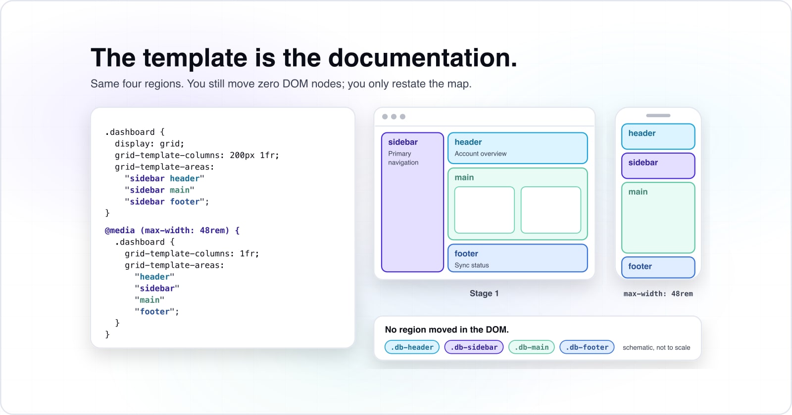
The template is the documentation#
Here is Stage 1 on our dashboard, where each region gets a name and the template paints the frame. You can read the arrangement at a glance, with no comment needed.
/* Name each region once, then draw the frame as ASCII art. The template
   IS the documentation: you can read the layout without a comment. */
.dashboard {
  display: grid;
  grid-template-columns: 200px 1fr;
  grid-template-rows: auto 1fr auto;
  grid-template-areas:
    "sidebar header"
    "sidebar main"
    "sidebar footer";
  min-height: 100vh;
}

/* Each region claims its name. The order in the DOM no longer decides
   the position; the area map does. */
.db-sidebar { grid-area: sidebar; }
.db-header  { grid-area: header; }
.db-main    { grid-area: main; }
.db-footer  { grid-area: footer; }
Look at the grid-template-areas block. Here the word sidebar repeats down the first column, so the sidebar spans all three rows. Because the names carry the intent, you write far fewer brittle selectors. As a result, that keeps your stylesheet clear of the same specificity discipline that trips people up with :focus-visible.
Re-arrange by redefining areas, not by moving DOM#
Now the payoff: a layout built from named areas re-arranges when you redefine the map, not when you reorder the document. The demo below proves it. Flip the breakpoint and watch the same four regions snap to a new position.
Showing the Desktop area map.
Desktop template
grid-template-columns: 200px 1fr;
grid-template-areas:
  "sidebar header"
  "sidebar main"
  "sidebar footer";
A full-height sidebar beside a stacked header, main, and footer.
What the browser draws
Tablet template
grid-template-columns: 160px 1fr;
grid-template-areas:
  "header  header"
  "sidebar main"
  "footer  footer";
The header spans the top, the sidebar tucks beside main, the footer spans the base.
What the browser draws
Mobile template
grid-template-columns: 1fr;
grid-template-areas:
  "header"
  "sidebar"
  "main"
  "footer";
One column. Every region stacks in reading order.
What the browser draws
Notice what did not happen. No region moved in the DOM, and no JavaScript reshuffled nodes. Instead each breakpoint stated a different area map, and the browser solved the rest. That is declarative layout: you change the description, and the engine changes the result.
How do minmax, fr and the intrinsic sizing keywords replace guessed widths?#
Intrinsic sizing lets each track state a minimum and a maximum, and the fr unit hands out whatever space is left, so you stop guessing widths. In practice, fixed pixel widths are the fragile part of most layouts. They break the moment content or the viewport disagrees with your guess. So Stage 2 replaces every fixed width with a function that states a constraint instead, and then the browser solves the widths.
minmax, fr, and the fraction that does the solving#
Here is the same dashboard with its fixed columns gone. Now the fixed sidebar width becomes a stated range. Meanwhile the flexible column becomes a fraction of the free space.
/* Stage 2: delete every fixed pixel width. State a RANGE and a fraction,
   then let the browser solve the columns. */
.dashboard {
  display: grid;
  /* The sidebar was 200px. Now it is "never below 12rem, never above 15rem". */
  grid-template-columns: minmax(12rem, 15rem) minmax(0, 1fr);
  grid-template-rows: auto minmax(0, 1fr) auto;
  /* The gap itself flexes with the viewport. */
  gap: clamp(0.75rem, 2vw, 1.5rem);
}
Say minmax(12rem, 15rem) aloud. It says the sidebar is never below 12rem and never above 15rem. Meanwhile minmax(0, 1fr) says the main column takes whatever is left, down to nothing. The fr unit is the fraction that does the solving, because it distributes free space after the fixed and ranged tracks are placed. Also, the minmax() reference covers the edge cases.
Each function replaces a brittle hack: the reasoning table#
In practice, these intrinsic functions are scattered across the docs, so they feel unrelated. In truth each one replaces a specific fragile hack. So treat the table as one reasoning system, not six tricks.
| Function | The brittle hack it replaces | The constraint it states |
|---|---|---|
| minmax(a, b) | A fixed width plus a media query to shrink it | Never below a, never above b. |
| 1fr | Percent widths that drift out of sync with the gap | Take one share of the free space left over. |
| min-content | A hardcoded narrow column for a label | Be as narrow as the longest unbreakable word. |
| max-content | A fixed width picked to avoid wrapping | Be as wide as the content needs with no wrapping. |
| fit-content(a) | A width that is min of content and a manual cap | Grow with content, but never past the cap a. |
| clamp(a, v, b) | Three media queries for small, medium, and large | Scale with v, held between a floor a and ceiling b. |
Every row states a constraint instead of a guess. Therefore the browser can solve the width at any container size. That is the whole shift from fighting the layout to describing it.
How does auto-fit with minmax make a responsive grid without media queries?#
With repeat(auto-fit, minmax()), the browser fits as many columns as the container allows and collapses the empty ones, so the grid reflows with no media query. This is the heart of the walkthrough. The widget grid inside main should add and drop columns as it resizes. However, most guides show the one-liner but skip the model. So here is both, then the live proof, then the honest exception.
The RAM one-liner, read as a sentence#
One declaration makes the widget area responsive with no breakpoint. Call it the RAM pattern, for repeat, auto-fit, minmax.
/* Stage 3: the widget grid inside main. ONE declaration, no breakpoints. */
.db-widgets {
  display: grid;
  grid-template-columns: repeat(auto-fit, minmax(200px, 1fr));
  gap: 16px;
}
Say it as plain English. In this example it says: as many equal columns as fit, each at least 200 pixels wide, sharing the leftover space. Because the constraint is complete, the browser adds a column when the container grows and drops one when it shrinks. This is the responsive performance work that goes beyond media-query breakpoints, which our 2026 site optimization guide treats in depth. Also, the repeat() reference documents the keywords.
The count is not magic. With auto-fit, the W3C layout specification, Level 2 says "the number of repetitions is the largest possible positive integer" that does not overflow the container. So take the repeat(auto-fit, 250px) example with no gap, divide the width by the track size, and drop the remainder. The chart runs that division at four container widths, which are an assumption.
Show data table
| Item | Value |
|---|---|
| 390px container | 1 |
| 768px container | 3 |
| 1024px container | 4 |
| 1280px container | 5 |
One repeat(auto-fit, 250px) line gives 1, 3, 4 or 5 columns as the assumed container grows from 390 to 1280 pixels.
auto-fit vs auto-fill: the empty-track difference, with real numbers#
Now the one distinction most guides get thin: auto-fit and auto-fill count tracks the same way. They differ only in what they do with an empty track, and the repeat() reference on MDN says that with auto-fit "any empty repeated tracks are collapsed". So rather than describe it, drag the numbers and watch it.
Tracks the browser reserves (4 fit at this width):
floor((1000 + 16) / (200 + 16)) = 4 tracks. auto-fit collapsed the 1 empty track to zero, so the 3 cards stretch to 322.67px each and fill the row. Switch to auto-fill to reserve the empty space instead.
| Container width | Tracks that fit | auto-fill result | auto-fit result |
|---|---|---|---|
| 1000px | 4 | 3 cards at 238px + 1 empty 238px track | 3 cards stretch to 322.67px |
| 640px | 3 | 3 cards at 202.67px, no empty track | 3 cards at 202.67px (identical) |
| 400px | 1 | 1 column at 400px, cards wrap | 1 column at 400px (identical) |
First, work the default numbers by hand to trust the demo. For example, assume a 1000-pixel container, a 200-pixel minimum track and a 16-pixel gap. Then, in this assumed case, the browser computes floor((1000 + 16) / (200 + 16)), which is floor(1016 / 216), or four tracks. So four columns fit.
Now place only three cards. Say you pick auto-fill: the browser keeps the fourth empty track, so each track is (1000 minus 48) / 4, which is 238 pixels. As a result, in this assumed case the three cards render at 238 pixels with a trailing empty column of the same width. For example, with auto-fit the empty track collapses to zero, so the three cards share the full width at (1000 minus 32) / 3, which is 322.67 pixels each. That single collapse is the entire real difference.
The one honest media query: redefine the areas at a breakpoint#
Intellectual honesty matters, so name the exception. There is one place a media query is still the right tool, and it is redefining the page skeleton, not a width.
/* The ONE honest media query left in the whole layout. It redefines the
   SKELETON, not a width. You are changing WHICH region sits WHERE, and no
   intrinsic function can express that rearrangement. */
@media (max-width: 48rem) {
  .dashboard {
    grid-template-columns: 1fr;
    grid-template-areas:
      "header"
      "sidebar"
      "main"
      "footer";
  }
}How does subgrid line up nested cards, and is it safe to use in 2026?#
Subgrid lets a nested grid reuse its parent's tracks, and the web-features explorer, read on 8 October 2026, lists it as Baseline Widely Available since March 2026. The widget cards have a title, a body, and a footer. Left alone, each card sizes its own rows, so footers drift out of line across the row. Subgrid fixes that by letting the cards share the parent's rows. Therefore in 2026 you can treat it as production-ready.
Subgrid browser support in 2026#
Show data table
| Item | Value |
|---|---|
| First browser (Firefox 71) to last major browser (Edge 117) | 45 |
| Last major browser to Baseline Widely Available | 30 |
Subgrid took 45 months to reach the last major browser, then 30 more to become Baseline Widely Available.
Card titles and footers that align across the row#
Next, compare the two approaches directly. First, the before version lets each card own its rows, so the footers land at different heights. Second, the after version shares the parent rows with subgrid, so every title and footer snaps to one baseline.
/* Before subgrid: each card owns its own rows. A long title in one card
   pushes its footer down, so footers across the row never line up. The cards
   do not agree on a shared baseline. */
.widget {
  display: grid;
  grid-template-rows: auto 1fr auto; /* title / body / footer, per card */
}/* After subgrid: define the three rows ONCE on the widget grid. Each card
opts into the parent tracks with subgrid, so every title, body, and footer
aligns across the entire row. The cards now share one baseline. */
.db-widgets {
display: grid;
grid-template-columns: repeat(auto-fit, minmax(200px, 1fr));
grid-auto-rows: auto;
gap: 16px;
}
.widget {
display: grid;
grid-row: span 3; /* occupy title, body, and footer rows */
grid-template-rows: subgrid; /* inherit the parent's row tracks */
}That change is small but load-bearing. First you define the three rows once on the parent, then each card inherits them with grid-template-rows: subgrid. Because the tracks are shared, alignment stops being a per-card fight. However, one detail from that guide matters when you place items inside a card. The nested element does not inherit the parent's line numbers, so line numbering restarts inside the nested card. In short, this is exactly the discipline behind scalable UI components built on a consistent layout contract, where cards must agree on a shared rhythm.
How do you layer a hero by stacking items in one grid cell?#
Placing the image and the text in the same grid cell layers them without absolute positioning, so the hero keeps its height from its content. The last stage is one that tutorials rarely teach as a first-class pattern. A layered hero puts an image, a scrim, and copy on top of each other. The old way reaches for absolute positioning. Instead, the calmer way is to place every child in the same cell.
/* Stage 5: the layered hero. Every child shares ONE cell, so they stack
   like layers in a design tool. z-index and place-self order them. No
   absolute positioning, no negative margins. */
.hero {
  display: grid;
  grid-template-areas: "stack";
  min-height: 22rem;
}

/* The load-bearing line: all children occupy the SAME 1 / 1 cell. */
.hero > * {
  grid-area: stack;
}

.hero__image { z-index: 0; inline-size: 100%; block-size: 100%; object-fit: cover; }
.hero__scrim { z-index: 1; background: linear-gradient(transparent, rgba(0, 0, 0, 0.55)); }
.hero__copy  { z-index: 2; place-self: end start; color: #fff; padding: 1.5rem; }
Look at the load-bearing line. Every child gets grid-area: stack, so they all occupy the same 1 / 1 cell. Then z-index orders them front to back, and place-self positions the copy in a corner. Also, the Learn CSS course on web.dev notes that items placed in the same cell stack, and items later in the source display on top of earlier ones. Because the cell contains them, you never fight offsets or negative margins. In short, overlapping becomes declarative layering.
Which documentation should you build a grid layout from?#
Build from MDN's grid basics first, then its grid-template-areas and repeat() references, its subgrid guide, and the web-features explorer for browser support. Because each page answers one stage, take them in this order; the first four are on MDN:
- Basic concepts guide: the container, tracks, lines and the
frunit, which is everything the smallest example uses. - The grid-template-areas property: the string syntax for named areas in Stage 1.
- The repeat() function:
auto-fitandauto-fillfor Stage 3. - The subgrid guide: inherited tracks and line numbering for Stage 4.
- The web-features explorer entry: the Baseline status and the first version in each browser.
Also keep the W3C Level 2 specification open for the edge cases, since the specification defines every function used here, nested tracks included.
Show data table
| Item | Value |
|---|---|
| Firefox | 71 |
| Safari | 16 |
| Chrome | 117 |
| Edge | 117 |
| Firefox for Android | 79 |
Every major browser now lists a first version with subgrid, the last being Chrome and Edge 117.
When is CSS Grid the wrong tool?#
In short, a template describes a frame while a row of items flows a line, and you often use both, with one module for the page and the other inside a cell.
There is one more trap to name: do not overuse named areas for a layout with a single obvious column. A one-column stack needs no template; a plain block flow already reads clearly. In the end, the toolkit is a set of tools, not a ranking to climb.
CSS Grid as a constraint system, in one screen#
Every stage above declared a constraint, a name, a limit, a minimum width, an inherited track or a shared cell, and left the solving to the browser. Finally, close the loop by stacking the stages back onto one artifact. The dashboard now names its frame, sizes its tracks with intrinsic functions, reflows its widgets with auto-fit, aligns its cards with subgrid, and layers its hero in a single cell. As a result, one dashboard carries the whole toolkit.
/* The one dashboard, now carrying all five stages at once. */
.dashboard {
  display: grid;
  grid-template-columns: minmax(12rem, 15rem) minmax(0, 1fr);
  grid-template-areas:
    "sidebar header"
    "sidebar main"
    "sidebar footer";
  gap: clamp(0.75rem, 2vw, 1.5rem);
}

/* Stage 3: the widgets reflow with no media query. */
.db-widgets {
  display: grid;
  grid-template-columns: repeat(auto-fit, minmax(200px, 1fr));
  gap: 16px;
}

/* Stage 4: nested card rows align across the row via subgrid. */
.widget { grid-row: span 3; grid-template-rows: subgrid; }

/* Stage 5: the hero layers three children in a single cell. */
.hero { display: grid; grid-template-areas: "stack"; }
.hero > * { grid-area: stack; }

/* Stage 3, the honest exception: redefine the SKELETON at one breakpoint. */
@media (max-width: 48rem) {
  .dashboard {
    grid-template-columns: 1fr;
    grid-template-areas: "header" "sidebar" "main" "footer";
  }
}
Treat the final CSS as five constraints, not five hacks. Each block states a rule, and the browser solves the rest across every screen. That is what it means to treat placement as a constraint system: you declare, and the layout engine does the solving.
From here, the same constraint thinking carries into scalable UI components and into the Baseline features worth adopting. If a team wants help turning a grid like this into shared components, the design systems and UI and UX design pages describe that work. Still, the reference pages listed above are enough on their own to build every stage.