Heuristic evaluation and cognitive walkthrough in software testing: which to run, and how many evaluators
Two expert inspections, two different jobs. One sweeps a whole interface for broken principles, the other walks a single task as a newcomer would, and the size of the panel decides how much the sweep finds.
What is the difference between heuristic evaluation and cognitive walkthrough?#
A heuristic evaluation checks a whole interface against a list of usability principles, while a cognitive walkthrough follows one task step by step to ask whether a first-time user could finish it. In its June 2023 guide, Nielsen Norman Group defines the first as a method where "evaluators judge the design against a set of guidelines (called heuristics)". In its February 2022 article, NN/g says a walkthrough is used to "evaluate the learnability of a system from the perspective of a new user".
So the difference between cognitive walkthrough and heuristic evaluation is the question each one asks. First, the sweep asks whether the design breaks a known rule anywhere. Second, the walkthrough asks whether a newcomer would get stuck on one path. When people search for walkthrough testing, heuristic testing or a heuristic walkthrough, they usually mean one of these two. So ask which question the team needs answered first.
| Heuristic evaluation | Cognitive walkthrough | |
|---|---|---|
| Question asked | Does the design break a usability principle? | Could a new user finish this task? |
| Point of view | An analyst | A first-time user |
| Target | General usability | Learnability |
| Scope | The whole product or a chosen section | One task flow at a time |
| Checklist | Nielsen's 10 heuristics | Four questions at every step |
| Who takes part | Three to five evaluators, each working alone | One group, with a facilitator and a recorder |
| Output | Issues, each tied to the heuristic it breaks | A pass or fail for every step |
| Best moment | Any stage, often early in design | Early prototypes of new or unusual flows |
Source: Nielsen Norman Group, "How to Conduct a Heuristic Evaluation" (25 June 2023), "Evaluate Interface Learnability with Cognitive Walkthroughs" (13 February 2022) and "10 Usability Heuristics" (last reviewed 30 January 2024).
What does each method catch that the other one misses?#
A heuristic sweep catches breadth defects such as inconsistent labels and missing feedback, while a walkthrough catches the single step where a new user stalls. Therefore running both before a release removes two different classes of defect before users meet either one. In particular, the sweep finds problems spread across many screens. Meanwhile, the walkthrough finds the one screen where a first visit ends.
Cost evidence on cognitive walkthrough vs heuristic evaluation points the same way. A 1991 study by Jeffries, Miller, Wharton and Uyeda compared four evaluation methods. According to University of Calgary course notes from 1998, the heuristic approach "found the largest number of problems, including the most serious ones and at the lowest cost". However, the same notes say it needs highly trained people. Although the walkthrough "was found to take the most time", it does not always need a usability specialist.
In practice the two lists overlap a little. NN/g's February 2022 article says both methods can run together for a fuller picture. However, it warns there will be "some degree of overlap". As a result, a QA (quality assurance) lead gets a cleaner release report. It names the rules the interface breaks, and the exact step where a new user gives up.
How does a heuristic evaluation work, and what are Nielsen's 10 heuristics?#
In a heuristic evaluation, three to five evaluators each inspect the interface alone against 10 heuristics and only then pool their findings, as Nielsen Norman Group advises in its June 2023 guide. The guide says heuristic evaluations "work best when performed by a group of people", because each person misses some issues. Also, Nielsen's 1994 theory page adds that evaluators may talk only after every session is done.
Here are the 10 heuristics, as NN/g lists them:
- Visibility of system status
- Match between the system and the real world
- User control and freedom
- Consistency and standards
- Error prevention
- Recognition rather than recall
- Flexibility and efficiency of use
- Aesthetic and minimalist design
- Help users recognize, diagnose, and recover from errors
- Help and documentation
Nielsen first wrote the list with Rolf Molich in 1990 and revised it in 1994. NN/g says the 10 heuristics "have remained relevant and unchanged since 1994", though the wording was refined in 2020.
In practice, the session is short. First, each evaluator walks the task once just to learn it. Then they walk it again and note every element that breaks a heuristic. NN/g's June 2023 guide suggests a timebox of one to two hours, and a spreadsheet with one observation per line beside its heuristic. Finally the group merges the lists, for example with an affinity diagram. Also note that a broken rule is not always a bug. For instance, NN/g's own example is a hamburger menu, which breaks heuristic 6 but is often a fair trade on a phone.
Learn the task
First, each evaluator walks the task once just to learn it.
Inspect alone
Then they walk it again and note every element that breaks a heuristic.
Timebox and log
NN/g's June 2023 guide suggests a timebox of one to two hours, and a spreadsheet with one observation per line beside its heuristic.
Merge
Finally the group merges the lists, for example with an affinity diagram.
What is a cognitive walkthrough, and what are its four questions?#
A cognitive walkthrough asks four questions at every step of one task, and a single No marks that step as a likely failure for a new user. In its February 2022 article, Nielsen Norman Group calls it "a task-based usability-inspection method". In practice, a group of reviewers walks each step of a flow and answers the same set of questions.
These are the four questions, in NN/g's words:
- Will users try to achieve the right result?
- Will users notice that the correct action is available?
- Will users associate the correct action with the result they're trying to achieve?
- After the action is performed, will users see that progress is made toward the goal?
The roles are fixed. First, one person acts as the facilitator and performs the task, stopping at each new screen. Second, everyone acts as an evaluator, while one person records the answers. Then, if any question gets a No, the recorder marks the whole step as Fail. Also, the team decides in advance how big a step is, so a short form can count as one step.
The method has a long history. NN/g's reference list dates its first version to a CHI '90 paper by Lewis, Polson, Wharton and Rieman. It was built for walk-up-and-use systems such as kiosks and cash machines. That list also names the 1994 "practitioner's guide" by Wharton, Rieman, Lewis and Polson in Usability Inspection Methods, the leaner version most teams now run. Since the method tests learnability, NN/g says it fits complex, new or unfamiliar flows best.
How many evaluators does a heuristic evaluation need?#
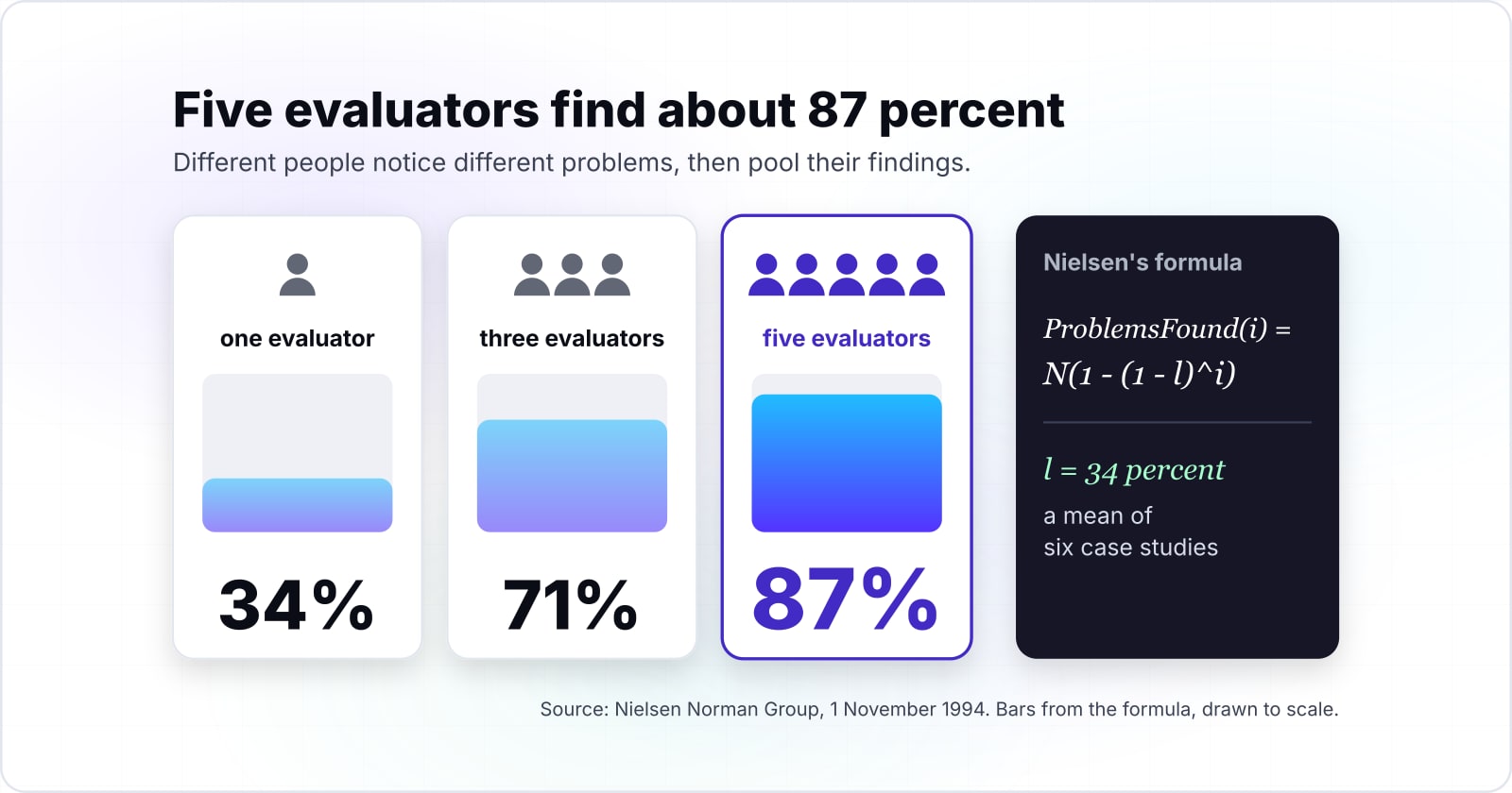
In Nielsen Norman Group's November 1994 analysis, single evaluators caught only 35 percent of the usability problems, so panels of three to five evaluators are the norm. On the same theory page, Nielsen says "single evaluators found only 35 percent of the usability problems". That figure is averaged over six of his projects. Because different evaluators find different problems, pooled panels climb fast at first and then flatten.
The page gives the curve as a formula, ProblemsFound(i) = N(1 - (1 - l)^i). Here N is the number of problems in the interface and l is the share one evaluator finds. In Nielsen and Landauer's six case studies, cited on that 1994 page, l had a mean of 34 percent. As a result, coverage rises from 34 percent for one evaluator to 87 percent for five.
Show data table
| Stage | Value |
|---|---|
| 1 evaluator | 34 |
| 2 evaluators | 56 |
| 3 evaluators | 71 |
| 4 evaluators | 81 |
| 5 evaluators | 87 |
| 6 evaluators | 92 |
| 7 evaluators | 95 |
| 8 evaluators | 96 |
| 9 evaluators | 98 |
| 10 evaluators | 98 |
Coverage climbs fast to five evaluators, then flattens.
However, the walkthrough has no such curve. It is a single workshop. NN/g lists UX specialists, product owners, software engineers and domain experts as people who may join. So a team sizes the walkthrough by the roles it needs, not by a coverage target.
Why does one evaluator miss so much?#
Across the six case studies in Nielsen Norman Group's November 1994 analysis, one evaluator found between 19 and 51 percent of the problems, with a mean of 34 percent. Because different people notice different problems, any one person's rate is low. It also moves a lot from project to project.
Show data table
| Item | Value |
|---|---|
| lowest of six case studies | 19 |
| mean of six case studies | 34 |
| highest of six case studies | 51 |
Any one evaluator's rate is low and swings from project to project.
Nielsen's banking case, on the same 1994 page, shows why. In that study, 19 evaluators looked for 16 problems in a voice response system. The grid of who found what shows "a substantial amount of nonoverlap". While some problems were found by almost everybody, others were found only by evaluators who found few problems overall.
For that reason, picking the best evaluator does not fix it. Nielsen gives two reasons on the 1994 page. First, the best evaluator on one project is not always the best on the next one. Second, some of the hardest problems come from people who are weak on everything else. The psychology of bugs works the same way at the code level. Each person's blind spots are their own, so a second pair of eyes finds a different set.
Where does adding evaluators stop paying off?#
Nielsen and Landauer's paper in the INTERACT '93 and CHI '93 proceedings puts the best benefit to cost ratio at four evaluations, and in their medium example 16 evaluations were still worth their cost. The paper's abstract puts it this way: "we estimate that 16 evaluations would be worth their cost, with maximum benefit/cost ratio at four".
4
Evaluations at the maximum benefit to cost ratio
16
Evaluations worth their cost in the medium example
The best ratio and the last evaluation worth its cost are different numbers.
| Option | evaluations in Nielsen and Landauer's medium example |
|---|---|
| Evaluations at the maximum benefit to cost ratio | 4 |
| Evaluations worth their cost in the medium example | 16 |
These are two different stopping points. In particular, the best ratio is where each extra hour buys the most. Then the second number marks where the extra hours stop paying at all. Meanwhile, Nielsen's 1994 page lands on four evaluators in its own worked sample, which matches the three to five rule.
So a team that wants the most per hour books three to five evaluators. A team shipping a system where usability is critical can book more, and the 1994 page says as much. In short, the panel size is a choice you can defend with a number.
Which guides should a QA team run each method from?#
Run the sweep from Nielsen Norman Group's heuristic list and its June 2023 procedure guide, and run the walkthrough from its February 2022 cognitive walkthrough guide. In practice, three pages hold the whole method, and a fourth sizes the panel. Open them in this order:
Also, each page is free to read, and none needs a tool beyond a spreadsheet.
How can you size an evaluator panel with a few lines of Python?#
A short Python loop over Nielsen's problems-found formula prints the coverage and the marginal gain for each panel size, so the stopping point is visible before anyone is booked. The defaults below are the six-case-study means from Nielsen Norman Group's November 1994 page, l = 0.34 and N = 33. Then swap in your own rate once you have measured one.
# ProblemsFound(i) = N(1 - (1 - l)^i), Nielsen Norman Group, 1994
l = 0.34   # share of problems one evaluator finds (six-case-study mean)
N = 33     # problems in the interface (six-case-study mean)

previous = 0
for i in range(1, 11):
    found = N * (1 - (1 - l) ** i)
    gain = found - previous
    print(f"{i:2d} evaluators: {found:4.1f} problems ({found / N:.0%}), +{gain:.1f}")
    previous = found
Run it with python3 and read the last column. With Nielsen's 1994 means, the fifth evaluator adds about two problems and the sixth adds less than one and a half. In practice, that is a sensible place to stop. For example, say a team's first sessions show a lower rate of l = 0.2, an illustrative case. Its curve flattens later, so it may book more people.
Which method should you run on which flow, and how do you record the findings?#
Run a heuristic sweep on a broad, near-final interface, run a walkthrough on any new or unfamiliar task flow, and record every finding with its heuristic or failed question and a severity. The flow decides the method. In particular, breadth and maturity call for the sweep, while novelty and first use call for the walkthrough.
Take a shop's checkout before a release. With the means from Nielsen Norman Group's November 1994 page (l = 34 percent, N = 33), one evaluator finds about 11 problems. Three find about 24, or 71 percent, and five find about 29, or 87 percent.
Evaluator 5 added only 2 problems. Each one past here is mostly cost.
Cumulative coverage view. The curve is the running share of all 33 problems the panel has found. By evaluator 5 it reaches 87%, about 29 problems. The line climbs fast, then flattens.
| Evaluators | Coverage | Problems found | Marginal gain |
|---|---|---|---|
| 1 | 34% | 11 | +11 |
| 2 | 56% | 19 | +8 |
| 3 | 71% | 24 | +5 |
| 4 | 81% | 27 | +3 |
| 5 | 87% | 29 | +2 |
| 6 | 92% | 30 | +1 |
| 7 | 95% | 31 | +1 |
| 8 | 96% | 32 | +1 |
| 9 | 98% | 32 | +0 |
| 10 | 98% | 32 | +0 |
An illustrative teaching model, not a benchmark. The curve is Nielsen's problems-found formula, ProblemsFound(i) = N(1 - (1 - l)^i). The defaults, l = 34% and N = 33, are the six-case-study means on Nielsen Norman Group's November 1994 page, so the coverage of your own audit depends on your evaluators and your interface.
However, NN/g's February 2022 article says a basic checkout does not need one, because nearly every shopper knows the pattern. Instead, walk the new step the release adds, such as a first-time instalment plan, for a shopper who has never used one. In short, sweep the familiar flow and walk the new one.
Then write each finding so a software engineer can act on it. One line per finding works:
- Where: the screen and the element.
- What: the observed problem, in plain words.
- Rule: the heuristic it breaks, or the walkthrough question that got a No.
- Severity: how badly it blocks the task, agreed by the group.
- Fix idea: an optional recommendation, as NN/g's workbook allows.
Also log every walkthrough step as pass or fail, as the recorder role in NN/g's article does. A test team already running exploratory sessions with Rapid Reporter can keep both logs in the same session notes.
When is an expert inspection the wrong tool?#
Neither method replaces testing with real users, because ISO 9241-11 treats usability as an outcome of use that only real users in a real context can show. The 2018 standard, confirmed in 2023, "explains that usability is an outcome of use". In short, an inspection only predicts that outcome. Three cases call for something else.
For scripts, Digital.gov, the US federal guidance site run by the General Services Administration, links free usability testing scripts and kits.
Second, when every evaluator built the product, they share the team's blind spots. Instead, bring in people from outside the team, or test with users.
Third, when the gap is access for disabled people, run an accessibility testing audit against the Web Content Accessibility Guidelines (WCAG). The 10 heuristics do not cover screen readers or contrast ratios. Likewise, the ISO 9241-210:2019 standard for human-centred design covers design activities across the whole life cycle, so evaluation is never a single gate.
Where should a QA team go from here?#
Pair these inspections with an accessibility audit, exploratory sessions and manual checks that feed automation, so each kind of defect has an owner. In short, an inspection is one instrument in a QA plan. The neighbouring guides cover the instruments around it.
For manual checks that later become automated suites, read how manual testing improves automation quality. For speed, which an inspection does not measure, the site optimization guide for 2026 covers performance and user experience together.
If the findings call for a redesigned flow, that is UI and UX design work. If they point at access gaps, an accessibility testing audit is the next step. Finally, the four NN/g pages above are enough to run both methods well on your own.