Building the Supabase Astro blog frontend with React and Tailwind
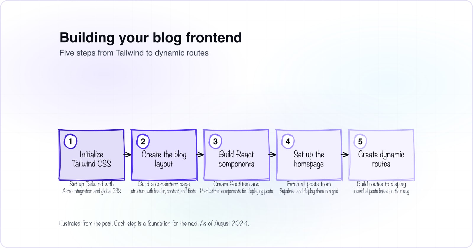
Welcome to Part 4 of our blog-building series. You have set up the Supabase backend and built the admin interface. Now it's time to create the frontend that brings your blog to life with a responsive, styled interface. In this part, you'll learn how to configure Tailwind CSS, build reusable React components, and connect them to Supabase to display your blog posts. By the end, you'll have a fully functional blog with a blog post list and individual post pages, all styled with Tailwind's utility classes.
1. Initializing Tailwind CSS#
First, you need to set up Tailwind CSS to style your blog. Tailwind is a utility-first CSS framework that lets you compose styles directly in your markup using predefined classes. This approach gives you flexibility and keeps your CSS file size minimal.
Step 1: Initialize Tailwind CSS#
Run the following command to initialize Tailwind in your project:
npx tailwindcss initThis command creates a tailwind.config.js file in your project root.
Step 2: Create the Global CSS File#
Create a global CSS file at src/styles/global.css and add the Tailwind directives:
@tailwind base;
@tailwind components;
@tailwind utilities;
These directives import Tailwind's base styles, component layer, and utility classes. The three layers give you a structured way to add custom styles without overriding utilities.
Step 3: Update the Tailwind Configuration#
Configure Tailwind to scan your source files for class names:
/** @type {import('tailwindcss').Config} */
export default {
  content: ['./src/**/*.{js,jsx,ts,tsx,astro}'],
  theme: {
    extend: {},
  },
  plugins: [],
}
The content path tells Tailwind which files to scan. This ensures only classes you actually use get included in the final CSS bundle.
Step 4: Integrate Tailwind into Astro#
Make sure your astro.config.mjs includes the Tailwind integration:
import { defineConfig } from 'astro/config';

import react from "@astrojs/react";
import cloudflare from "@astrojs/cloudflare";
import tailwind from '@astrojs/tailwind';

// https://astro.build/config
export default defineConfig({
  integrations: [react(), tailwind()],
  output: "server",
  adapter: cloudflare()
});
This configuration adds React for component interactivity, Cloudflare Workers for deployment, and Tailwind for styling. As of August 2024, this setup creates a fast, deployable blog foundation.
2. Creating the Blog Layout#
A layout component provides consistent structure across all your blog pages. It handles the header, navigation, content area, and footer so each page doesn't need to repeat this markup.
Create the Base Layout#
Create src/layouts/BaseLayout.astro with this structure:
---
const { title } = Astro.props;
---
<html lang="en" class="min-h-screen">
  <head>
    <meta charset="utf-8">
    <meta name="viewport" content="width=device-width, initial-scale=1">
    <title>{title ?? 'Quick blog with Supabase'}</title>
  </head>
  <body class="min-h-screen">
    <h1>{title}</h1>
    <article>
      <slot /> <!-- your content is injected here -->
    </article>
    <footer class="sticky top-[100vh] text-center">
      <p class="text-grey">
        Made with ❤️ by <a href="https://atyantik.com">Atyantik Technologies</a>
      </p>
    </footer>
  </body>
</html>
This layout accepts a title prop, renders it as an h1, and uses a slot for page-specific content. The footer includes a link back to Atyantik Technologies. The sticky footer positioning keeps it visible even on short pages. Tailwind utilities like min-h-screen ensure the page fills the viewport.
3. Building the Blog List and Post Components#
Components handle displaying individual posts and lists of posts. React components receive data as props and return JSX elements styled with Tailwind classes.
Create the PostItem Component#
This component displays a single blog post with its featured image, title, publication date, and content:
import dayjs from "dayjs";

interface IPostItem {
  title: string;
  slug: string;
  unique_id: string;
  excerpt: string;
  publish_date: string;
  content: string;
  featured_images: { src: string; title: string }[];
}

export const PostItem = (props: IPostItem) => {
  const publishDate = dayjs(props.publish_date);
  const publishDateTime = publishDate.format("MMMM D, YYYY");
  return (
    <div>
      <div className="flex text-left max-w-4xl flex-col mx-auto">
        <div className="mx-auto">
          <a
            href="/"
            className="block my-4 text-xl leading-7 text-indigo-600"
          >
            ← Go Back
          </a>
        </div>
      </div>
      <img
        style={{ maxHeight: "60dvh" }}
        src={props.featured_images?.[0]?.src ?? ""}
        alt={props.featured_images?.[0]?.title ?? props.title}
        className="w-full object-cover object-top"
      />
      <div className="flex justify-center max-w-4xl flex-col mx-auto">
        <div className="mx-auto">
          <div>
            <p className="mt-3 text-xl font-semibold leading-7 text-indigo-600">
              {publishDateTime}
            </p>
            <h1 className="mt-2 text-3xl font-bold tracking-tight text-gray-900 sm:text-4xl">
              {props.title}
            </h1>
            <div
              className="mt-6 text-xl leading-8 text-gray-700"
              dangerouslySetInnerHTML={{
                __html: props.content,
              }}
            />
          </div>
        </div>
      </div>
    </div>
  );
};
The component uses the dayjs library to format the publication date. The featured image scales to fill its container with object-cover, keeping its aspect ratio. The content is rendered as innerHTML because it comes from your Supabase database as HTML. The back link returns you to the post list.
Create the PostListItem Component#
This component displays a post in a list format with a thumbnail:
{props.excerpt}
import dayjs from "dayjs";

interface IPostListItem {
  title: string;
  slug: string;
  unique_id: string;
  excerpt: string;
  publish_date: string;
  featured_images: { src: string; title: string }[];
};

export const PostListItem = (props: IPostListItem) => {
  const publishDate = dayjs(props.publish_date);
  const publishDateTime = publishDate.format("MMMM D, YYYY");
  return (
    <article className="flex max-w-xl flex-col items-start justify-between">
      <div className="group relative">
        <a href={"/" + props.slug + "-" + props.unique_id + "/"}>
          <img
            className="h-40 w-full object-cover object-top rounded-md"
            src={props.featured_images?.[0]?.src ?? ""}
            alt={props.featured_images?.[0]?.title ?? ""}
          />
        </a>
        <h3 className="mt-3 text-lg font-semibold leading-6 text-gray-900 group-hover:text-gray-600">
          <a href={"/" + props.slug + "-" + props.unique_id + "/"}>
            <span className="absolute inset-0"></span>
            {props.title}
          </a>
        </h3>
        <div className="flex items-center gap-x-4 text-xs">
          <time dateTime={props.publish_date} className="text-gray-500">
            {publishDateTime}
          </time>
        </div>
        <p className="mt-5 line-clamp-3 text-sm leading-6 text-gray-600">
          {props.excerpt}
        </p>
      </div>
    </article>
  );
};
Each list item is an article with a thumbnail image, title, publication date, and excerpt. The group-hover effect darkens the text when you hover over the article. Tailwind's line-clamp-3 utility truncates the excerpt to three lines. The link href constructs the URL from the post's slug and unique_id.
4. Setting Up the Homepage#
The homepage lists all blog posts in a responsive grid. Astro fetches the data at build time when you query Supabase directly in the frontmatter.
Create the Homepage#
Create src/pages/index.astro to fetch posts and render them:
---
import BaseLayout from "../layouts/BaseLayout.astro";
import { PostListItem } from "../components/PostListItem";

import { supabaseClient } from "../utils/supabase";
const { data } = await supabaseClient
  .from("posts")
  .select("title, slug, unique_id, publish_date, featured_images, excerpt");
---

<BaseLayout>
  <div class="bg-white py-24 sm:py-32">
    <div class="mx-auto max-w-7xl px-6 lg:px-8">
      <div class="mx-auto max-w-2xl lg:mx-0">
        <h2 class="text-3xl font-bold tracking-tight text-gray-900 sm:text-4xl">
          The Supabase blog
        </h2>
      </div>
      <div
        class="mx-auto mt-10 grid max-w-2xl grid-cols-1 gap-x-8 gap-y-16 border-t border-gray-200 pt-10 sm:mt-16 sm:pt-16 lg:mx-0 lg:max-w-none lg:grid-cols-3"
      >
        {(data ?? []).map((post) => <PostListItem {...post} />)}
      </div>
    </div>
  </div>
</BaseLayout>
The frontmatter queries Supabase for all posts. The query selects only the fields needed for display, which reduces bandwidth. The template maps over the posts and renders a PostListItem for each one. The grid uses Tailwind's responsive classes to show one column on mobile, three on larger screens. The border-t adds a subtle visual separator above the post grid.
5. Creating the Blog Post Route#
Dynamic routes display individual posts based on their URL. The route captures the slug from the URL, extracts the post's unique ID, and fetches that specific post from Supabase.
Create the Dynamic Route#
Create src/pages/[...slug].astro to handle post URLs:
---
import BaseLayout from "../layouts/BaseLayout.astro";
import { PostItem } from "../components/PostItem";
import { supabaseClient } from "../utils/supabase";

const { slug } = Astro.params;
const uniqueId = slug?.split("-")?.pop();
if (!slug || !uniqueId) {
  return Astro.redirect("/404");
}

const { data } = await supabaseClient
  .from("posts")
  .select("title, slug, unique_id, publish_date, content, featured_images, excerpt")
  .eq("unique_id", uniqueId)
  .single();

if (!data?.title) {
  return Astro.redirect("/404");
}
---

<BaseLayout>
  <PostItem {...data} />
</BaseLayout>
The [...slug] syntax creates a catch-all route that matches any URL. The frontmatter extracts the unique ID from the slug by splitting on hyphens and taking the last segment. If either slug or uniqueId is missing, it redirects to 404. The query fetches that specific post from Supabase and renders it with the PostItem component. If the post doesn't exist, it also redirects to 404.
Wrapping Up Part 4#
You now have a complete, styled blog frontend. The Tailwind setup handles all styling through utility classes. The React components are reusable and data-driven, connecting directly to Supabase. The homepage and dynamic routes give readers a way to discover and read posts. Your blog has everything needed for visitors to browse and read content. In Part 5, you'll deploy this blog to Cloudflare, making it fast and globally accessible. The deployment step takes your local blog online. If you're building beyond a blog and need help scaling your platform, we offer expert Cloudflare development services and can assist with building and launching custom software tailored to your needs.