Web accessibility for developers: where to start, in priority order
The web reaches about 1 in 6 people and is a 2026 legal requirement. The single highest-return move is semantic HTML first, because native elements hand you keyboard and screen-reader behaviour for free.
Why web accessibility for developers actually matters#
The case for web accessibility for developers rests on four separate arguments. Each one alone is enough for a decision-maker. Together they close the question. So let us take them in turn, from the ethical to the legal.
The ethical case: the web is the default interface#
Start with the honest reason. The web is now the default interface for banking, work, health, and government. Because so much runs through it, an inaccessible site shuts people out of ordinary life. This is baseline dignity, not charity. For a builder, it is also just correct: a page that works for only some users is a page with a defect.
The reach case: about 1 in 6 people, 1.3 billion, 16%#
Now put numbers on it. The World Health Organization estimates that about 1.3 billion people live with significant disability. Furthermore, that share grows as populations age. So this is not an edge case you can defer.
~1.3 billion
People affected worldwide
16%
Share of the world population
About 1 in 6 people, roughly 16% or 1.3 billion, live with a significant disability. That is a sixth of your users, not a rounding error, and the share rises every year as populations age.
Show data table
| Option | people living with significant disability (WHO Disability fact sheet) |
|---|---|
| People affected worldwide | ~1.3 billion |
| Share of the world population | 16% |
The market case: the spending power you turn away#
Reach ties straight to money. Those users hold real disposable income, and so do the families and friends who shop alongside them. Therefore an inaccessible checkout turns away paying customers, not abstract personas. In practice, the teams that treat accessibility as a growth lever ship it early. This is one place where good practice and revenue point the same way, and it is why we fold accessibility into Atyantik's software development services from the first sprint.
The 2026 legal case: ADA, Section 508, and the European Accessibility Act now in force#
The legal ground has shifted, and 2026 is the year it bites. In the United States, the Department of Justice 2024 ADA Title II rule adopts WCAG 2.1 Level AA for state and local government sites. Section 508 already binds federal software. Meanwhile in the European Union, the European Accessibility Act applies from 28 June 2025. All three point at the same technical standard. The matrix below is the decision-grade view.
| Jurisdiction | Law or rule | Applies to | Technical standard |
|---|---|---|---|
| United States | Law or ruleADA Title II, DOJ 2024 web rule | Applies toState and local government web and apps | Technical standardWCAG 2.1 AA |
| United States | Law or ruleSection 508 | Applies toUS federal information and communications tech | Technical standardWCAG 2.0 AA via 508 refresh |
| European Union | Law or ruleEuropean Accessibility Act, Directive (EU) 2019/882 | Applies toConsumer products and services from 28 June 2025 | Technical standardEN 301 549, which references WCAG |
What is POUR, and how does it organize everything?#
A flat checklist is hard to hold in your head. POUR is the frame that makes it stick. The W3C accessibility principles group every guideline under four ideas. Once you know them, each fix has an obvious home.
Perceivable, Operable, Understandable, Robust, in one pass#
Here is each pillar in a line. Perceivable means users can sense the content, through sight, sound, or touch. Operable means they can drive every control, by mouse, keyboard, or assistive tech. Understandable means the content and the interface behave predictably. Robust means it holds up across browsers, devices, and assistive tools, now and later. Together those four spell POUR.
How POUR maps to the first fixes (and to WCAG AA)#
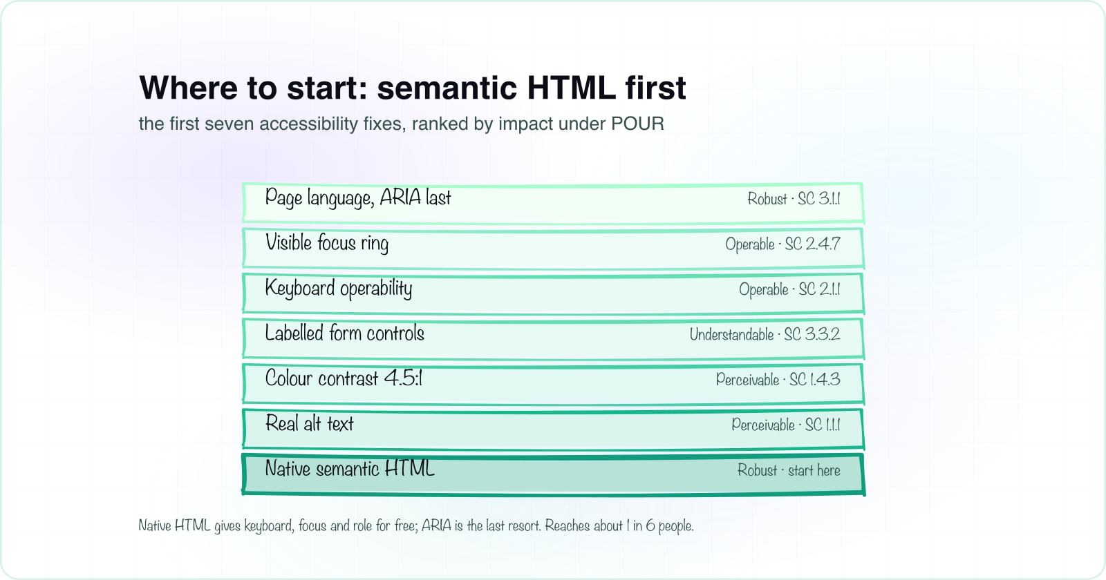
The diagram maps each of the first seven fixes to the pillar it satisfies. So the mental model and the checklist become one artifact, not two things to remember. Because every fix has a home, you always know why you are doing it.
Why is semantic HTML the highest-ROI foundation?#
Here is the thesis the reference guides skip for beginners. In web accessibility for developers, semantic HTML is the highest-return foundation. Native elements hand you keyboard support, focus behaviour, and screen-reader roles for free. Because you get that behaviour without writing it, you also cannot forget it. ARIA, by contrast, is a promise you have to keep by hand.
What native elements hand you for free#
Compare the two ways to build one button. The native version is a single element. The rebuilt version has to re-add everything the browser already gave you.
<!-- One element. The browser hands you the rest for free:
     focusable, fires on Enter and Space, announces role="button",
     and honours the disabled state. -->
<button type="button" class="menu-toggle">
  Menu
</button><!-- The same look, rebuilt from a div. Now YOU own every
behaviour the native button gave you, and one gap breaks it. -->
<div
class="menu-toggle"
role="button"
tabindex="0"
aria-pressed="false"
onkeydown="if (event.key === 'Enter' || event.key === ' ') toggle()"
onclick="toggle()"
>
Menu
</div>Notice the second tab. It re-implements focus, Enter, Space, the role, and the pressed state, and it will still miss an edge case. For example, a real button is announced and disabled correctly with no extra code. So the native element is shorter, safer, and cheaper to maintain.
The first rule of ARIA: no ARIA is better than bad ARIA#
This leads straight to the first rule of ARIA. As the W3C Using ARIA guidance puts it, prefer a native element over an ARIA role whenever one exists. A wrong role or a stale state misinforms a screen reader, which is worse than plain HTML. The table below makes the native versus ARIA choice concrete.
| Behaviour | Native button | div + role + tabindex + keydown |
|---|---|---|
| Focusable by keyboard | Native buttonBuilt in | div + role + tabindex + keydownOnly if you add tabindex="0" |
| Enter and Space activate it | Native buttonBuilt in | div + role + tabindex + keydownOnly if you write the keydown handler |
| Role announced to screen readers | Native buttonBuilt in | div + role + tabindex + keydownOnly if you set role="button" |
| Disabled state | Native buttonBuilt in via disabled | div + role + tabindex + keydownYou add aria-disabled and block the handler |
| Maintenance cost | Native buttonLow, the browser owns it | div + role + tabindex + keydownHigh, you own every behaviour |
Where do I start? The first 7 fixes, ranked by impact#
So where does a beginner start? Not everywhere at once. Instead, work the fixes in impact order, highest return first. The whole point of web accessibility for developers is knowing what to do first. The checklist below ranks the first seven fixes and tags each to its POUR pillar. Check them off as you go, then flip the view to see them grouped by pillar.
0 of 7 first fixes marked done. Currently grouped by impact.
A worked example: the one-line contrast fix (2.85:1 to 4.54:1)#
Take fix four, colour contrast, and watch it move. A common light grey, #999999 on white, computes to 2.85:1. That fails WCAG SC 1.4.3 for body text, which needs 4.5:1. Darken it to #767676 and the ratio climbs to 4.54:1, which passes. So one hex value is the entire fix. Drag the slider below and read the real WCAG relative-luminance math as it recomputes.
#707070 on white is 4.95:1 against the 4.5:1 normal-text floor. It clears AA for this text size.
- Large text, 3:1
- Normal text AA, 4.5:1
- Normal text AAA, 7:1
| Grey | Ratio on white | Normal text AA (4.5:1) | Note |
|---|---|---|---|
| #999999 | 2.85:1 | Fails | a common "looks fine" grey |
| #949494 | 3.03:1 | Fails | clears large text only |
| #767676 | 4.54:1 | Passes | minimum accessible grey |
| #595959 | 7.00:1 | Passes | clears AAA |
Grey #707070 on white computes to 4.95:1. Against the normal-text 4.5 to 1 floor it passes WCAG AA.
That is a highest-impact first step in one line of CSS. Moreover, the readers it helps are part of the 1 in 6 the reach case counted. So a small change carries a large benefit.
When is this NOT where to start? (honest scope)#
This page owns one job: why accessibility matters, and where to begin. It is not the whole method. So here is when this guide is not your next step, stated plainly.
When your foundations are already in: go test#
When you are deep in focus rings and keyboard nav#
Accessibility is built-in and ongoing, not a one-time audit#
One honest note to close. Accessibility is not a one-time audit you pass and forget. Instead, it is a property you build into every component and then keep. Because it lives in your markup and your process, the cheapest place to get it right is at the very start. That is also why it pairs with building scalable, accessible UI components from the start. The same habits that keep a component library sane keep it accessible.
So carry away one rule. Reach for the native element first, rank your fixes by impact, and treat web accessibility for developers as work you build in, not a test you bolt on at the end. Do that, and the standard and the law mostly take care of themselves.
Want a second read on where your product stands, or help building accessibility into your next release? We can start from your real screens, not a generic audit. There is no pressure and no lock-in.
See how Atyantik builds accessible software