The history of tabs in user interfaces: from dialog boxes to digital dominance
You have 27 tabs open right now, don't you? One plays music, another holds your work document, a few contain memes, and the rest? Mystery. Tabs organize our digital chaos into a beautiful mess. They rewired how we navigate the web. Not literally our brains, but our habits and expectations. Let's step back to see how this simple feature became essential. The story starts decades before browsers existed, in places where nobody expected it.
Where tabs in user interfaces began#
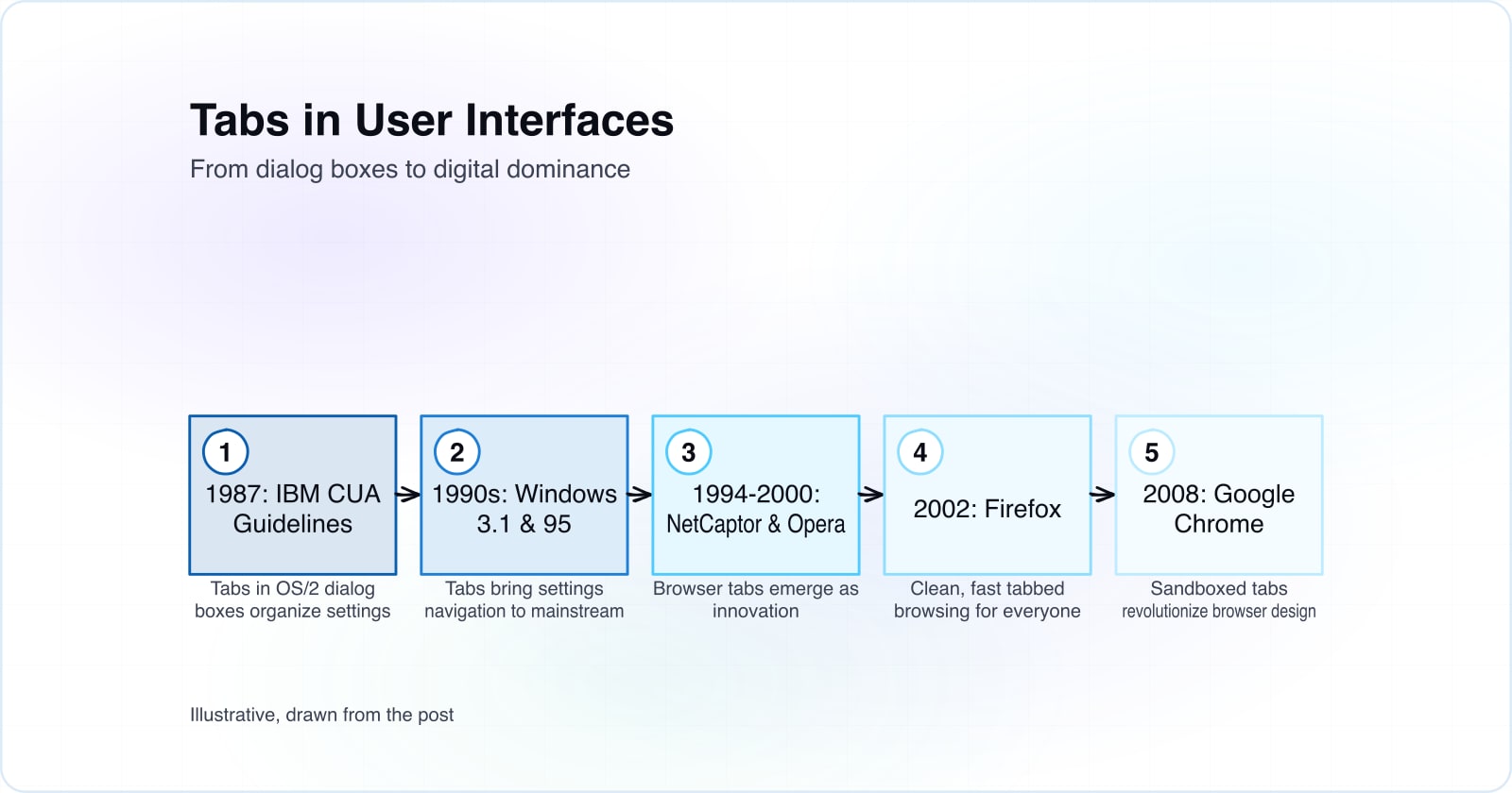
The real story starts in 1987, not with browsers but with IBM's Common User Access (CUA) standards on OS/2. Tabs arrived as clickable labels that let users page through settings like electronic filing cabinets. These early interfaces solved a real problem: settings dialogs felt like terror mazes. Tabs made navigation visible and intuitive. Users could see what options existed without memorizing shortcuts or invoking wizards.
A timeline of tab adoption#
Tab UI evolved gradually across two decades. Windows 3.1 and Windows 95 brought tabs into mainstream computing. Browsers caught on slowly at first. InternetWorks introduced tabbed browsing in 1994, but nobody noticed. NetCaptor arrived in 1997, and Opera showed up in 2000 with cooler UI than anyone else. Firefox launched in 2002 with clean, fast tabbed browsing. Amazon adopted tabs for product pages in the early 2000s, organizing Books, Music, and Video into a digital catalog with no paper cuts. Then came September 2, 2008: Google Chrome exploded onto the scene.
Chrome didn't just have tabs. It mastered them. Every tab lived in its own sandbox. One crashed? The others kept vibing. You could drag tabs out, rearrange them, and feel like you were getting things done. Chrome made tabs feel less like windows and more like magic.
Why tabs in user interfaces actually work#
Tabs click because they mirror how our brains work: taking enormous things and breaking them into small bites. Want to switch between cat videos and your bank account? Tab it. They let you multitask, research, and fall into Wikipedia rabbit holes without losing your place. Tabs give us structure when digital life feels chaotic. They give us the illusion of control and productivity, which honestly counts for a lot.
Tabs everywhere now#
Tabs conquered the world. Gmail, Figma, and Notion all need tabs because people want multiple things open at once. Mobile apps adapted tabs into bottom navigation bars, creating mini-tab kingdoms. Web browsers remain the unbeaten champions. Tabs got baked into design libraries as if they were born there. Today they're not a feature. They're a requirement. Learn more about how design systems evolve with interface components and the role of UI patterns in product launches.
A few growing pains tabs never solved#
Even revolutionary features have drama. Forty-plus tabs means you're not working. You're hoarding. Mobile screens plus 12 tabs equals Where's Waldo. Hidden tabs hide important context until 2AM when your laptop starts buzzing from notification creep. Still, tabs beat opening 27 pop-ups like it's 2002. The web is better with tabs than without them, even if they're not perfect.
Why tabs mattered for user interfaces#
Tabs didn't just structure our screens. They gave structure to our digital lives. They gave us order, control, and the illusion of productivity. That's heavy mojo. For something so bland, tab UI flipped the paradigm on how we interact with computer programs. They organized the web and our work lives.
And that's the tale of tabs: from boring dialog boxes in 1987 to digital dominance by 2008. From OS/2 to Chrome. From settings screens to the place where half your day lives. Long live the tab. We're kind of glad they're staying around.